Multiple Income Households
Here’s household income by number of earners in the household, based on data from the 2022 Current Population Survey. The values are adjusted for 2023 dollars.
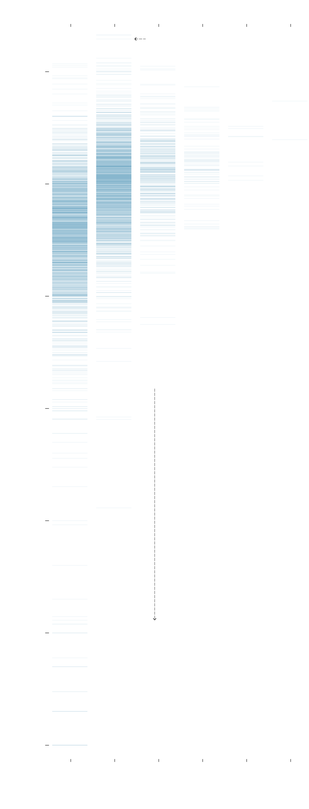
PEOPLE WHO EARNED INCOME IN THE HOUSEHOLD
1
2
3
4
5
6
This is one household.
HOUSEHOLD
INCOME
$1,000,000
More earners usually means higher income, as expected.
$100,000
$10,000
Among all households with income, 5% earned less than $10,000. Among households with one earner, it was 9%.
$1,000
$100
$10
$1
1
2
3
4
5
6
PEOPLE WHO EARNED INCOME IN THE HOUSEHOLD
SOURCE: Current Population Survey 2022, IPUMS
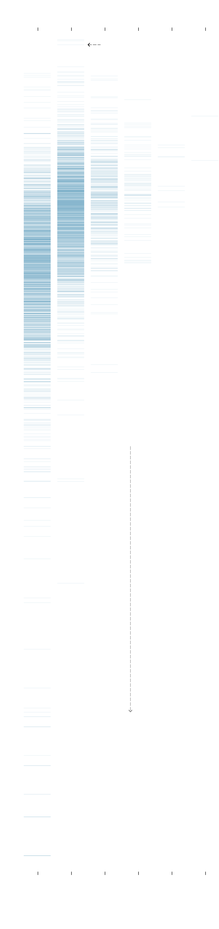
PEOPLE WHO EARNED INCOME IN THE HOUSEHOLD
1
2
3
4
5
6
This is one household.
HOUSEHOLD
INCOME
$1M
More earners usually means higher income, as expected.
$100k
$10k
Among all households with income, 5% earned less than $10,000. Among households with one earner, it was 9%.
$1k
$100
$10
$1
1
2
3
4
5
6
PEOPLE WHO EARNED INCOME IN THE HOUSEHOLD
SOURCE: Current Population Survey 2022, IPUMS