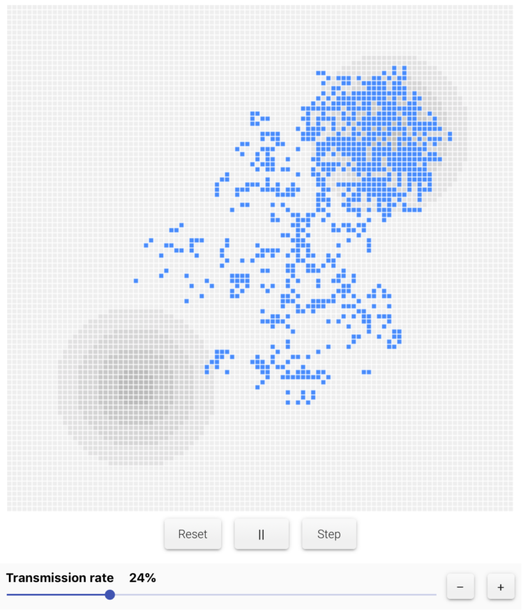
 Kevin Simler uses interactive simulations to explain how things — ideas, disease, memes — spread through a network. It always looks like concentrated chaos to begin, but then the things infect quickly. Adjust variables, press play, and watch them go.
-
-
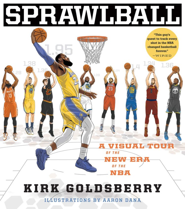
If you’ve seen a basketball shot chart in the past few years, it was probably made or inspired by the work of Kirk Goldsberry. Coming from a cartography and data visualization background, Goldsberry applied his skills to basketball data, and he has a new book called Sprawlball. It tells the story of how this modern era of shooting threes at high volume came to be.
Read More -
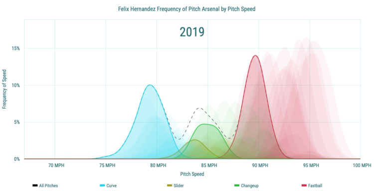
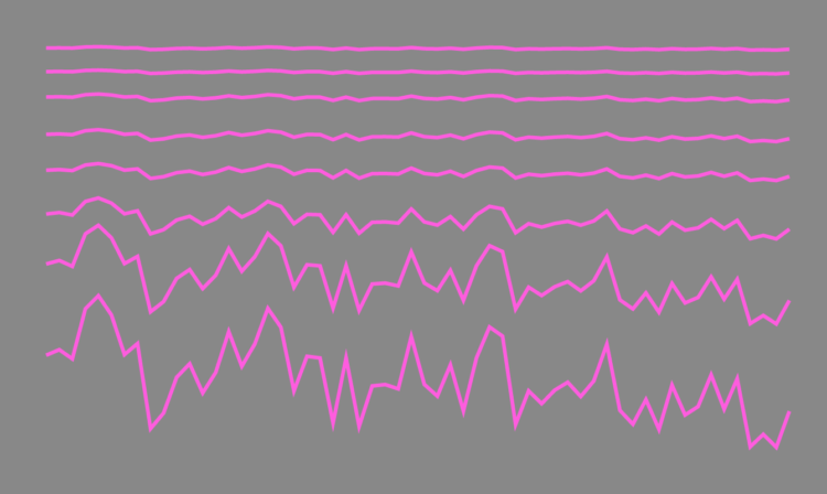
Pitch speed starts to decrease with a baseball player’s age at some point. This makes sense. That’s why athletes retire. The Statcast pitch distributions show when this happens for individual players, categorized by pitch type. I like the transparent distributions for past seasons as a mode of comparison. [via @statpumpkin]
-
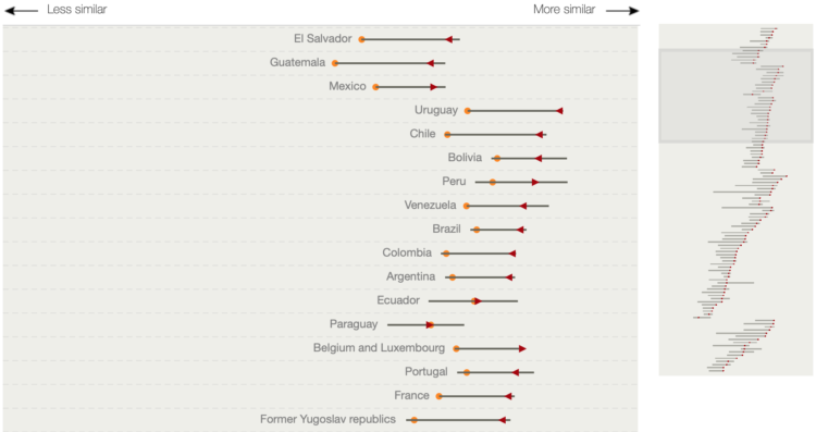
Diet around the world is growing more similar. National Geographic charted estimates of the similarity over time:
People increasingly eat the same types of food. They now get more calories from wheat, rice, corn, sugar, oil crops, and animal products. Meanwhile, consumption of grains such as sorghum, millet, and rye and of root crops such as cassava and yams has fallen.
Comparing diets by country, the international agricultural research group CGIAR tracked five decades of change.
-
Members Only
There was renewed interest in — gasp — truncated axes this week, a never-ending debate about whether starting axes at non-zero is misleading.
-
Ted Mellnik and Reuben Fischer-Baum for The Washington Post describe the changes to the 2020 Census, which will lean more heavily on technology:
The coming census also will break with history with a controversial restoration of a citizenship question, as well as with the adoption of new technologies that change how the count is performed
The census will move away from paper as the primary way to collect data, for the first time since it began in 1790. You will be able to answer the census on the Internet, and census workers in the field will use mobile phone apps.
For the first time since 1880, census workers probably won’t visit your neighborhood to confirm your address. Instead, they’re relying mostly on high-resolution imagery to verify their maps.
-
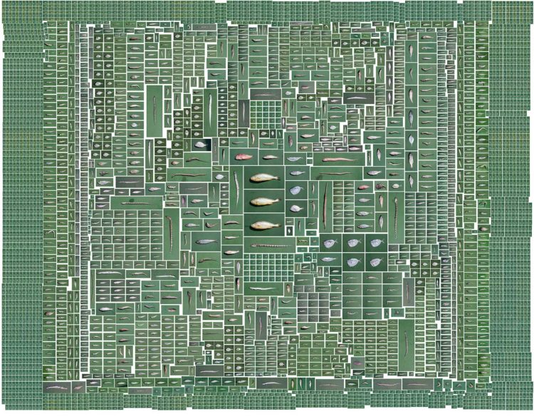
Raising living things requires resources. In the case of fish, it requires more fish so that another can grow larger. Artists Chow and Lin calculated how much. The surrounding small fish are required to grow the three yellow carp in the middle. [via kottke]
-
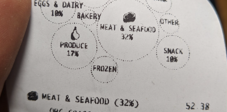
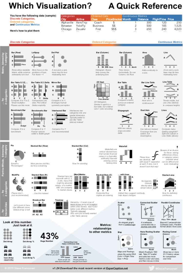
In prototyping mode, Susie Lu incorporated visualization into the common receipt from the grocery store. It gives a price breakdown for money spent on an actual receipt-sized paper using the same thermal printer you might see at the store.
It reminds me of the redesigned nutrition facts on a milk carton. Whatever happened to that trend of sticking visualization on everyday things? I think it’s comeback time.
-
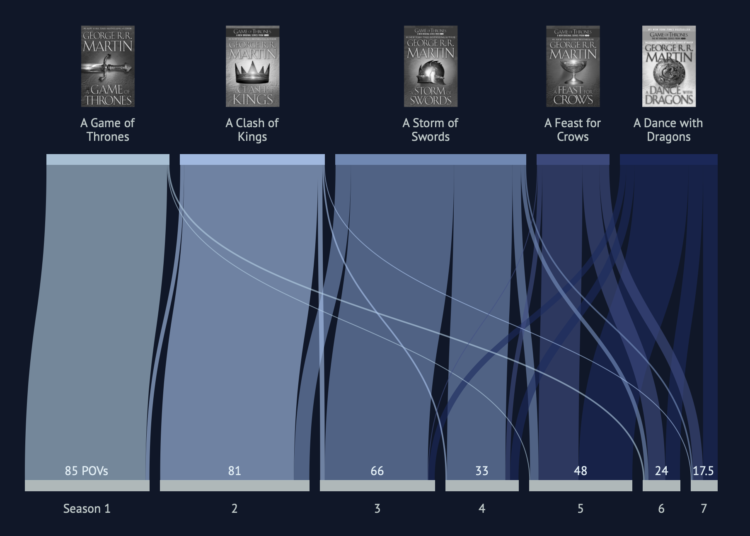
I think I started watching Game of Thrones around the fourth season (my wife gave me the cliffs notes), so I’ve missed a bunch, but I’ve seen enough now where I have to know what happens from here on out. For those deeper into it, here’s a comparison between the books and the television series by Alyssa Karla Mungcal, Jocelyn Tan, and Pooja Sharma.
The above is an overview, but they also break it down by scene, marking each as matching with the book or not.
-
There are many chart types to choose from, which is great, because there’s always something to fit your needs. But sometimes the variety can be daunting, because it can feel like there are too many to sift through. Steven Franconeri proposes this chart chooser based on data format to make selection more straightforward:
This is a contrast, or rather a complement, to other chart choosers based on what you want to show or see. Because sometimes you don’t know what you’re looking for.
-
Members Only

In this guide, I look maybe a little too closely at how to adjust axis labels for more readable charts.
-
A note on a pack of Skittles reads, “No two rainbows are the same. Neither are two packs of Skittles. Enjoy an odd mix.” Of course that can’t possibly be right, because there are a finite number of color combinations and there are many packs of Skittles in the world. That led possiblywrong down a path of wondering how many packs it’d take before getting two identical ones. The answer came 27,000 Skittles later.
-
Looking at the 100 most common jobs people switched to, a timeline comes into view when we adjust the relative switch rates by age.
-
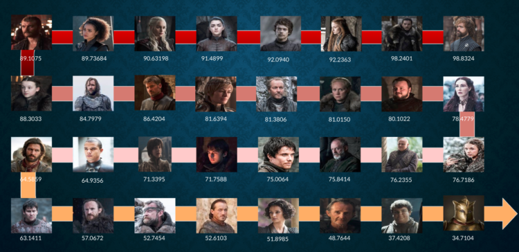
Monica Ramirez tried her hand with modeling deaths on Game of Thrones and trying to predict the next ones:
Since the series is so famous for killing principal characters (It’s true! Yu can’t have a favourite character because he/she wouls die, and slowly, other characters take the lead… and would probably die too), I decided to make a Classification Model in Python, to try to find any rule or pattern and discopver: Who will die on this last season?
I’m always on a viewing delay with this stuff, so I’m not sure whether this is right or completely wrong, but there you go. The above shows the characters ordered by probability of death (not order in which they will die).
-
Jen Luker noted, “As amazing as @github is, it is a tool designed to track code, not people. I’m sharing my annotated GitHub history to show you what it can’t tell you about a developer.”
As amazing as @github is, it is a tool designed to track code, not people. I'm sharing my annotated GitHub history to show you what it can't tell you about a developer. pic.twitter.com/b94kYqQHaZ
— Jen Luker (@knitcodemonkey) April 25, 2019
Data as footprints? Footprints can tell you where someone went, but you have to evaluate surroundings to figure out what he or she did along the way. And there’s a lot that can happen between when the footprints set and when you find them.
-
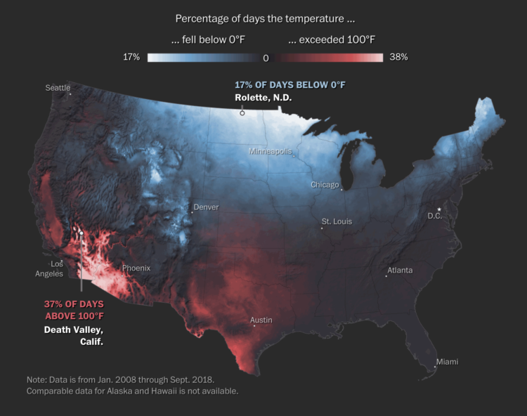
For The Washington Post, Tim Meko mapped floods, tornados, hurricanes, extreme temperatures, wildfires, and lightning:
Data collection for these events has never been more consistent. Mapping the trends in recent years gives us an idea of where disasters have the tendency to strike. In 2018, it is estimated that natural disasters cost the nation almost $100 billion and took nearly 250 lives. It turns out there is nowhere in the United States that is particularly insulated from everything.
NOWHERE IS SAFE.
-
Members Only
Every month I collect the new tools, resources, and datasets. Here they are for April.
-
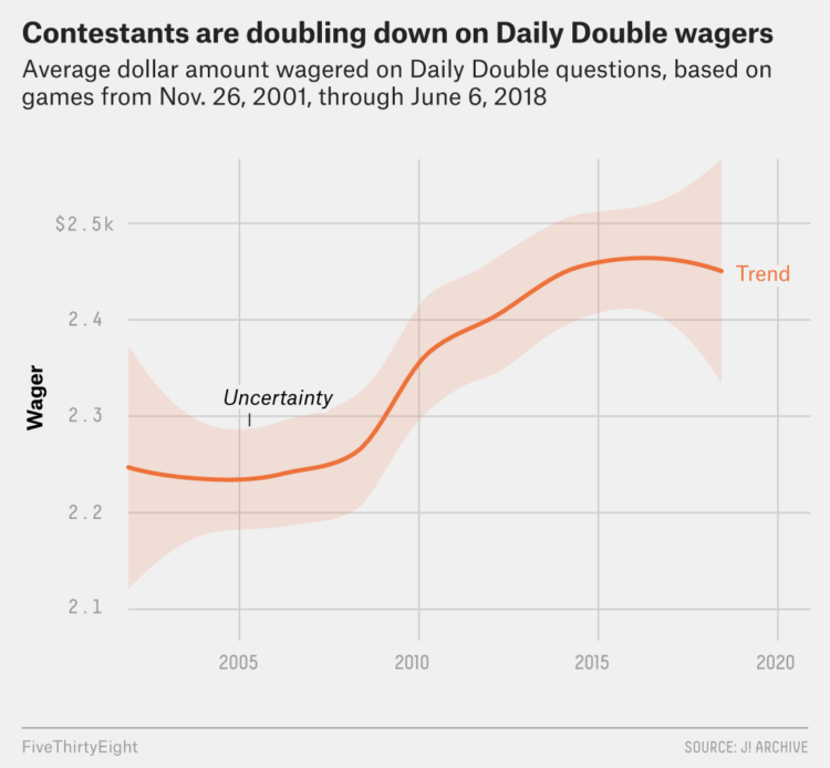
James Holzhauer is the new hotness on Jeopardy! with Daily Double hunting, big wagers, lightning clicks, and all-around trivia skills. For FiveThirtyEight, Oliver Roeder looks at how Holzhauer dominates:
Holzhauer has played this game like no one has ever played it before — large bets coupled with expert navigation of the game board. He has now played 14 games with his total winnings sitting above $1,000,000 and counting, and he is well on his way to surpassing the $2,520,700 won by the most famous “Jeopardy!” record-holder of all, Ken Jennings. One difference? It took Jennings 74 straight victorious shows to bring in that haul, and if he maintains his current pace, Holzhauer is on track to break that record in as few as 34.
So not only is he hunting for Daily Doubles (because we know where they usually are), but he builds a pot first so that he’ll have more to wager. And then, when the time comes, he has no problem putting the money on the line.
-
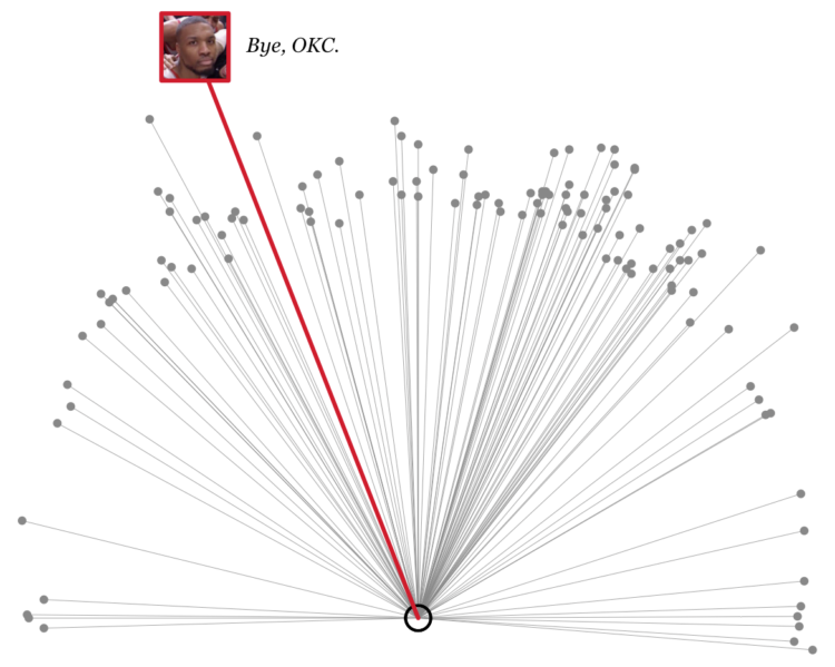
Here are all the playoff threes he’s made in his playoff career, plus some R code.
-
Caitlin Dewey for OneZero describes the case of the Fruit Belt neighborhood in Buffalo, New York, or “Medical Park” as it was incorrectly named in Google Maps:
Lott learned that the issue had been festering for years, and she wanted answers. The 2,300 residents in the Fruit Belt didn’t refer to the community as “Medical Park,” but Google Maps had done so since the late 2000s. Community members argued the designation was a calculated tweak in favor of gentrification, a digital rechristening that would be used to sell houses, market Airbnbs, and wrest the neighborhood’s future from the people who had made a home there for generations.
Lott didn’t know it at the time, but the misnomer also revealed a great deal about the invisible process major tech firms use to put neighborhoods on their maps — and how decisions based off arcane data sets can affect communities thousands of miles away.
Recently for Members
Second Edition
 Visualize This: The FlowingData Guide to Design, Visualization, and Statistics (2nd Edition)
 Visualize This: The FlowingData Guide to Design, Visualization, and Statistics (2nd Edition)
New tools, refined process.
Browse by Chart Type See All →


