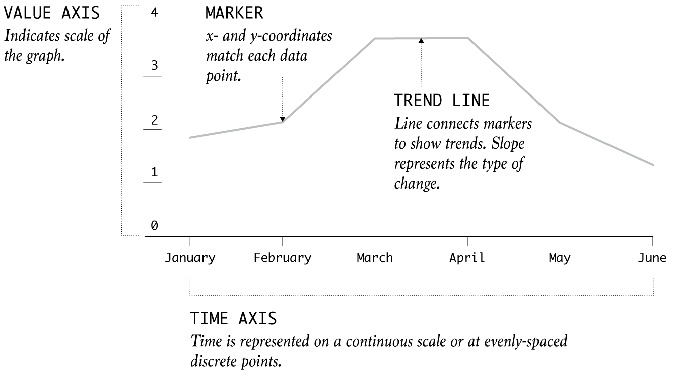
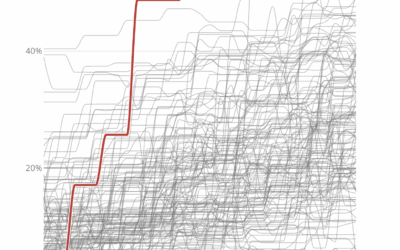
Typically used to show trends over time, the slope of the line between two points shows patterns of change.
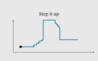
This week we look at the step chart and how to highlight specific patterns in the steps.
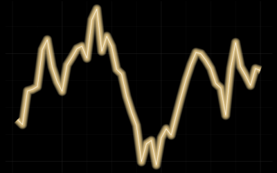
We do it because things that glow in the dark are awesome, including line charts.
Default visualization settings are useful when it's just you analyzing data. However, visual focus is better when it's time to present.
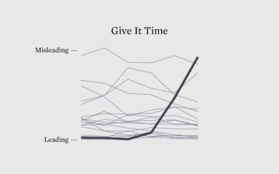
If a chart is seen by enough people, someone will call it misleading. There are no exceptions.
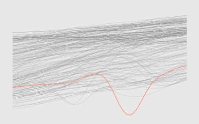
More lines can mean more patterns, more cycles, and more context.
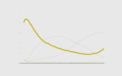
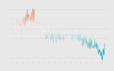
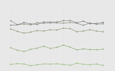
Use color to reinforce or add another layer of meaning to a regular line chart.
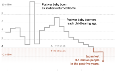
Japan has been aging and having fewer children, which led to a decline…
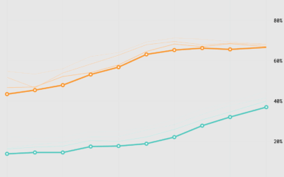
It seems like people don't stick with the same job for as long as they used to, but maybe that's not the case.
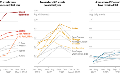
For the New York Times, Albert Sun, Allison McCann, and Hamed Aleaziz obtained…
For the Washington Post’s Department of Data, Andrew Van Dam looks at historical…
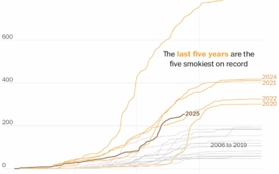
The wildfires keep coming, and the smoke pollution keeps filling the air. It…
Chartle, by Erwan Rivault and Adnaan Jiwa, is a game to test and/or…
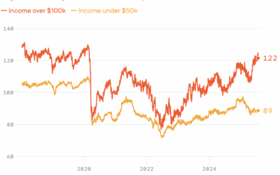
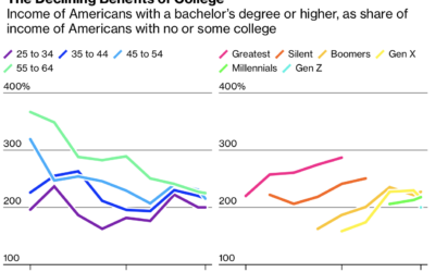
From Axios, a quick chart that shows consumer sentiment between those with annual…
People stay single longer, marry later, divorce less, and widow older.
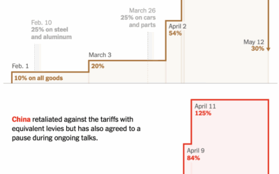
The U.S. and China put a semi-hold on tariffs for the next 90…
For Bloomberg, Zoe Tillman and Christopher Cannon break down the lawsuits against the…
For the New York Times, Josh Holder, Niraj Chokshi, and Samuel Granados use…
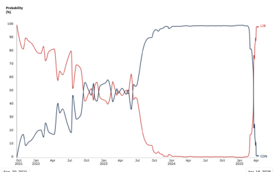
Since early 2024, polls showed near certainty that Conservatives in Canada were going…
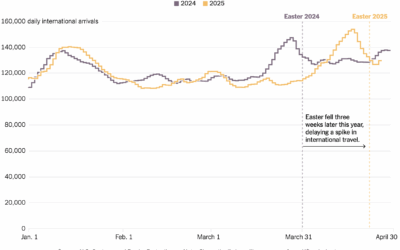
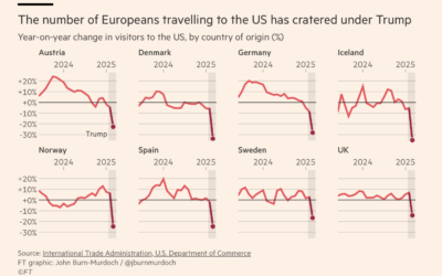
These charts will shock you I am sure. Travel to the United States…
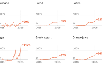
Households are seeing the value of their savings decrease significantly over a short period of time. Now seems like a good time to take the long-term point of view.
Washington Post Opinion has a tracker updated weekly that groups items by everyday…
As you might expect, there is a big income difference between those with…