Damian Lillard’s Game-Winner in Context
Damian Lillard of the Portland Trailblazers hit a crazy game-winner the other night. The game was tied, the clock was winding down, and Lillard pulled up from a thousand feet away for the win. Lillard’s straight-faced reaction was as good as the shot.
Here’s how that shot matches up with all of the other threes Lillard has made during his playoff career:
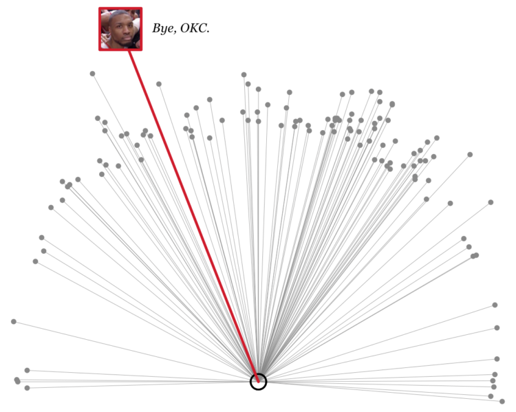
Just nuts.
The R code, in case you’re interested:
library(png)
library(plotrix)

# Load data.
makes3 <- read.csv("https://flowingdata.com/projects/2019/lillard/threes_lillard.tsv", sep="\t")

# Plot all made threes
par(mar=c(0,0,0,0))
plot(-makes3$loc_x[-dim(makes3)[1]], makes3$loc_y[-dim(makes3)[1]],
     cex=.7, pch=19, col="#888888",
     asp=1, bty="n", axes=FALSE, xlab="", ylab="",
     xlim=c(-25, 25), ylim=c(0, 50))
segments(-makes3$loc_x[-dim(makes3)[1]], makes3$loc_y[-dim(makes3)[1]],
         rep(0, dim(makes3)[1]), rep(5.25, dim(makes3)[1]),
         lwd=.4, col="#888888")
draw.arc(0, 5.25, 9/12, angle1=0, angle2=2*pi, col="black", lwd=2)

# Game winner
x_win <- -makes3$loc_x[dim(makes3)[1]]
y_win <- makes3$loc_y[dim(makes3)[1]]
segments(x_win, y_win, 0, 5.25, lwd=3, col="#CF082C")

# Note: Download file at https://flowingdata.com/projects/2019/lillard/lillard_face.png
img <- readPNG("lillard_face.png")
rasterImage(img, xleft=x_win-2, xright=x_win+2, ybottom = y_win-2, ytop=y_win+2)
symbols(x_win, y_win, squares = 4, add=TRUE, inches=FALSE, lwd=3, fg="#CF082C")
text(x_win+2.25, y_win, "Bye, OKC.", pos=4, family="Georgia", font=3, cex=.9)
Become a member. Support an independent site. Get extra visualization goodness.
See What You Get