• Membership
  • Newsletter
  • Projects
  • Learning
  • About
  • Member Login
  • When geolocation makes everyone think you stole their phone

    January 14, 2019

    Topic

    Mistaken Data  /  cartography, location

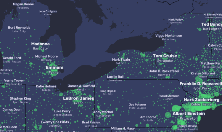
    People show up unannounced at John and his mother Ann’s home in South Africa, looking for stolen property, but John and Ann didn’t steal anything. For Gizmodo, Kashmir Hill investigates another case of IP address and geolocation mistaken for exactness:

    John and Ann’s problems weren’t necessarily caused by one bad actor, but by the interaction of a bunch of careless decisions that cascaded through a series of databases. The NGA provides a free database with no regulations on its use. MaxMind takes some coordinates from that database and slaps IP addresses on them. Then IP mapping sites, as well as phone carriers offering “find my phone” services, display those coordinates on maps as distinct and exact locations, ignoring the “accuracy radius” that is supposed to accompany them.

    The victims of theft, police officers, private investigators, the Hawks (South Africa’s FBI), and even foreign government investigators showed up mistakenly at John and Ann’s door, and none of them ever tried to figure out why.

    Remember when we thought Kansas had unusually high porn views per capita?

  • One-year time-lapse of the weather

    January 14, 2019

    Topic

    Maps  /  time-lapse, weather

    Along the same lines as last week’s one-year wind time-lapse, Weather Decoded provides this one-year time-lapse of the weather over the United States:

    [arve url=”https://www.youtube.com/watch?v=FPuDPxK88g0″ /]

    Fun. [via kottke]

  • Voronoi diagram from smooshing paint between glass

    January 11, 2019

    Topic

    Statistical Visualization  /  paint, voronoi

    [arve url=”https://www.youtube.com/watch?v=yDMtGT0b_kg” /]

    It feels like magic. I think there’s a magic trick percolating in there somewhere.

    I’m not sure where this is from. It looks like it’s a recording from a camera pointed at a television screen, so if anyone knows where the original is, please let me know.

  • Members Only

    Repetitions, Data Analysis as Brainstorm

    January 10, 2019

    Topic

    The Process  /  exercise, practice

    Compelling visualization doesn’t just conjure itself out of nowhere. The ideas come from somewhere, and oftentimes they build off previous ones.

  • Time-lapse of all the wind in 2018

    January 10, 2019

    Topic

    Maps  /  time-lapse, wind

    Using the same National Weather Service data that powers his live-ish wind map of Earth, Cameron Beccario put together a time-lapse for all of 2018. Watch it on full-screen in its 4k glory.

    [arve url=”https://www.youtube.com/watch?v=obsw9qiBnjo” /]

  • Government shutdown, other industries provided for scale

    January 9, 2019

    Topic

    Infographics  /  government, New York Times, scale, shutdown

    As the shutdown continues, 800,000 government workers wait for something to happen. The New York Times uses others industries for scale. Ugh.

  • Vintage map with modern 3-D elevation

    January 8, 2019

    Topic

    Maps  /  3-d, Scott Reinhard, vintage

    This vintage recreation by graphic designer Scott Reinhard fills all the right checkboxes for me.

  • Border wall progress chart

    January 7, 2019

    Topic

    Infographics  /  New York Times, wall

    Denise Lu for The New York Times provides a quick overview of the proposed border wall and its progress. Scroll for zeros.

  • List of visualization best-of-year lists, 2018

    January 4, 2019

    Topic

    Visualization  /  best-of, list

    The end of a year is always a good time to look back at past work, because the day-to-day can sometimes feel like an endless churn. There’s also just no way to remember everything, and because of the volume, there’s really no way you can see everything that everyone made. Hence, lists. And Maarten Lambrechts compiled a list of all the visualization lists for 2018 for your perusal.

    I am partial to the lists from The New York Times, The Washington Post (not listed), and FiveThirtyEight.

  • No such thing as raw data

    January 4, 2019

    Topic

    Statistics

    Nick Barrowman on the myth of raw data:

    Assumptions inevitably find their way into the data and color the conclusions drawn from it. Moreover, they reflect the beliefs of those who collect the data. As economist Ronald Coase famously remarked, “If you torture the data enough, nature will always confess.” And journalist Lena Groeger, in a 2017 ProPublica story on the biases that visual designers inscribe into their work, soundly noted that “data doesn’t speak for itself — it echoes its collectors.”

    So, when you work with data and make conclusions, you must consider everything that came before.

  • Members Only

    Avoiding D3, Using D3, and Why I Use D3

    January 3, 2019

    Topic

    The Process  /  d3js

    D3.js can be used for a lot of things, and for some people it’s too much to deal with.

  • Applying for a PhD program in visualization

    January 3, 2019

    Topic

    Visualization  /  academic, PhD

    Niklas Elmqvist provides a detailed guide for finding and a visualization PhD program:

    Unless you have a specific reason to choose a specific university (such as a geographic one; maybe you can’t relocate), don’t start from the university you want to go to, but start with the faculty member you want to work with. This is where all that idle web surfing experience can come in useful: you need to become an expert in finding faculty members that have research interests that match your own, and the only way to do so is to trawl their websites and read their papers.

    And then applying:

    Now, having identified some possible advisors (and don’t just pick one; you never know whether you will be admitted and whether they have funding to hire new students), you should reach out to them. In other words, don’t just apply, but send them an email with plenty of time to spare before the application deadline. Attach your CV, outline your background, and provide some of the above-mentioned commentary on their work and why you are interested in it (i.e., the “hook”). If you have a portfolio or website, link to it. Remember, no form letters!

    Useful information here. You might also want to get a sense of flexibility in the department. I was two years into my PhD in statistics until I decided I wanted to go the visualization direction, which was a big switch from my original intentions of statistics education. Focus and interests tend to shift after you learn more.

    Once you get into a program, see also my survival guide for avoiding burnout and finishing.

  • Context to the stock market rise and falls

    January 2, 2019

    Topic

    Visualization  /  stock market, Washington Post

    The stock market is in a state. So finicky the past few months. Kate Rabinowitz and Leslie Shapiro for The Washington Post provide a view further into the past for more context to the recent flux. The stretching time axis as you scroll makes for an easy-to-follow visual cue.

  • Fake internet

    January 1, 2019

    Topic

    Mistaken Data  /  fake, Internet, New York Magazine

    Max Read for New York Magazine describes the fake-ness of internet through the metrics, the people, and the content:

    Can we still trust the metrics? After the Inversion, what’s the point? Even when we put our faith in their accuracy, there’s something not quite real about them: My favorite statistic this year was Facebook’s claim that 75 million people watched at least a minute of Facebook Watch videos every day — though, as Facebook admitted, the 60 seconds in that one minute didn’t need to be watched consecutively. Real videos, real people, fake minutes.

    I wonder how the fake-ness level online compares to fraud IRL.

  • 2018.

    December 31, 2018

    Topic

    Site News  /  annual review

    While looking through this year’s projects, picking out my favorites, I couldn’t help but reminisce about the times when the internet used to feel so care-free. It was more relaxed.

    These days, there’s too much going on in the world for the internet to relax. Or rather, more of the world happens online now. This year, I felt like if I was going to spend time working on a project or writing something, it had to help people see a different perspective or teach something. I couldn’t just do it out of personal interest.
    Read More

  • Higher turnout for midterm elections

    December 28, 2018

    Topic

    Statistical Visualization  /  Bloomberg, elections

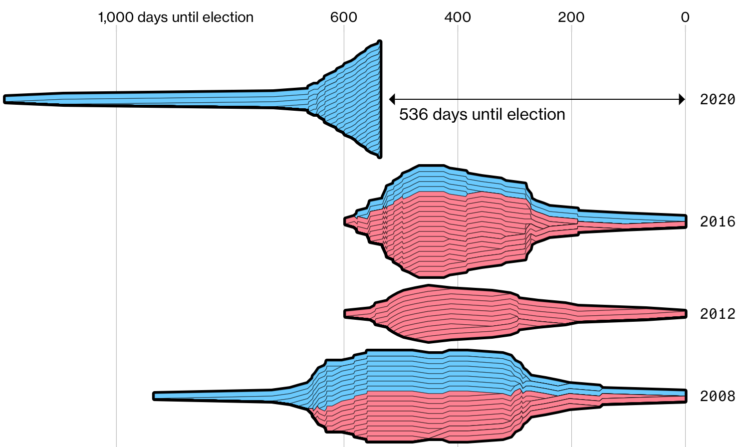
    Bloomberg charted voter turnout for the just past midterm elections, comparing 2018 against 2014. As you might expect, there are a lot of blue arrows pointed up and to the left. Turnout decreased in only two districts.

  • Visualization  /  best-of

    Best Data Visualization Projects of 2018

    Visualization continues to mature and develop into a medium. There’s less focus on visualization the tool and more focus on how to use the tools. That is a good thing.

    Read More
  • Kernel density estimation explainer

    December 27, 2018

    Topic

    Infographics  /  kernel density estimation

    Matthew Conlen provides a short explainer of how kernel density estimation works. Nifty.

  • Top NBA player by zone

    December 27, 2018

    Topic

    Infographics  /  basketball, Kirk Goldsberry

    Kirk Goldsberry is back at ESPN. I put this here mainly because it’s nice to have the hexbin shot charts in the feed again.

  • Following your gut, following the data

    December 26, 2018

    Topic

    Statistics  /  netflix, relationships, Roger Peng

    The Wall Street Journal highlighted a disagreement between data and business at Netflix. Ultimately, the business side “won.” However, maybe that’s the wrong framing. Roger Peng describes the differences between analysis and the full truth:

    There’s no evidence in the reporting that the content team didn’t believe the data or the analysis. It’s just that their fear of damaging a relationship with an actor overruled whatever desire they might have had to maximize clicks or views. The logic was probably along the lines of “We may take a hit in the short-run but we will benefit from this relationship in the long-run.” Whether that’s true or not is unclear, but it’s a tricky question to answer with data. It’s not even clear to me how you would formulate that question.

    Data often pitches itself as the path to definitive answers, but most of the time it gives you possibilities and weighted suggestions. Follow blindly, and you end up with creepy, algorithmically-generated YouTube videos.

  • Page 131 of 392
  • <
  • 1
  • ...
  • 128
  • 129
  • 130
  • 131
  • 132
  • 133
  • ...
  • 392
  • >

Analyze, visualize, and communicate data usefully, beyond the defaults.

Become a member →

Recently for Members

May 8, 2025
When the data is not what it seems

May 1, 2025
Finding the Right Charts

April 24, 2025
Visualization Tools, Datasets, and Resources – April 2025 Roundup

April 17, 2025
Breaking Out of Chart Software Defaults

April 15, 2025
Line Chart with Decorative Neon Accents

Browse by Chart Type See All →

Moving Bubbles Small Multiples Slope Chart Timeline Voronoi Diagram Stacked Area Chart Parallel Coordinates Treemap Barcode Chart Area Chart

Browse By Topic

  • Visualization

    Seeing data

  • Maps

    Seeing geographic data

  • Infographics

    Explaining data

  • Networks

    Connecting data

  • Statistics

    Analyzing data

  • Software

    Working with data

  • Sources

    Getting data

  • Design

    Making data readable

Get the Book

Visualize This: The FlowingData Guide to Design, Visualization, and Statistics

Available now.

Order: Amazon / Bookshop

Made by FlowingData

  • The Process

  • Data Underload

  • Chart Everything

  • Guides

  • Books

  • Shop

  • About
  • Contact
  • Newsletter
  • LinkedIn
  • Instagram
  • Bluesky
  • RSS
Copyright © 2007-Present FlowingData. All rights reserved.