James Holzhauer is the new hotness on Jeopardy! with Daily Double hunting, big wagers, lightning clicks, and all-around trivia skills. For FiveThirtyEight, Oliver Roeder looks at how Holzhauer dominates:
Holzhauer has played this game like no one has ever played it before — large bets coupled with expert navigation of the game board. He has now played 14 games with his total winnings sitting above $1,000,000 and counting, and he is well on his way to surpassing the $2,520,700 won by the most famous “Jeopardy!” record-holder of all, Ken Jennings. One difference? It took Jennings 74 straight victorious shows to bring in that haul, and if he maintains his current pace, Holzhauer is on track to break that record in as few as 34.
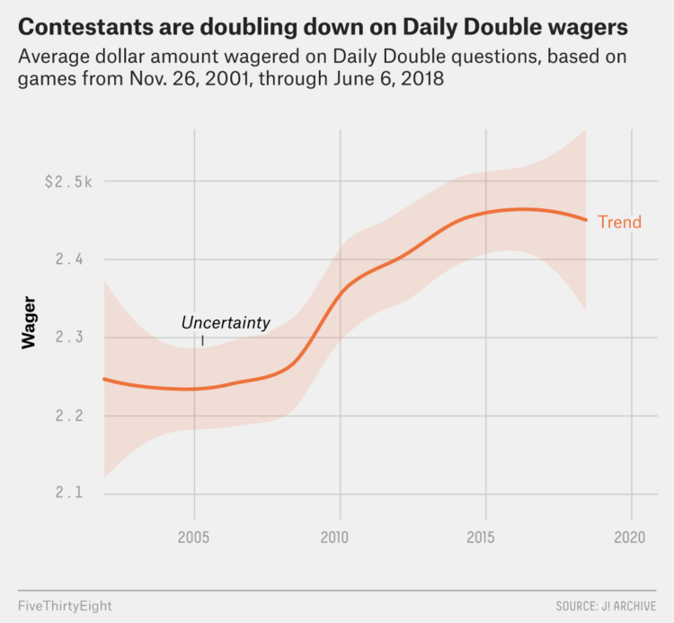
So not only is he hunting for Daily Doubles (because we know where they usually are), but he builds a pot first so that he’ll have more to wager. And then, when the time comes, he has no problem putting the money on the line.


 Visualize This: The FlowingData Guide to Design, Visualization, and Statistics (2nd Edition)


