How to Make a Moving Bubble Chart, Based on a Dataset
Ooo, bubbles… It’s not the most visually efficient method, but it’s one of the more visually satisfying ones.
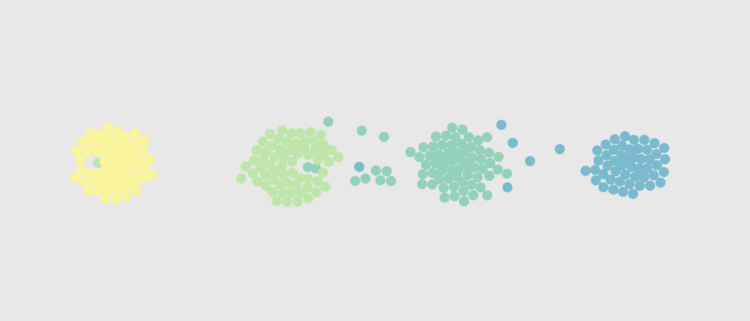
The moving bubble chart with simulated forces is one my favorite methods to play with. Colliding nodes show independence between points, and as a whole, you see patterns in movement when multiple nodes shift to different spots on the screen.
It might not be the most visually efficient way to see the data, but there’s an organic nature to it that makes the moving bubbles visually satisfying. I’ve used the method to show the day in the life of Americans. I showed the changing stages in relationships.
In this tutorial, I’ll show you how to make something like the latter.
This is an updated version of the previous moving bubble chart tutorial. It uses a more recent version of D3.js, and I explain how to use your own dataset.
To access this full tutorial, you must be a member. (If you are already a member, log in here.)
Get instant access to this tutorial and hundreds more, plus courses, guides, and additional resources.
Membership
You will get unlimited access to step-by-step visualization courses and tutorials for insight and presentation — all while supporting an independent site. Files and data are included so that you can more easily apply what you learn in your own work.
Learn to make great charts that are beautiful and useful.
Members also receive a weekly newsletter, The Process. Keep up-to-date on visualization tools, the rules, and the guidelines and how they all work together in practice.
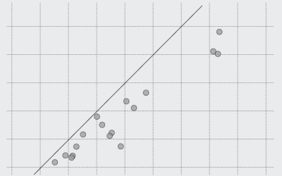
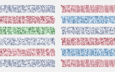
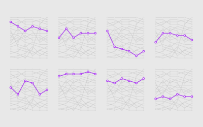
See samples of everything you gain access to:
About the Author
Nathan Yau is a statistician who works primarily with visualization. He earned his PhD in statistics from UCLA, is the author of two best-selling books — Data Points and Visualize This — and runs FlowingData. Introvert. Likes food. Likes beer.