Goodbye, Mid-Range Shot
There’s a space on the basketball court called “mid-range.” It’s in between the three-point line and the key (the rectangular area around the basket). You never see players shoot from this “mid-range” area, but it’s actually not off-limits. In fact, people used to shoot these “mid-range” shots.
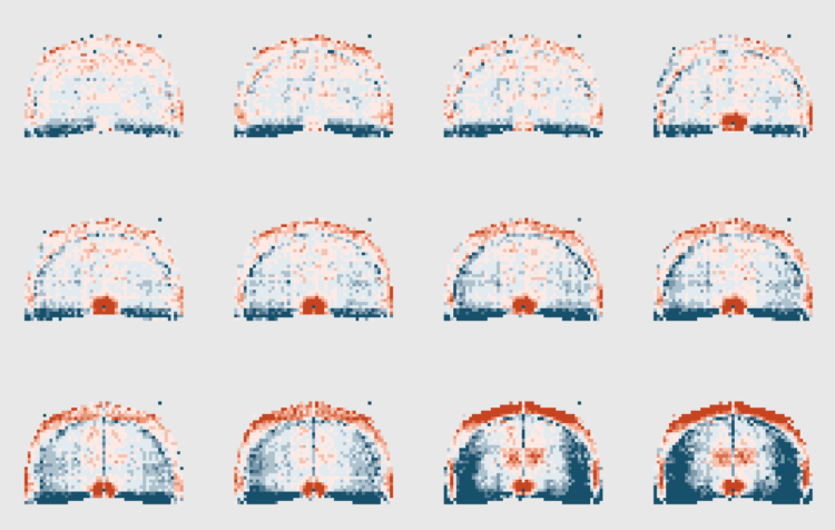
I know, I know. It’s crazy. But look at this shot chart that shows relative frequency by season for the National Basketball Association, compared against the 2009-10 season:
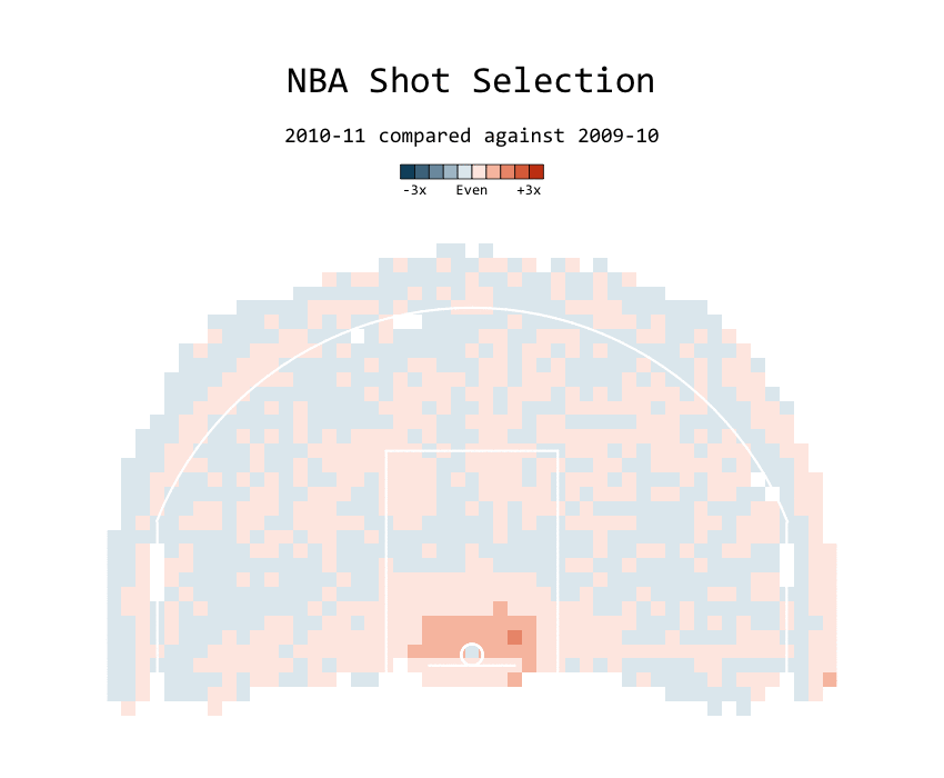
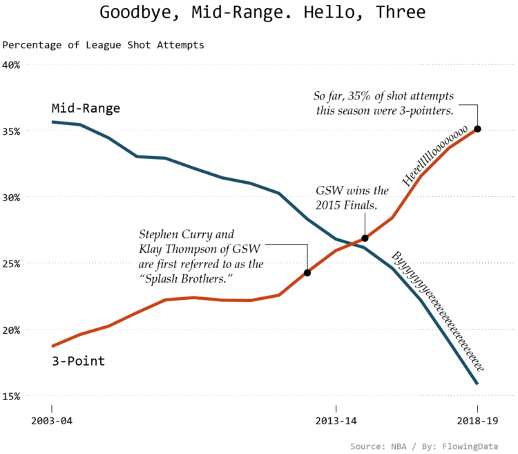
The mid-range shot was already slowly in decline, but after the Golden State Warriors, known for their three-point shooting prowess, won the championship in 2015, shot selection quickly shifted towards long-range. Mid-range more rapidly declined.
For the Warriors, the shift started earlier in 2012. Here’s the game that their two best shooters, Stephen Curry and Klay Thompson, came to be known as the Splash Brothers:
Again though, after the Warriors won in 2015, mid-range really took a hit league-wide:
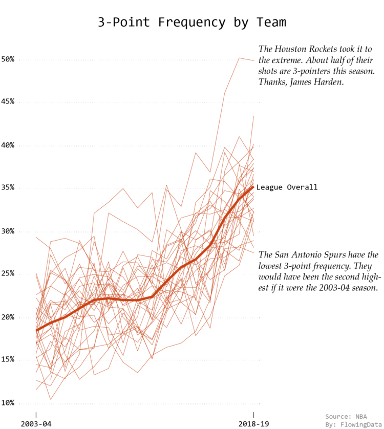
Some teams changed slower, but in the end, everyone adapted:
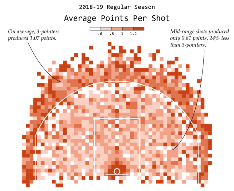
It makes sense when you look at the simple math of mid-range versus three-point shot. You get more points for three-pointers, so you can make fewer of them and still earn more points than if you were to shoot mostly mid-range.
This 2018-19 season so far, the league as a whole earned 24 percent less on average at mid-range than they did with three-pointers:
This depends on percentages though. What percentage of mid-range shots does the team make? What percentage of threes do they make? If you make a really high percentage of mid-range shots and are really bad at three-point shooting then the mid-range avoidance wouldn’t work.
It’s all about balance.
After all, even though the Warriors were the ones who sped up this current evolution of shot selection, they have the second highest percentage for mid-range at just over a quarter. The San Antonio Spurs have the highest at 28 percent as of this writing. (In contrast, only 5 percent of the Houston Rockets’ shots this season were mid-range.)
So the mid-range shot isn’t dead…yet. A couple of decades from now, when “mid-range” is simply a dark, cavernous pit on the court, you can gather the kids around and tell them the story of the time you saw a player shoot 18 feet from the basket.
How to Make Animated (GIF) Heatmaps in R
Using color as the visual encoding, show changes over time in two dimensions. Check out the tutorial.
Chart Types Used


Become a member. Support an independent site. Get extra visualization goodness.
See What You Get