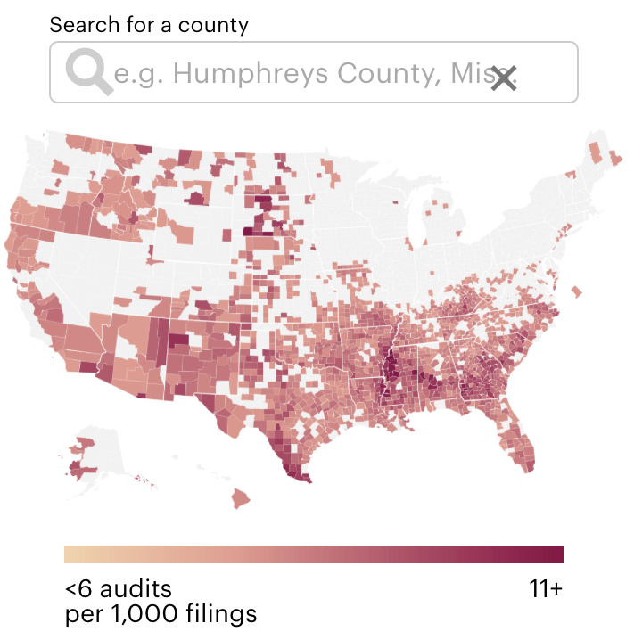
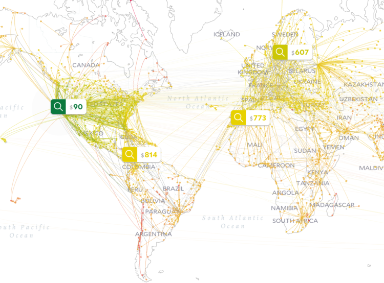
-
Based on data from Dave Leip’s Atlas of U.S. Presidential Elections, The Washington Post mapped voter turnout on a diverging color scale. Orange represents lower than average turnout in 2016 and purple represents higher than average.
Not to diminish the meaning of the map, but the most shocking part might be the placement of Hawaii.
-
High school seniors, in the Political Statistics class at Montgomery Blair High School in Silver Spring, Maryland, built a prediction model for the upcoming elections:
Under the guidance of Mr. David Stein, this model (which we named the Overall Results of an Analytical Consideration of the Looming Elections a.k.a. ORACLE of Blair) was developed by a group of around 70 high school seniors, working diligently since the start of September. Apart from the youth and enthusiasm that went into making it, the advantage our model has over professionally developed models is transparency. Unlike professionals, we need not have any secrets in regards to how our predictions are generated. In fact, the sections that follow attempt to detail exactly how we come up with all of the numbers involved in our model.
I’m so glad this exists and that young people are learning how to make things like this. My high school self is jealous, because the only statistics he got to learn was punched into a TI-83 calculator.
-
Accurat, in partnership with the Google News Initiative, built an augmented reality app to build statues of hope:
We live in a world awash with information. Every time we walk the street holding our phones, every time we perform a research online or buy a product with our credit card data is created and often time communicated to us. How can we make people care about a specific dataset? How can we form our own opinions and points of view on what matters to us? With Building Hopes we wanted people to take a stance on what they are hopeful for, even in a historical moment that many define as hopeless and bleak, and have them look at Google search data through this framework of their own creation.
There’s a web version, but be sure to check out the AR version if you can. You walk around your area picking stones, each representing something to be hopeful for, and the app points to you to statues nearby that others built.
-
There are many racial disparities in education. ProPublica shows estimates for the gaps:
Based on civil rights data released by the U.S. Department of Education, ProPublica has built an interactive database to examine racial disparities in educational opportunities and school discipline. Look up more than 96,000 individual public and charter schools and 17,000 districts to see how they compare with their counterparts.
Using white students as the baseline, compare opportunity, discipline, segregation, and achievement for black and Hispanic students.
Be sure to click through to a school district or state of interest to see more detailed breakdowns of the measures.
-
The Washington Post provides a flyover view of the barriers at the U.S.-Mexico border. It’s a combination of satellite imagery, path overlays, and information panels as you scroll. It gives an inkling of an idea of the challenges involved when people try to cross the border.
-
Members Only
-
Let’s work through a practical example to see how asking and answering questions helps guide you towards more focused data graphics.
-
When you drink bubble tea, ideally you’d like to finish with the same proportions of boba and tea that you started at. Krist Wongsuphasawat took care of the math and provides a simulator for this ever important challenge:
This article simulates an optimized sip based on amount of boba and tea in the straw before sipping (method adopted from this post). The simulation assumes that all bobas sit in the bottom of the cup and stack on top of each other nicely. If you put a straw straight down when there are n layers of bobas, you will get n bobas in the straw. The rest of the straw up to the drink’s height is tea. The drinker sips until all n bobas are in his/her mouth then stop. After each sip these n bobas and tea inside the straw are gradually reduced from the cup.
The final recommendations: use a slim cup, minimize ice, and drink strongly. Mess around with variables here.
-
A few months back, Microsoft released a comprehensive dataset that included the estimated footprints of all of the buildings in the United States. The New York Times mapped all of it.
The footnote says a lot about their attention to detail:
In some cases, the building shapes generated by Microsoft’s automated process do not match the existing building footprints exactly. We manually corrected as many of these mistakes as we found, or, where available, replaced the shapes using more precise local data sets. Data was unavailable for much of Alaska.
-
Based on data from the Census Bureau, National Geographic mapped predominant race in 11 million administrative regions in the United States. Many of the regions are the size of a single block.
Looking at the national overview, the country looks predominantly white (represented blue), but as you zoom in for more details, you start to see the mix.
-
Giorgia Lupi and Stefanie Posavec continue on their path of Dear Data with a book that you draw in: Observe, Collect, Draw!
The first section describes some of the basics of journaling with data and how you can use various visual encodings. However, the main part of the book is a journal that guides you through collection and the visual encodings that Lupi and Posavec used with their postcards. First, there’s an instruction page and then the adjacent page provides blank scales for you to sketch yourself.
Fun. It seems like a good way to jog your imagination, in case you feel like you’re stuck in a bar chart geometry funk. [Amazon link]
-
Members Only
-
How to Make an Animated Pyramid Chart with D3.js
Compare distributions side-by-side with a pyramid chart. Observe the change over the years by animating it.
-
As you click through the news, you can probably almost always figure out what source is loading without the URL or title. Just judge based on the layout. Noah Veltman made this overview to show how news orgs prioritize editorial content, ads, and sponsored content.
-
There was a survey a while back that asked people to provide a 0 to 100 percent value to probabilistic words like “usually” and “likely”. YouGov did something similar for words describing good and bad sentiments.
-
[arve url=”https://www.youtube.com/watch?v=A7MIVsE2oMM” /]
This 3-D view inside Hurricane Maria, from NASA’s Scientific Visualization Studio and NASA’s Goddard Space Flight Center, lets you see the data and the lead-up to the storm in a neat 360-degree view. Be sure to watch it on your phone or with a VR thingy for full effect. Disregard the questionable color scale.
-
FiveThirtyEight and The Trace investigate the uncertainty and accuracy of gun injury data released by the Centers for Disease Control and Prevention:
An analysis performed by FiveThirtyEight and The Trace, a nonprofit news organization covering gun violence in America, found that the CDC’s report of a steady increase in nonfatal gun injuries is out of step with a downward trend we found using data from multiple independent public health and criminal justice databases. That casts doubt on the CDC’s figures and the narrative suggested by the way those numbers have changed over time.
It might be time to update the statistical models used to estimate injuries.
-
Getting into data science typically requires that you have access to a decent computer or server. You also usually need to install software. Chromebook Data Science, a set of online sources from the Johns Hopkins Data Science Lab, lets people learn with just a Chromebook and an internet connection:
Today I’m excited to announce the first part of our new system, a new set of massive online open courses called Chromebook Data Science. These MOOCs are for anyone from high schoolers on up to get into data science. If you can read and follow instructions you can learn data science from these courses!
The reason they are called Chromebook Data Science is because philosophically our goal was that anyone with a Chromebook could do the courses. All you need is a web browser and an internet connection. The courses all take advantage of RStudio Cloud so that all course work can be completed entirely in a web browser. No need to install software or have the latest MacBook Computer.
It’s pay-what-you-want with a $0 minimum and it’s designed specifically for people with no data science experience. Sounds pretty sweet.
-
Members Only