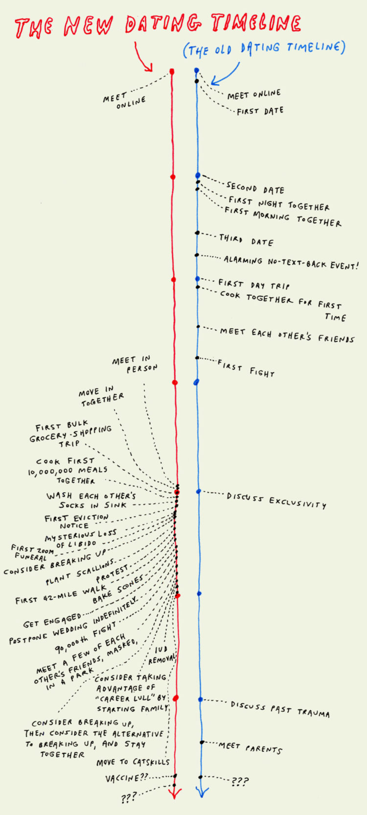
Liana Finck for Man Repeller draws out the new timeline. I’m a couple of decades removed from this timeline, but it doesn’t look very fun. I’m always down to plant some scallions though. [via swissmiss]
Liana Finck for Man Repeller draws out the new timeline. I’m a couple of decades removed from this timeline, but it doesn’t look very fun. I’m always down to plant some scallions though. [via swissmiss]

If someone sneezes in a closed space, you hope that the area has good ventilation, because those sneeze particles are going to spread. The New York Times explains in the context of a subway train.
Wear a mask.
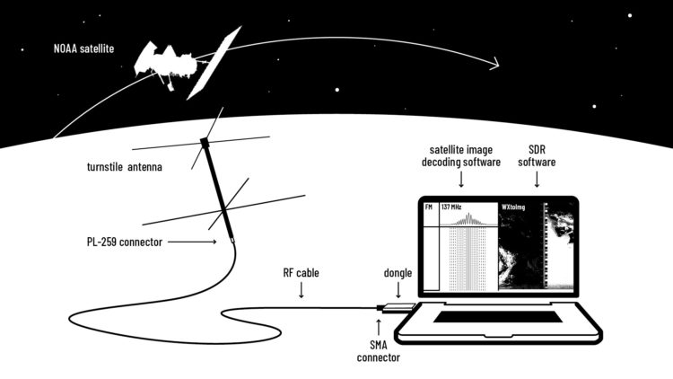
You can basically hook up an antennae to your laptop and start receiving images from space. This DIY guide from Public Lab amazes me.
The NOAA satellites have inbuilt radio antennas that transmit the data collected by the AVHRR instrument on a frequency in the 137 MHz range. To minimise interference between satellites, each NOAA satellite transmits on a different frequency within the 137 MHz range.
[…]
Your antenna is a sensor. It catches electromagnetic waves and transforms them into an electrical current i.e. an electrical signal. All antennas are tuned to specific frequency ranges meaning that they receive or transmit these frequencies best. Most antennas are directional.
I need to try this.
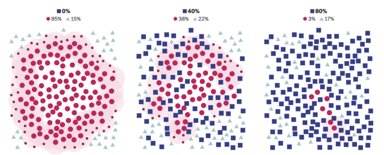
Herd immunity works when you have enough people who are immune to a disease, maybe because they already got it or there’s a vaccine, so that the disease can’t spread anymore to those who don’t have a resistance. For The Washington Post, Harry Stevens is back with simulitis to demonstrate how this works in greater detail.
It starts at the individual level, generalizes to a larger group, and then zooms out to the more concrete state level. It ends with an interactive that lets you test the thresholds yourself.
Each step builds on the previous, which provides clarity to an otherwise abstract idea.

We know the big ones. Now here are the small ones. Focused. Efficient.
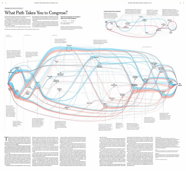
Malofiej, which in the visual journalism sphere is a high-tier honor to win each year, announced the winners for 2019. Congratulations to Sahil Chinoy and Jessia Ma for The New York Times on their Best of Show in print. They showed the various paths to Congress. And congrats to National Geographic for Best of Show in digital. They showed the moons.
Check out all of the medal winners here. Lots of good stuff.
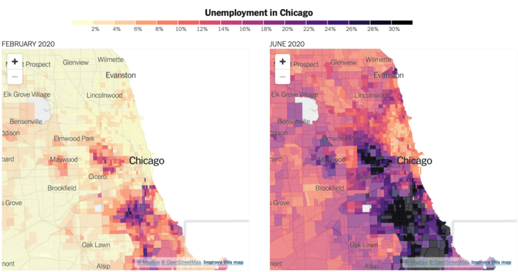
We’ve been hearing a lot about national unemployment rate, but it’s not uniformly distributed across the country. Some areas are a lot higher, some places are a lot lower, and there are places in between. To see the variation across the United States, Yair Ghitza and Mark Steitz estimated unemployment at the tract level.
Quoctrung Bui and Emily Badger for NYT’s The Upshot have the maps and histograms zooming in on places where unemployment is the highest.

With Joe Biden calling for 100% clean electricity, John Muyskens and Juliet Eilperin for The Washington Post looked at where states are at now in terms of electricity generation.
The variable width bar chart above uses a column for each state. Clean electricity stacks on the top and fossil fuels stack on the bottom, each representing a percentage of total generation. Column width represents total electricity for each state.
It reminds me of the spending graphic by Interactive Things in 2010. I think variable width is about to be a thing again.
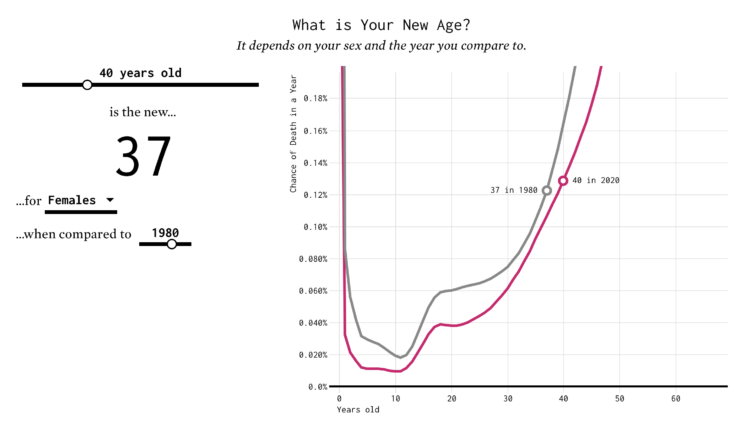
You’ve probably heard the lines about how “40 is the new 30” or “30 is the new 20.” What is this based on? I tried to solve the problem using life expectancy data. Your age is the new age.
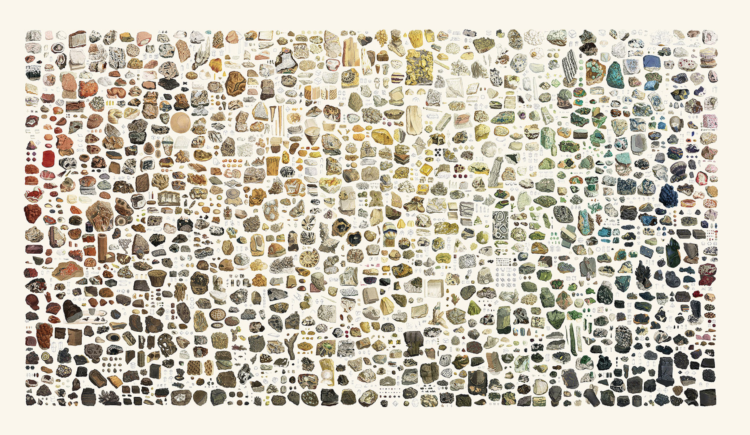
Between 1802 and 1817, James Sowerby cataloged and illustrated 718 minerals across seven volumes. Nicholas Rougeux restored all of the illustrations over several months, carefully arranged them by color, and made them browsable on a page. The result: British & Exotic Mineralogy.
Read about the slow process here. Also in poster form.

Here’s the good stuff for July.
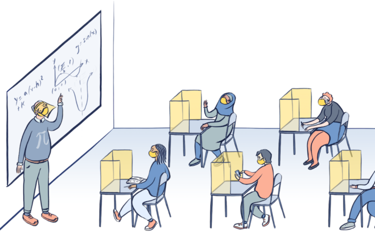
Dana Goldstein, with illustrations by Yuliya Parshina-Kottas, imagines what school might look like if students go back. Face shields, distancing, masks, and pods.
I’m having trouble imagining any of this working in practice, especially with the young ones.
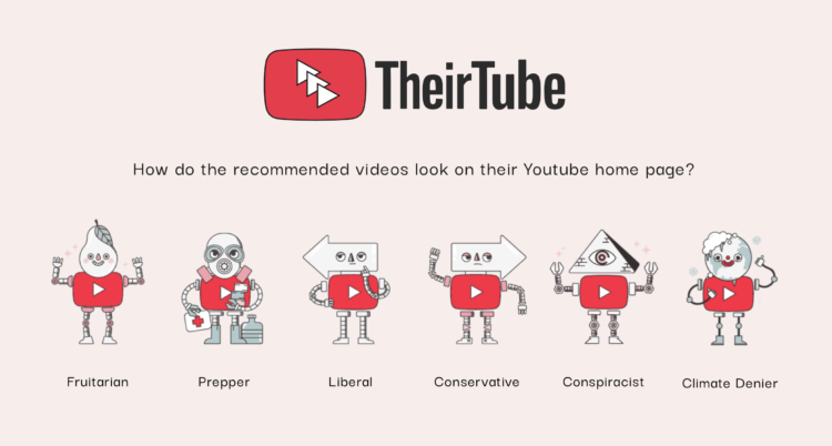
Watch enough YouTube, and you end up in a bubble of videos catered to everything you like and believe in. TheirTube, by Tomo Kihara and Polina Alexeenko and funded by the Mozilla Foundation, imagines the point of view of six personas:
Each of these TheirTube personas is informed by interviews with real YouTube users who experienced similar recommendation bubbles. Six YouTube accounts were created in order to simulate the interviewees’ experiences. These accounts subscribe to the channels that the interviewees followed, and watches videos from these channels to reproduce a similar viewing history and a recommendation bubble. Everyday, TheirTube retrieves the recommendations that shows up on their Youtube home page.
In case you’re wondering what my YouTube homepage looks like — and I know you are — just watch every J. Kenji López-Alt upload, and you’ll be just about there.
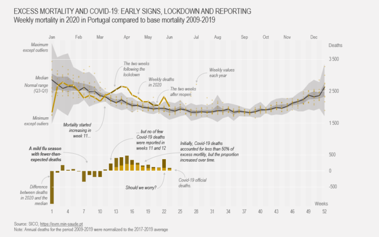
Show current evolution against expected historical variability and add one or more series that could account for the difference.
You’ve probably seen the videos. ProPublica is tracking to see what happens after:
ProPublica wanted to find out what happens after these moments are caught on tape. We culled hundreds of videos to find those with the clearest examples of officers apparently using a disproportionate level of force against protesters and reached out to 40 law enforcement agencies about the 68 incidents below. For each incident, we inquired about any disciplinary action, investigations and whether the department would disclose the officer or officers involved. While some departments provided details or relevant public records, others leaned on state laws to withhold information.
See also ProPublica’s recent release of NYPD civilian complaints against police officers.
From Google’s People + AI Research team, David Weinberger and Yannick Assogba build a machine learning system that plays Tic-Tac-Toe. They discuss the choices, not just the technical ones, along the way in the ten-part podcast series:
A writer and a software engineer engage in an extended conversation as they take a hands-on approach to exploring how machine learning systems get made and the human choices that shape them. Along the way they build competing tic-tac-toe agents and pit them against each other in a dramatic showdown!
This is a podcast for anyone, from curious non-techies to developers dabbling in machine learning, interested in peeking under the hood at how people make and shape ML systems.
I’m a few episodes in. It’s entertaining.
This is an especially good listen if you’re interested in machine learning, but aren’t quite sure about how it works beyond a bunch of data going into a black box.
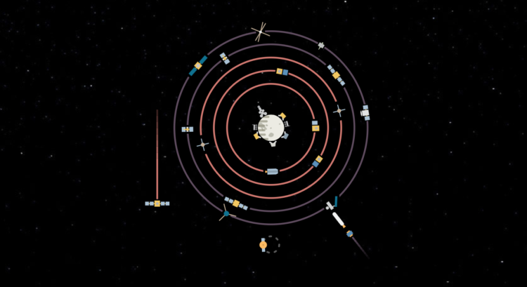
For The New York Times, Jonathan Corum illustrated the dozens of spacecraft orbiting planets and objects in the Solar System. The piece starts at the sun and then makes it way towards interstellar space. Showing active and inactive spacecraft, it’s part history lesson and part cute animation.
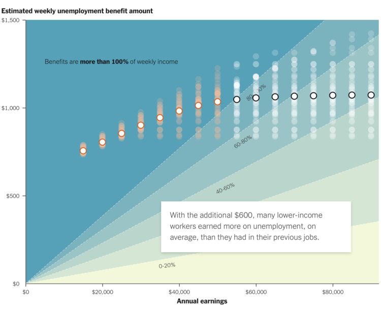
A $600 per week benefit expires for the unemployed at the end of July. Congress is still deciding what to do after. For The New York Times, Ella Koeze highlights the percentage of usual income the unemployed will receive as a function of annual earnings and weekly benefit amount if the benefit goes away.
Each dot represents a state. The percentage ranges in the background provide a point of reference for where each income group and state falls. The scrollytelling format starts with individual points and then tours through the shifts.
An aside: I might just be imagining things, but I feel like there’s been more scrollytelling lately. Is this a function of doomscrolling on our phones? Also, whenever a chart anchors in the background and a text frame scrolls over, I think of Snow Fall from 2012.
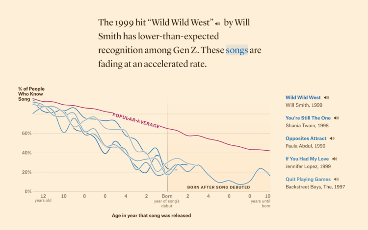
In search of songs that define music in the 1990s, Matt Daniels and Ilia Blinderman for The Pudding look for songs that that Gen Z still recognizes. Also, the songs that are mostly foreign to the younger generation:
In 1999, “Wild Wild West” was the song of the summer. Yet it is fading far faster than any other ’90s hit with comparable starting popularity. Twenty years ago, it was inescapable. Maybe Millennials are still too sick of it, even for nostalgia rotation. Perhaps it wasn’t even that great of a song to begin with, artificially inflated by Smith’s celebrity and cross-promotion with the film Wild Wild West.
Sorry, Will Smith.
The results are based on data gathered by The Pudding in an interactive survey.
 Visualize This: The FlowingData Guide to Design, Visualization, and Statistics (2nd Edition)
New tools, refined process.