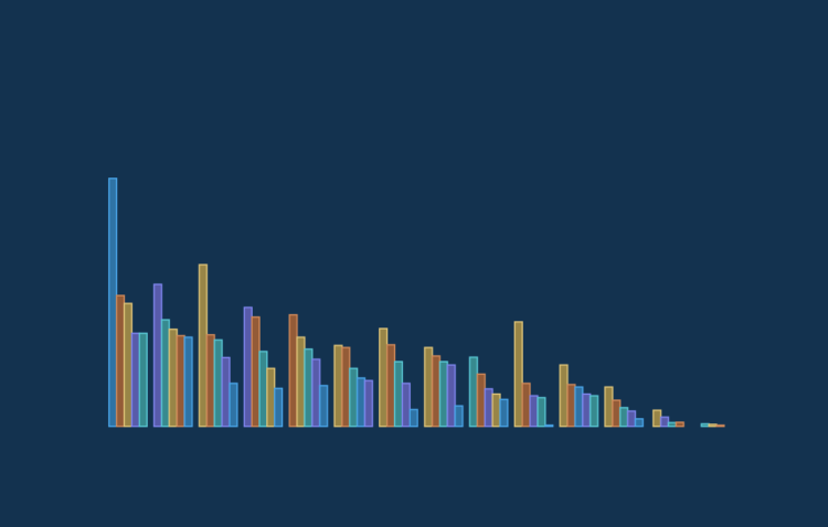
The Georgia Department of Public Health published a questionable chart showing confirmed Covid-19 cases over time. Some thought it was intentionally misleading to make it look like conditions were better than they actually were. Others blamed software defaults. So which is it?
To access this issue of The Process, you must be a member. (If you are already a member, log in here.)
The Process is a weekly newsletter on how visualization tools, rules, and guidelines work in practice. I publish every Thursday. Get it in your inbox or read it on FlowingData.
You also gain unlimited access to hundreds of hours worth of step-by-step visualization courses and tutorials, which will help you make sense of data for insight and presentation. Resources include source code and datasets so that you can more easily apply what you learn in your own work.
Your support keeps the rest of FlowingData open and assures the data keeps flowing freely.
 Visualize This: The FlowingData Guide to Design, Visualization, and Statistics (2nd Edition)