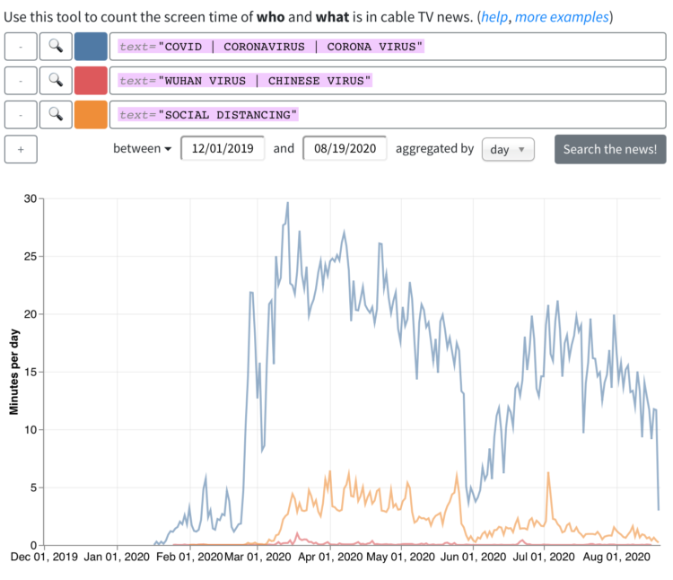
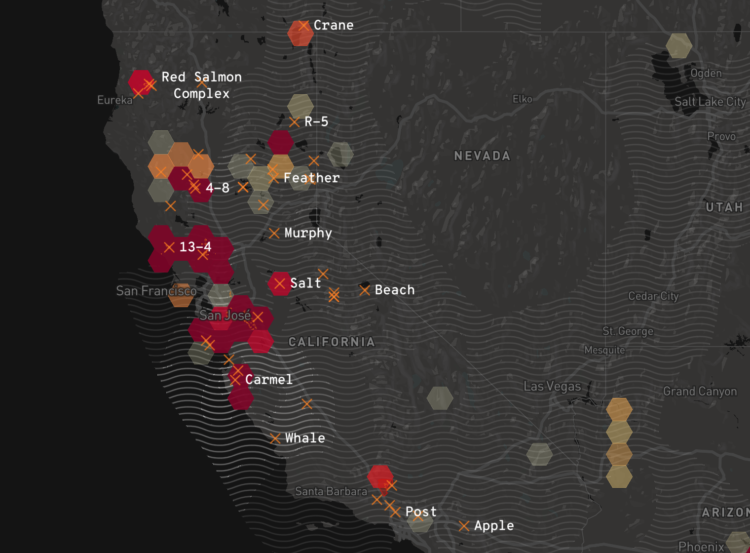
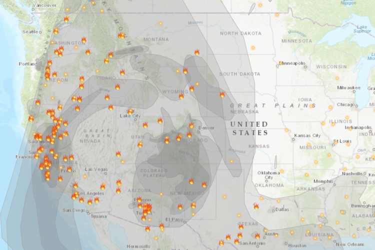
• For The Upshot, Emily Badger and Quoctrung Bui looked for major urban developments in the United States by comparing satellite imagery of past to present:

    To grasp the scale of this decade of change, The Upshot worked with Tim Wallace and Krishna Karra from Descartes Labs, a geospatial analytics company, using a tool that has itself evolved significantly over this time: satellite imagery. With its growing power and precision, we can see both intimate details — a single home, bulldozed; a tennis court, reinvented — and big patterns that recur across the country. Here, we show some of the most consequential changes over the last 10 years, as seen from above.

    The resolution is impressive (but still creeps me out a little bit). And while maybe not as fun to watch as a time-lapse, the two-snapshot treatment provides more contrast, which makes it easier to see the change. I also like the two small dots on the right of each image to indicate progress while scrolling.

  • My main goal for FD this year was to make charts.

    I hoped to make one chart per week, along with the newsletter and tutorials, which would force me to focus and spend less time dwelling on a dataset. I didn’t quite get to one per week, but I made about twice as many graphics as I did last year. I’ll take it.

    Instead of long-ish, in-depth analyses, I usually looked at one dataset from various angles, making one or two graphics per angle. Basically, instead of essays, I opted for small collections of short stories.

    So, here are the most popular topics/datasets and their accompanying charts.
    Read More

  • A file leaked to The New York Times contained location traces of 12 million unique smartphones. Stuart A. Thompson and Charlie Warzel went digging:

    The data set is large enough that it surely points to scandal and crime but our purpose wasn’t to dig up dirt. We wanted to document the risk of underregulated surveillance.

    Watching dots move across a map sometimes revealed hints of faltering marriages, evidence of drug addiction, records of visits to psychological facilities.

    Connecting a sanitized ping to an actual human in time and place could feel like reading someone else’s diary.

    They also probably found the POTUS in the data.

    Ugh.

  • The decade is almost done. You’re sitting there and you’re thinking: “I wish I could easily access the scripts from all seasons of The Office so that I could analyze the dialogue and relationships between characters.” Well, your wish is granted. Bradley Lindblad stuck all the scripts in an R package. It’s called schrute.

    Take that, 2019.

  • For The New York Times, Jonah M. Kessel and Hiroko Tabuchi went to oilfields in Texas with an infrared camera to look for methane leaks.

    Okay, important topic here, and the contrast between regular photograph and infrared video is alarming, but I may have been drawn to the methodology at the end:

    To create images of methane emissions in the Permian Basin, The Times used a custom-built FLIR camera that converts infrared energy into an electronic signal to create moving pictures. The camera’s filter allows infrared wavelengths between 3.2 to 3.4 micrometers on the electromagnetic spectrum to pass through to the sensor.

    To visualize gas, the camera uses helium to cool down the sensor to the temperature of liquid nitrogen, around minus 200 degrees Celsius. Unlike traditional photography lenses, which are glass, the infrared images were created using metal lenses made from germanium, which is transparent at infrared wavelengths.

  • One way to gauge the amount of ice in the Arctic is to look at the average age of the ice. From the NASA Scientific Visualization Studio, the map above shows the estimated age of ice on a monthly basis, going back to 1984:

    One significant change in the Arctic region in recent years has been the rapid decline in perennial sea ice. Perennial sea ice, also known as multi-year ice, is the portion of the sea ice that survives the summer melt season. Perennial ice may have a life-span of nine years or more and represents the thickest component of the sea ice; perennial ice can grow up to four meters thick. By contrast, first year ice that grows during a single winter is generally at most two meters thick.

  • Pew Research Center analyzed online sermons in U.S. searches, taking a closer look at what people typically hear across religions:

    For instance, the distinctive words (or sequences of words) that often appear in sermons delivered at historically black Protestant congregations include “powerful hand” and “hallelujah … come.” The latter phrase (which appears online in actual sentences such as “Hallelujah! Come on … let your praises loose!”) appeared in some form in the sermons of 22% of all historically black Protestant churches across the study period. And these congregations were eight times more likely than others to hear that phrase or a close variant. Although the word “hallelujah” is by no means unique to historically black Protestant services, this analysis indicates that it is a hallmark of black Protestant churches.

  • For The Washington Post, Tim Meko and Lauren Tierney:

    Before the 1930s, Christmas trees typically were cut down on an individual’s property or out in the wild. Now, tree farms in all 50 states (yes, Hawaii too) are where most Christmas trees come from, accounting for 98 percent of live Christmas trees brought into homes. These farms churn out many kinds of conifers, but two main regions — Clackamas County near Portland, Ore., and the Blue Ridge Mountains of North Carolina — produce the most.

    I wonder if we can see a similar map for artificial Christmas trees.

  • For Scientific American, Nicholas Rougeux and Jen Christiansen show the shift in hues for the magazine’s covers over the past 175 years. The changes serve as a proxy for technology advancements, changes in ownership, and shifts in thinking.

  • As I do every year, I picked my ten favorite visualization projects. Here they are in no particular order.

  • Members Only

    Every month I collect links to new tools, datasets, and visualization resources. Here’s the good stuff for December 2019 and the last roundup for the decade.

  • Our brains are pretty good at finding patterns, but it has some blindspots and then we get confused. The Illusion of the Year contest targets those blindspots. This year’s winner shows a rotating pattern that seems to switch axes depending on where you look.

  • Standardized ratings are a challenge, because they often try to encapsulate many variables into a single variable. On the upside, a single score is quick and easy to see, but on the downside, variance goes into hiding and people/things that don’t fit a defined standard get dinged.

    Vox looks at these challenges in the context of online school ratings.

  • By way of the Child Abuse Prevention and Treatment Act, ProPublica and The Boston Globe requested records from each state. They compiled the many documents into a single dataset:

    In each record, CAPTA requires states to list the age and gender of the child, and information about a household’s prior contact with welfare services. The information is supposed to help government agencies prevent child abuse, neglect and death, but reporting across states is so inconsistent that comparisons and trends are impossible to identify. ProPublica is releasing the data we’ve collected as a minimum count of child fatality records in the United States. Researchers and journalists can download the full records with summaries at the ProPublica Data Store.

    Unfortunately, not all state agencies are compliant, but it’s a start.

    Also, Jessica Huseman of ProPublica discussed some of the emotional challenges of working with such sensitive data.

  • Color scheme selections are nice and all, but they’re even better when viewed in context. It’s part of ColorBrewer’s charm, in the context of maps. Happy Hues offers color schemes in the context of a web page. A combination of this plus Viz Palette would be killer.

  • How to Make a Grid Map with Histograms in R, with ggplot

    Layout multiple charts in a single view. Then adjust the scales appropriately for maximum comparability and a unified graphic.

  • How to Make Interactive Frequency Trails with D3.js

    Layering time series data or distributions with this method can change the feel and aesthetic versus a multi-line chart or small multiples. In some cases, frequency trails let you show more in less space.

  • We looked at shifts in job distribution over the past several decades, but it was difficult to see by how much each occupation group changed individually. This chart makes the changes more obvious.

  • Datawrapper, a focused web tool that makes online charts easier to put together and share, changed their pricing structure. There used to be a couple of paid tiers for individuals and small teams, but now you get more for free. And even though it’s free:

    • We won’t sell your data. Some companies make the user into the product, but this is not our business model. All data you upload to Datawrapper is treated as confidential and only belongs to your account.
    • We won’t track your readers. Your embedded charts will not contain any code that tracks you or your readers. We’ve never done that, and will continue to not do that, regardless of your plan.
    • Your charts are private. You decide when it’s time to share your charts with the world. Until you hit “Publish”, your charts are visible only to you and your team.
    • Published charts will stay online indefinitely. We will never delete or disable any of your Datawrapper visualizations that you embedded somewhere. We stand by our pledge to keep all our users’ charts online.

    They continue to impress.

    It wasn’t that long ago when online charting tools felt buggy and overly limited. But Datawrapper is laying some strong groundwork (and Flourish continues to build up their offerings). Instead of a one-size-fits-all, we’re seeing an application focus, which allows for more specific tools.

  • For Reuters, Feilding Cage describes a weather time machine project by NOAA that uses old shipping logs to build climate models for the 19th century:

    In the 19th and early 20th centuries, millions of weather observations were carefully made in the logbooks of ships sailing through largely uncharted waters. Written in pen and ink, the logs recorded barometric pressure, air temperature, ice conditions and other variables. Today, volunteers from a project called Old Weather are transcribing these observations, which are fed into a huge dataset at the National Oceanic and Atmospheric Administration. This “weather time machine,” as NOAA puts it, can estimate what the weather was for every day back to 1836, improving our understanding of extreme weather events and the impacts of climate change.

    Consider my mind blown.

    I wonder what researchers will extract from our current data streams a century from now.

    Nevermind. I don’t want to know.