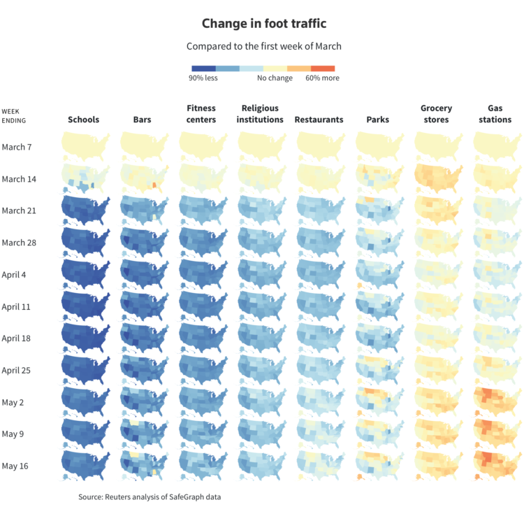
Using anonymized cellphone data from SafeGraph, Reade Levinson and Chris Canipe for Reuters mapped the change in foot traffic for different types of businesses over time.
Orange represents more movements since the first week of March. Blue means less. Yellow means about the same. We’re working towards all orange. Fingers crossed.
Sidenote: Now isn’t really the time, but when it is, we’re gonna have to come back to this mobile data stuff. Clearly it has its uses, but with so many offerings, there’s bound to be a less than useful leak.
 Visualize This: The FlowingData Guide to Design, Visualization, and Statistics (2nd Edition)