How to Make Difference Charts in Excel
Also known as a bivariate area chart, the plot type focuses on the comparison between two time series.
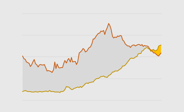
Regular line charts display patterns and trends over time. Instead of comparing those trends, you may want to emphasize the gap between two series and the sections where they intersect and flip. That is what bivariate area charts are used for. A well-known historical example of a bivariate area chart is William Playfair’s trade balance chart.
In Excel, you can create a bivariate area chart with a combination of area and line chart. To illustrate this chart we’ll use a popular dataset, food availability in the US, and specifically the evolution of beef and chicken availability. We want to focus on the flip in recent years, when chicken surpassed beef.
To access this full tutorial, you must be a member. (If you are already a member, log in here.)
Get instant access to this tutorial and hundreds more, plus courses, guides, and additional resources.
Membership
You will get unlimited access to step-by-step visualization courses and tutorials for insight and presentation — all while supporting an independent site. Files and data are included so that you can more easily apply what you learn in your own work.
Learn to make great charts that are beautiful and useful.
Members also receive a weekly newsletter, The Process. Keep up-to-date on visualization tools, the rules, and the guidelines and how they all work together in practice.
See samples of everything you gain access to:
About the Author
Jorge Camoes is a data visualization consultant based in Lisbon. Author of the book Data at Work. Runs ExcelCharts.com, where he discusses how to use Excel as data visualization tool. Recently playing with PowerBI & PowerQuery.