From Google’s People + AI Research team, David Weinberger and Yannick Assogba build a machine learning system that plays Tic-Tac-Toe. They discuss the choices, not just the technical ones, along the way in the ten-part podcast series:
A writer and a software engineer engage in an extended conversation as they take a hands-on approach to exploring how machine learning systems get made and the human choices that shape them. Along the way they build competing tic-tac-toe agents and pit them against each other in a dramatic showdown!
This is a podcast for anyone, from curious non-techies to developers dabbling in machine learning, interested in peeking under the hood at how people make and shape ML systems.
I’m a few episodes in. It’s entertaining.
This is an especially good listen if you’re interested in machine learning, but aren’t quite sure about how it works beyond a bunch of data going into a black box.


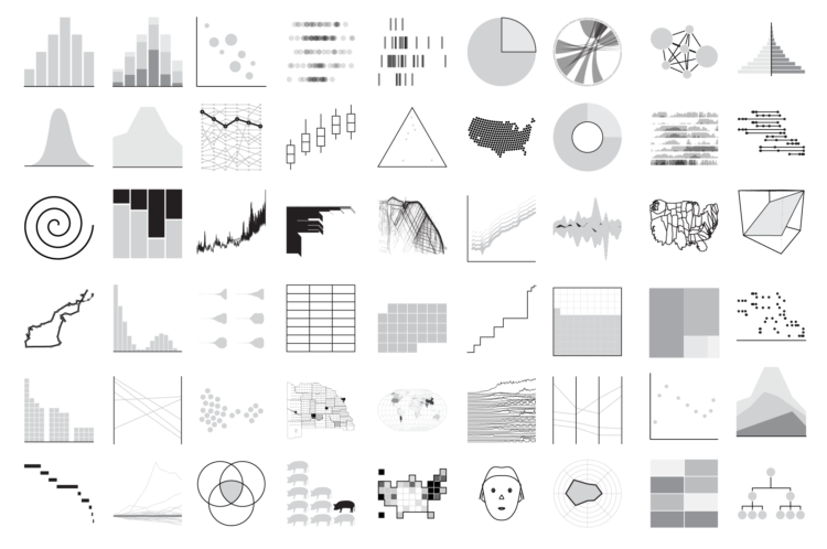
 Visualize This: The FlowingData Guide to Design, Visualization, and Statistics (2nd Edition)


