Bloomberg gained access to an email cache from Jeffrey Epstein’s Yahoo Mail inbox, spanning two decades between 2002 and 2022. They highlight the relationship between Epstein and Ghislaine Maxwell and how the timing and nature of the emails reflect a closer timeline than Maxwell has suggested.
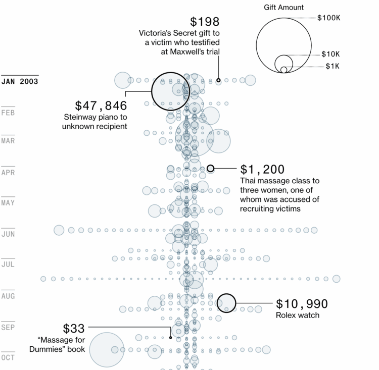
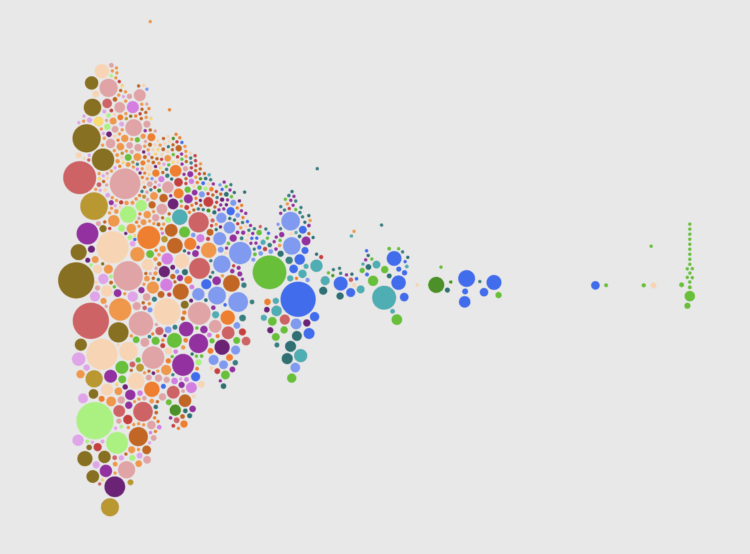
The cache also included a spreadsheet from Epstein’s accountant that lists gifts and payments, such as watches and massage lessons. Bloomberg charted three years of transactions with a bubble chart over time.
It’s only a fraction of Epstein emails, as he used multiple addresses over decades, but it’s quite the digital trace. Find more on how Bloomberg verified and analyzed the cache here.


 Visualize This: The FlowingData Guide to Design, Visualization, and Statistics (2nd Edition)


