There’s been a lot of talk about building a wall at the U.S.-Mexican…
-

Visualizing the U.S.-Mexican border
-
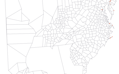
Adjusting map data with Mapshaper
Map making is a finicky challenge where oftentimes your map data — points,…
-
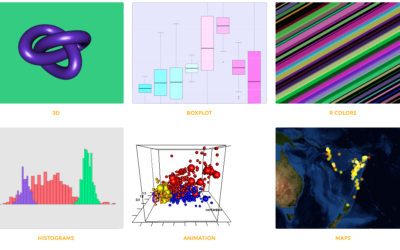
R graph gallery
One of best ways to learn visualization in any given software is to…
-
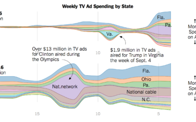
Ad spending for Clinton and Trump
Adam Pearce for the New York Times charted ad spending for Clinton and…
-
Members Only
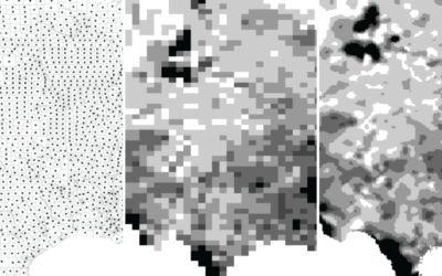
Transitioning Map, Part 1: Mapping Irregular Data with Interpolation in R
Rarely do you have evenly-spaced data across an entire geographic space. Here is a way to fill in the gaps.
-

Trump bar chart baselines are the worst baselines. Sad.
The Donald Trump campaign has a habit of highlighting poll results with a…
-
Interactive charts in R
Interactive charts in R are still so-so, but if you don’t mind giving…
-

Composite photos of airplanes in flight
Photographer Mike Kelley visited airports around the world, took pictures of airplanes leaving,…
-

@HillaryClinton vs. @realDonaldTrump
A comparison of the words unique to the candidates on Twitter.
-
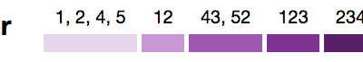
Using clustering to make a color scale
Choice of color scale can make a big difference in how the data…
-
Seeking solace in data
I think many of us can relate to this during the odd election…
-
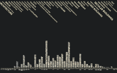
Visions penned by the 18th century king of Prussia
Past Visions, a visual archive of Frederick William IV’s, shows thousands of drawings…
-
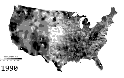
Unemployment in America, Mapped Over Time
Watch the regional changes across the country from 1990 to 2016.
-

Tron-style slippy map
Mapzen just released a Tron-style slippy map.
Today we introduce TRON version 2… -
How one man shifts national polls
I love the statistics lessons coming out of the Upshot, in the context…
-

Tilegrams in R
Last month Pitch Interactive launched an online tool for tiled cartograms, or tilegrams…
-
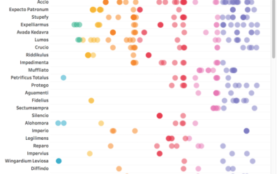
All the Harry Potter spells, when they were used
I often stare far into the distance and ponder world’s greatest questions —…
-
Deep fried data
Maciej Ceglowski, the creator of bookmarking site Pinboard, spoke at the Library of…
-
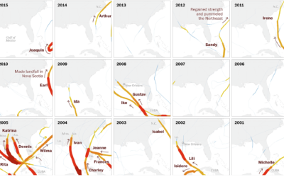
Century of Florida hurricanes
Florida has seen a lot of hurricanes come and go. Lazaro Gamio for…
-
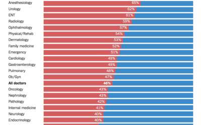
Doctors’ political leanings
Based on data from researchers at Yale, the Upshot charts party registration by…
Recently for Members
Second Edition
 Visualize This: The FlowingData Guide to Design, Visualization, and Statistics (2nd Edition)
 Visualize This: The FlowingData Guide to Design, Visualization, and Statistics (2nd Edition)
New tools, refined process.
Browse by Chart Type See All →


