In an effort to get people more interested in and to learn about…
-
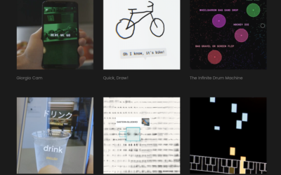
Google A.I. Experiments
-
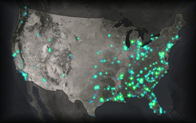
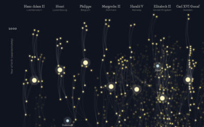
Glow map
John Nelson has a knack for making maps that glow, where the base…
-
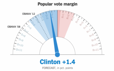
Showing uncertainty during the live election forecast
During the election, The New York Times showed a live gauge to show…
-
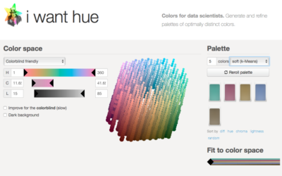
Generate color palettes automatically
Default color schemes are often horrible, but spending a lot of time putting…
-
Data Sketches, a monthly visualization matchup
Data Sketches, a collaboration between Nadieh Bremer and Shirley Wu, aims to visualize…
-
Resources to Find the Data You Need, 2016 Edition
This is an update to the guide I wrote in 2009, which as it turns out, is now mostly outdated. So, 2016. Here we go.
-
Members Only
Transitioning Map, Part 2: Refining the Format and Layout
How to make a more readable and more visually accurate map, before you dive into the big transitions.
-
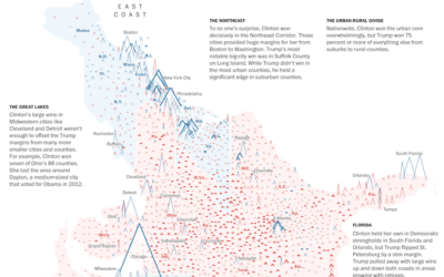
Peaks and valleys of presidential support
This is some fine map work by Lazaro Gamio and Dan Keating for…
-
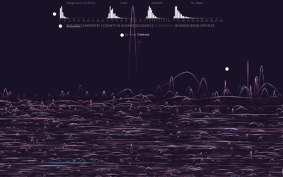
Randomness of scientific impact
A group of researchers wondered if there was a trend or predictability for…
-

Together
Here we go.…
-
Textured SVG patterns in JavaScript
In case you didn’t get the memo, pattern fills are back and so…
-

Nuclear war is on the ballot
Neil Halloran, creator of the interactive World War II documentary focused on deaths,…
-
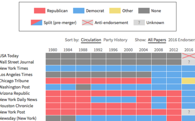
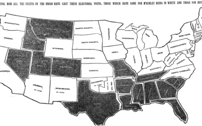
Newspaper endorsements since 1980
Noah Veltman put together a history of newspapers’ presidential endorsements since 1980 for…
-
Majority minorities
We saw the changing percentage of white people in the United States and…
-
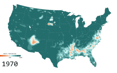
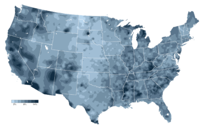
Percentage of white people
Below is the estimated percentage of white population in the United States from…
-
All the ways to map election results
Every election, there’s a slew of election maps that come in all shapes…
-
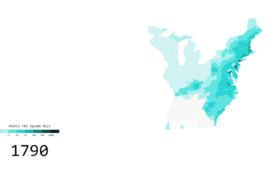
Two Centuries of Population, Animated
A visual history of a growing United States.
-
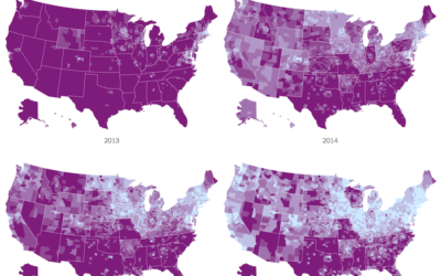
Impact of Obamacare in maps
It’s been three years since the Affordable Health Care Act. Margot Sanger-Katz and…
-
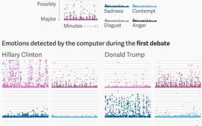
Sentiment analysis on Trump and Clinton faces during debate
For anyone who watched the presidential debates, I think it was fairly obvious…
-
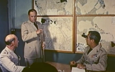
Vintage cartography and geography documentary, from 1961
This is too good not to watch. It’s a 1961 documentary on cartography…
Recently for Members
Second Edition
 Visualize This: The FlowingData Guide to Design, Visualization, and Statistics (2nd Edition)
 Visualize This: The FlowingData Guide to Design, Visualization, and Statistics (2nd Edition)
New tools, refined process.
Browse by Chart Type See All →


