Transitioning Map, Part 1: Mapping Irregular Data with Interpolation in R
Rarely do you have evenly-spaced data across an entire geographic space. Here is a way to fill in the gaps.
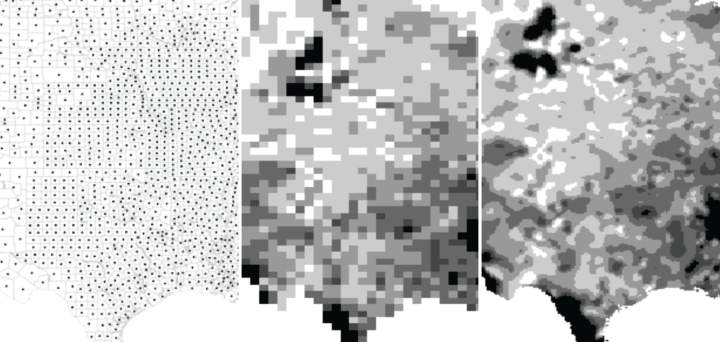
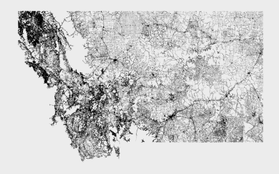
A lot of geographic data that you can download is aggregated by geographic boundaries. You get data by state. You get data by county. Unless you’re looking at weather data, you typically don’t get data across a continuous spectrum.
Because the data is binned, it’s often a good idea to map it in the same way. You don’t really know what the metrics really look like in between the estimated areas. However, sometimes interpolation can be useful in the same way it can be useful to fit a curve to a set of points over time. The smoothed data isn’t as exact, but sometimes it makes trends — over space or time — more obvious visually.
To access this full tutorial, you must be a member. (If you are already a member, log in here.)
Get instant access to this tutorial and hundreds more, plus courses, guides, and additional resources.
Membership
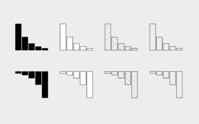
You will get unlimited access to step-by-step visualization courses and tutorials for insight and presentation — all while supporting an independent site. Files and data are included so that you can more easily apply what you learn in your own work.
Learn to make great charts that are beautiful and useful.
Members also receive a weekly newsletter, The Process. Keep up-to-date on visualization tools, the rules, and the guidelines and how they all work together in practice.
See samples of everything you gain access to:
About the Author
Nathan Yau is a statistician who works primarily with visualization. He earned his PhD in statistics from UCLA, is the author of two best-selling books — Data Points and Visualize This — and runs FlowingData. Introvert. Likes food. Likes beer.