@HillaryClinton vs. @realDonaldTrump

If like me, you’ve browsed the Twitter feeds of the presidential candidates (and have since been cursed with a constant itch to look), you know that Hillary Clinton and Donald Trump tweet differently.
Clinton’s feed looks a lot like what you expect from a presidential candidate, whereas Trump’s feed feels more like a mix of things. I mean, well, do I really have to explain? You know what they’re like. If you don’t look at Twitter, just imagine a more succinct, 140-characters-at-a-time version of what you saw in the debates.
So I wondered if you could see the differences between Clinton and Trump with a simple word breakdown of their tweets. I grabbed the tweets available — ones between June 3 and October 17 of this year — and took a look. Here are the results.
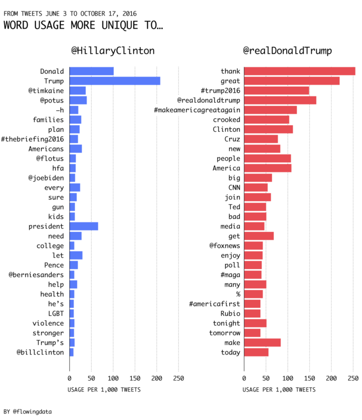
In the chart above shows the words most unique to each candidate. They are ordered by uniqueness, and bars represent the rate the words were used during the time period. Clinton often refers to Trump, but doesn’t use his Twitter handle, and she often retweets others such as @timkaine, @potus, and @flotus. Trump tends to informally retweet with quotes, which is why his screen name is towards the top of his list.
Towards the middle of each list, you see the topics each candidate tends to talk about. I like how the percentage sign for poll results pops up on Trump’s side.
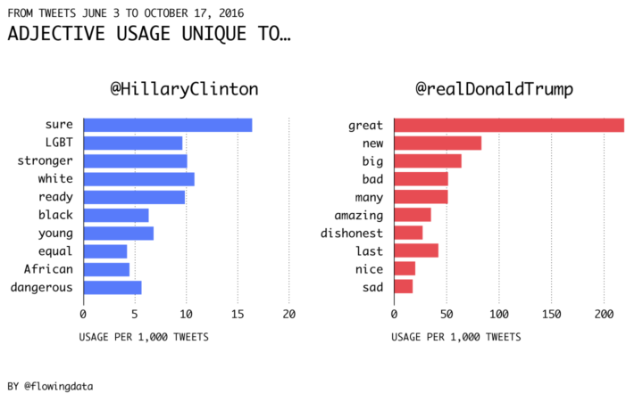
If you look at the adjectives, you get a pretty good idea of the vibe of each campaign. Notice the different horizontal axes. Trump uses way more adjectives in his tweets.
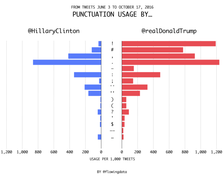
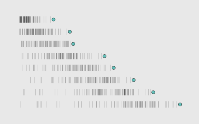
But maybe we don’t have to look at the words at all. Maybe we can look just at punctuation. The marks are sorted by more unique to Trump to more unique to Clinton, top to bottom. Trump uses the exclamation point about 35 times more than Clinton. Clinton’s punctuation usage doesn’t stand out so much, other than that she uses more ellipses to tweet quotes.
Chart Type Used

Become a member. Support an independent site. Make great charts.
See What You Get