Choice of color scale can make a big difference in how the data reads. A careless choice might make the data appear skewed too far low or too far high, so you need to look at the data and decide what’s right for the context. But, sometimes you just gotta make a lot of charts or maps. Or, you just don’t feel like manually picking the colors.
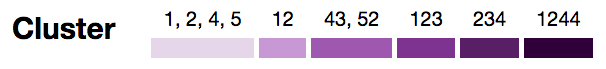
David Schnurr describes a way to use clustering to pick the natural breaks in a more automatic fashion. The best part:
In an effort to make it easier for anyone to use this technique in data visualizations, I’ve ported this new algorithm to JavaScript and created a custom d3 scale called d3-scale-cluster. You can find d3-scale-cluster on Github and npm–give it a try and shoot me a tweet @dschnr with your thoughts!
And I await for someone to make an R package.
 Visualize This: The FlowingData Guide to Design, Visualization, and Statistics (2nd Edition)