For those who work with R and d3.js, the differences between the two…
-

Learning R Versus d3.js for Visualization
-
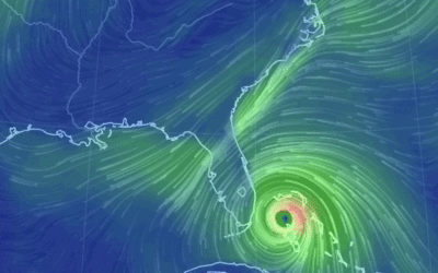
Hurricane Matthew en route
Stay safe, Florida.…
-
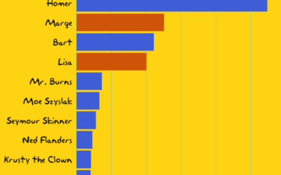
An analysis of The Simpsons
The Simpsons is in its 27th season. That’s a lot of d’ohs. Todd…
-

Classical music visualized
Artist Nicholas Rouguex visualized some musical scores in his project Off the Staff.…
-
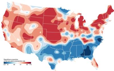
Map shows two-party presidential shifts since 1920
In an update to his two-party map, political scientist David Sparks shows the…
-

Finding the biggest busts and steals from NBA drafts past
Picking basketball players for a professional team is no easy task. College and…
-
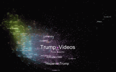
Trending #TrumpWon didn’t start in Russia
After the first presidential debate, #TrumpWon was a trending topic on Twitter, which…
-

Breaking the algorithmic black box
The general public kind of knows about data privacy issues. But not really.…
-
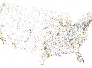
Traffic fatalities data for 2015 released
Each year, the National Highway Traffic Safety Administration releases data for traffic accidents…
-
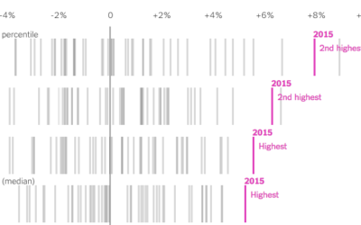
Rise in income for the poor and middle class
We know that income increased by a lot in 2015, but for who?…
-
Members Only

How to Visualize Proportions in R
There are many ways to show parts of a whole. Here are quick one-liners for the more common ones.
-
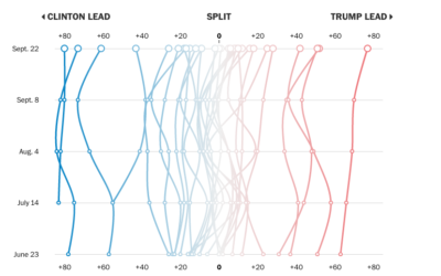
Shifting Clinton and Trump support for different demographic groups
Using data from their Washington Post-ABC News polling, the Washington Post compares shifting…
-

Food pictures taken with thermal camera
Thermal cameras, which use infrared to detect heat, provide images of temperature. Firefighters…
-

Mapping the Spread of Obesity
A look at the rise for each state over three decades, for men and women.
-

Showing missing data in line charts
Missing data is everywhere. Or, I guess technically it’s nowhere. You know what…
-

Skittle disconnect
This is what happens when there is a disconnect between data and what…
-
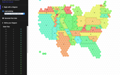
Make your own tiled cartograms
A challenge of using geographic maps to show data is that larger regions…
-
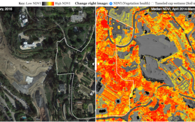
Finding the wet princes of Bel Air
In case you didn’t know, there’s a drought here in California so there…
-
Statistics lesson on polling
Nate Cohn for the Upshot provides a statistics lesson in the context of…
-
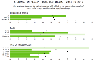
Income Increased
But not every group’s median income increased by the same amount.
Recently for Members
Second Edition
 Visualize This: The FlowingData Guide to Design, Visualization, and Statistics (2nd Edition)
 Visualize This: The FlowingData Guide to Design, Visualization, and Statistics (2nd Edition)
New tools, refined process.
Browse by Chart Type See All →


