Separately, we looked at marrying age, divorce rates, and those who never married. Now let’s look at marital status all together, with the addition of the widowed status.
-

Marital Status by Age
-

Physical demo of how all maps are wrong
We’ve seen many one-off projects that show the distortions you get when you…
-
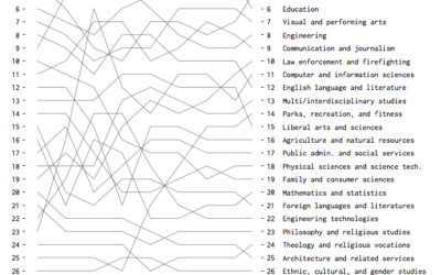
Most Popular Fields of Study (1970–2013)
Based on bachelor’s degrees conferred, here are the fields that were and are currently popular.
-
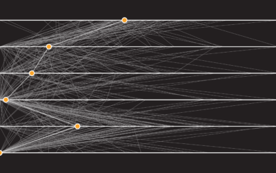
How People Like You Spend Their Time
Looking at American time use for various combinations of sex, age, and employment status, on weekdays and weekends.
-
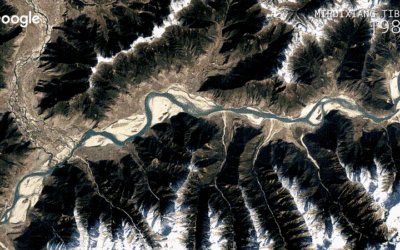
Detailed time-lapse of everywhere on Earth
A few years back, Google released a time-lapse feature in Google Earth that…
-
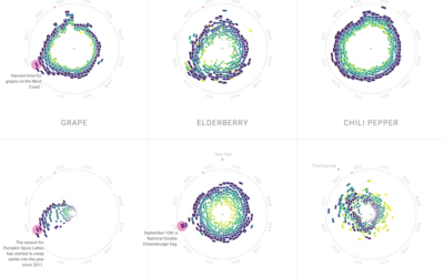
Food patterns
Food trends come and go. Some stay longer than expected, and others come…
-
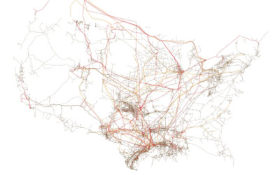
American infrastructure mapped
I can always find time to enjoy me some minimal maps. Tim Meko…
-

Typeface interweaves words and graphs
Datalegreya is a new typeface by Fig that lets you intertwine a graph…
-
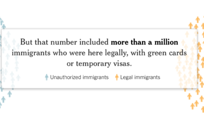
Actual deportation numbers
There was a lot of talk about deporting millions of illegal immigrants immediately,…
-

in/ex troversion
Here’s a short illustrated animation on introverts and extroverts by Julia Rodrigues.
This… -
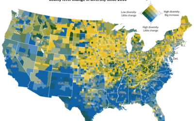
Increasing diversity
Dan Keating and Laris Karklis for The Washington Post map the change in…
-

Visual collection of bird sounds
Different species of birds make different sounds. However, the sounds are so quick…
-

History of Earth in the context of a football field
In the latest addition to the put-big-numbers-in-context genre, here’s the history timeline of…
-
Shift Your Point of View to When America Was “Better”
How good or bad something is depends on what you compare against.
-
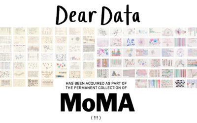
Dear Data headed to MoMA’s permanent collection
What started as a personal project and then turned into a book, Dear…
-
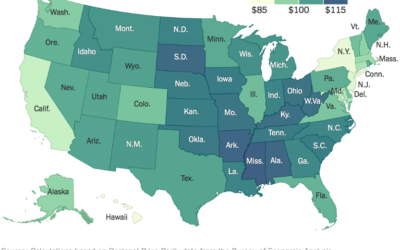
What $100 buys in each state
A hundred bucks in one state doesn’t always get you the same thing…
-

Dialect book of maps
In 2013, Josh Katz put together a dialect quiz that showed where people…
-
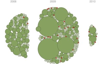
Floaty bubble charts with d3.js
D3.js, or Data-Driven Documents, version 4.0 was released a few months ago, so…
-
Members Only
Transitioning Map, Part 3: Animate Change Over Time
How to make a bunch of maps and string them together to show change.
-
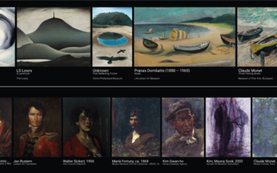
Visual connections between art pieces
This is neat. A Google Arts & Culture Experiment, X Degrees of Separation…
Recently for Members
Second Edition
 Visualize This: The FlowingData Guide to Design, Visualization, and Statistics (2nd Edition)
 Visualize This: The FlowingData Guide to Design, Visualization, and Statistics (2nd Edition)
New tools, refined process.
Browse by Chart Type See All →


