A frequent challenge of visualization is behind the scenes, to get the data and to mold it into the format you need. Do that. Then map.
-
Members Only
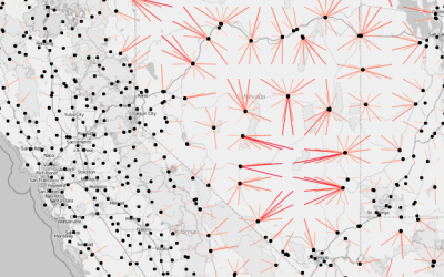
Working with Line Maps, the Google Places API, and R
-

Treemap art
Ben Shneiderman invented the treemap in the 1990s to visualize the hierarchical contents…
-
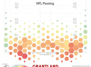
Where NFL quarterbacks throw
Kirk Goldsberry, known for his basketball analysis and shot charts, has applied his…
-
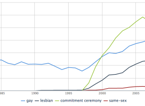
Crunching the wedding numbers
Weddings are special events where friends and family come together to celebrate, and…
-
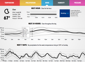
Weather models, a visual comparison
Forecast, one of the best if not the best quick-look weather sites, uses…
-
UK Census at risk
There is a possibility the UK Census is scrapped for cheaper options next…
-
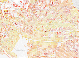
Age of city buildings
When we think about the age of cities, it’s common to think of…
-
London to Brighton train ride, 1953-2013
In 1953, the BBC filmed a train ride from London to Brighton and…
-
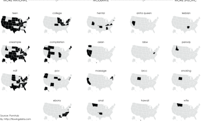
Most popular porn searches, by state
We’ve seen that we can learn from what people search for, through the…
-
Data in the service of humanity
For this rainy Labor Day, here’s an uplifting talk by DataKind founder Jake…
-
WTF visualizations
There are a lot of poorly conceived graphics that make little sense or…
-
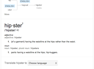
Etymology and word usage when you ‘define’ with Google
Pro tip: When you Google “define <INSERT WORD HERE>” and open the information…
-
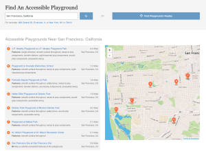
Playgrounds for everyone →
NPR digs into accessible playgrounds, because everyone should get to play.
Remember running… -
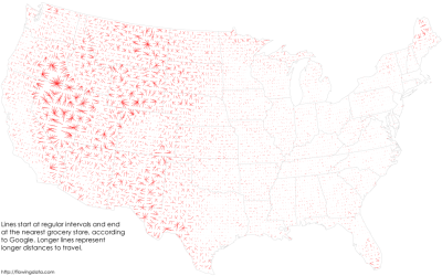
In search of food deserts
Last time I looked at where major grocery stores are across the United…
-
The inventor of modern probability
Andrei Kolmogorov is a name unfamiliar to most, but his work had lasting…
-
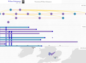
British relationships throughout history
In Kindred Britain, Nicholas Jenkins, Elijah Meeks and Scott Murray provide a visual…
-
A master’s degree in statistics is worthwhile
Statistician (and brand new PhD student) Jerzy Wieczorek explains the usefulness of a…
-
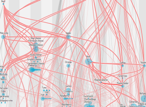
Network of shared flavors
Jan Willem Tulp, for this month’s Scientific American food issue, recreated the flavor…
-
Learn to make animated information graphics
Graham Roberts, a graphics and multimedia editor at The New York Times, is…
-
Pickle Index for population estimation
As China moves forward with a plan to move 250 million people to…
Recently for Members
Second Edition
 Visualize This: The FlowingData Guide to Design, Visualization, and Statistics (2nd Edition)
 Visualize This: The FlowingData Guide to Design, Visualization, and Statistics (2nd Edition)
New tools, refined process.
Browse by Chart Type See All →


