If my inbox has taught me anything, it’s that there are a lot…
-
Introducing the FlowingData Job Board
-
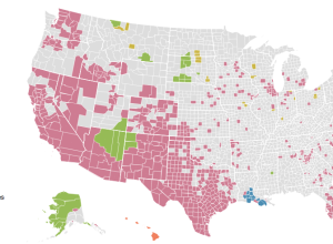
Where non-English language is spoken in the US →
Dan Keating and Darla Cameron for the Washington Post mapped commonly used languages…
-
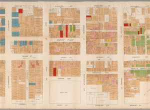
Map shows illegal activity in San Francisco Chinatown, from 1885
From the David Rumsey map collection, the detailed map of San Francisco Chinatown…
-

Extensive timelines of slang for genitalia
The title says it all. Jonathon Green, a slang lexicographer, has two new…
-
Why everyone is more popular than you
Mathematician Hannah Fry is back with another video. She explains why it seems…
-
Pie charts about pies with pies
Josh Sundquist and Hannah Hart made a video about pies, the edible variety…
-
Members Only

How to Make a Connected Scatter Plot
The combination of a time series chart and a scatter plot lets you compare two variables along with temporal changes.
-
Beach Boys vocals visualized
Alexander Chen visualized “You Still Believe in Me” by the Beach Boys.
This… -
Introduction to R, a video series by Google
Google released a 21-part short video series that introduces R. Most of the…
-
Seeking a career in visualization
Some readers asked about career choices in visualization recently, and I was about…
-

Listening to Zen-like Wikipedia edits
It’s easy to think of online activity as a whirlwind of chatter and…
-

Racial dot map
Dustin Cable, a demographer at the University of Virginia’s Weldon Cooper Center for…
-

A second on the Internet →
In a straightforward view of online activity, Designly shows the approximate number of…
-
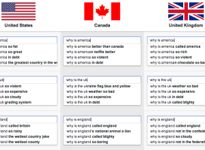
Google search suggestions by country
Google search suggestions have transformed into a never-ending source of entertainment and a…
-

Size comparison of everything
If you’re like me, you often wonder how big the Stay Puft Marshmallow…
-
Behind the Netflix recommendation system
Wired has a fun Netflix interview on the behind-the-scenes work on the recommendation…
-
Piemaster
I’m not entirely sure where this came from, but it’s from someone who…
-
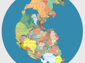
Pangea with political boundaries
What would Pangea look like if today’s political boundaries were drawn on it?…
-
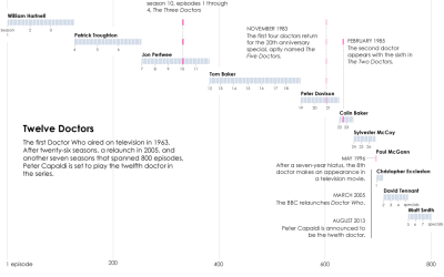
Doctor timeline for Doctor Who
I have yet to see a full episode of Doctor Who, “the longest-running…
-
Useless infographics
The Guardian posted a small collection of useless infographics. It kind of looks…
Recently for Members
Second Edition
 Visualize This: The FlowingData Guide to Design, Visualization, and Statistics (2nd Edition)
 Visualize This: The FlowingData Guide to Design, Visualization, and Statistics (2nd Edition)
New tools, refined process.
Browse by Chart Type See All →


