The title caption reads: “A classmate was caught using his phone in maths.…
-
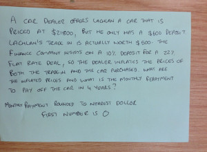
Teacher forces student to do math to unlock phone
-
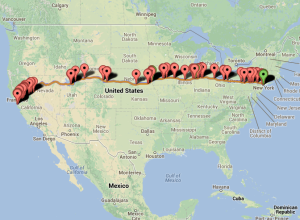
BreweryMap plans your next beer road trip
BreweryMap, a Google Maps mashup and mobile app, provides two main functions. The…
-
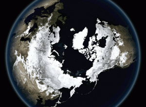
Breathing Earth
John Nelson of IDV Solutions strung together satellite imagery for dramatic animated GIFs.…
-
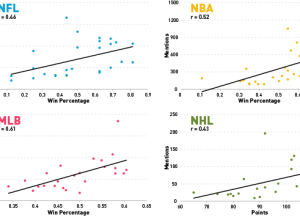
An analysis after watching a year’s worth of SportsCenter
Patrick Burns for Deadspin watched 23,000 minutes of SportsCenter, keeping track of the…
-

A study of quantified emotion
Mike Pelletier experimented with quantified emotion in his piece Parametric Expression. This is…
-
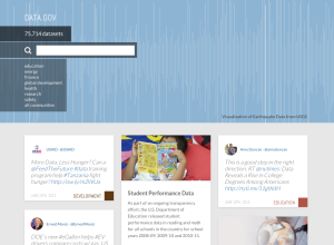
Data.gov revamp
After budget cuts a couple of years ago, I assumed Data.gov was all…
-
Internet critique as infographic music video
I’m not entirely sure how to interpret this music video from Franz Ferdinand,…
-
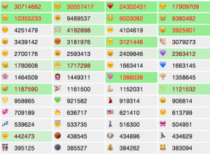
Tracking emoji usage on Twitter
The people I follow on Twitter almost never use emojis, but every now…
-
Link
Vintage map design with QGIS
A quick, three-step tutorial on how to make maps that look vintage in the open source QGIS. [via]
-
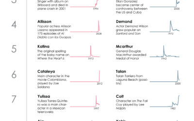
The Most Trendy Names in US History
Names are incredibly personal things. It’s how we identity ourselves. We associate others,…
-
Link
NYPL map vectorizer
The NYPL map vectorizer turns old maps into GIS data.
-
Datalandia, the fictional town saved by data
GE has a short video series on a fictional town called Datalandia where…
-

Lessons learned from mapping millions of dots
Erica Fischer, known around these parts for her dot maps, describes the lessons…
-
Physics of love
Louise Ma, along with Chris Parker and Lola Kalman, started a six-part short…
-
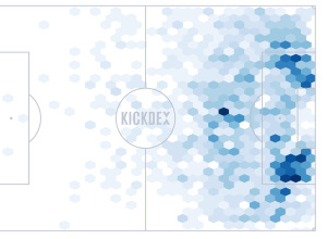
Soccer assists mapped
Using Opta data for assists in the Premier League, Kickdex made this straightforward…
-

Physical installation shows actual wind patterns
Artist Charles Sowers specializes in public art works and display of physical phenomena.…
-
Link
A big collection of sites and services for accessing data
Andy Kirk put together a big collection of sites and services for accessing data. It’s essentially a big ol’ data dump.
-

GPS shoes show you the way home
Inspired by The Wizard of Oz, where Dorothy clicks her heels to get…
-
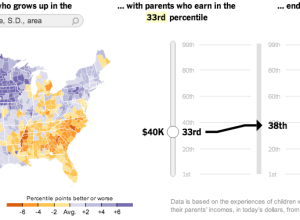
Climbing the income ladder →
In a study conducted by researchers at Harvard and UC Berkeley, data shows…
-
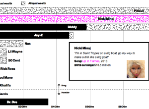
Rappers’ claimed wealth versus actual wealth
Allison McCann for Businessweek graphed rappers’ claimed wealth in their songs versus their…
Recently for Members
Second Edition
 Visualize This: The FlowingData Guide to Design, Visualization, and Statistics (2nd Edition)
 Visualize This: The FlowingData Guide to Design, Visualization, and Statistics (2nd Edition)
New tools, refined process.
Browse by Chart Type See All →


