In search of food deserts

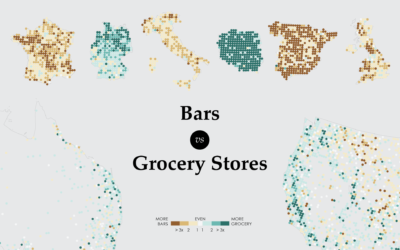
Last time I looked at where major grocery stores are across the United States. Where you shop for groceries changes depending on what region you live in, but hunger and nutrition carries less variance. It’s important that everyone has access to healthy food options, so I looked at the data, this time from Google and from a different angle. Instead of where stores are, I looked at how far away the nearest grocery store is.
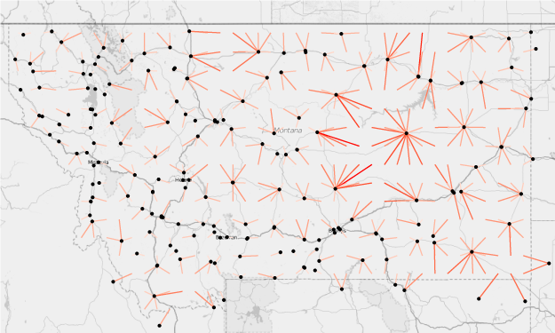
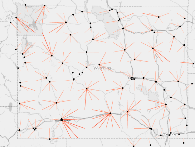
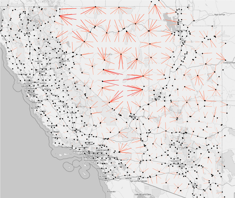
The map above shows a sample of locations across the country, and line length represents distance to the nearest store. For example, in areas with a lot of lines headed to one spot is an area with fewer grocery stores. In contrast, mostly small line segments mean more grocery stores, and therefore less distance to travel to buy groceries.
Places where residents have limited access to grocery stores are called food deserts. However, there’s no exact definition of what limited access means or what a long distance is. Some set a 10-mile marker whereas others say a store should be less than a mile away where there is a lot of pedestrian traffic.
So instead of define counties or census tracts as food deserts or not, I took an incremental approach. I pinged Google Maps every twenty miles, west to east and north to south, and asked for the nearest grocery store. There were about 9,600 observations.
Here’s the distribution of distances from the sample:
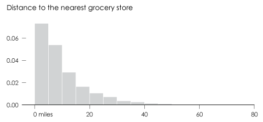
The nearest grocery store is more than 10 miles away in about 36 percent of the country and the median distance is 7 miles. However, a lot of these areas are rural with few (if any) people who live there.
For example, if we zoom in on Montana (dots represent store locations), we see sparse roads in the northeast and then more stores as you sweep west.
It’s similar in Wyoming.
From a visual standpoint, you essentially see population density in reverse. Longer distances (and typically fewer people) mean more prominent lines, whereas areas with a lot of stores blend into the background. This is obvious when you look at Texas.
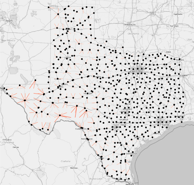
Or in the west. It makes sense that actual deserts look like food deserts.
But what if you zoom in to cities and decrease the search radius? Here are grocery distances in Chicago with a search every two miles, instead of 20 miles like the above views:
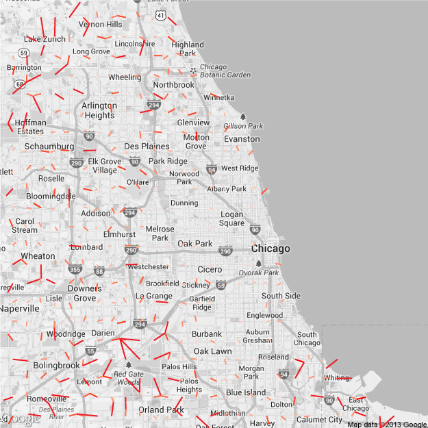
This is interesting when you consider the disagreements in Chicago last week over the aggregates. The mayor cited a decline in overall food deserts, but people who work on the ground see it differently. I imagine someone familiar with the city could easily pinpoint areas on this map where just one grocery store could make a big difference. We didn’t even look at population, income, zoning, transportation, or food price yet.
Become a member. Support an independent site. Get extra visualization goodness.
See What You Get