How to Make Frequency Trails in R
Also known as ridgeline plots, the method overlaps time series for a 3-D-ish view of the data. While perhaps not the most visually efficient, the allure is undeniable.
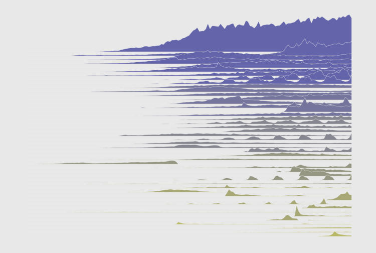
Frequency trails have been around for a few decades but only recently became more popular. It hit peak popularity in 2017 when Henrik Lindberg posted a chart that showed sports participation by time of day.
They’re essentially just overlapping time series charts, but there is something about the overlap that makes the data feel for visually intriguing. More approachable?
I’ll let you decide what to do with them.
In this tutorial, you reproduce a simplified version of the frequency trails I used to show comment activity over time.
To access this full tutorial, you must be a member. (If you are already a member, log in here.)
Get instant access to this tutorial and hundreds more, plus courses, guides, and additional resources.
Membership
You will get unlimited access to step-by-step visualization courses and tutorials for insight and presentation — all while supporting an independent site. Files and data are included so that you can more easily apply what you learn in your own work.
Learn to make great charts that are beautiful and useful.
Members also receive a weekly newsletter, The Process. Keep up-to-date on visualization tools, the rules, and the guidelines and how they all work together in practice.
See samples of everything you gain access to:
About the Author
Nathan Yau is a statistician who works primarily with visualization. He earned his PhD in statistics from UCLA, is the author of two best-selling books — Data Points and Visualize This — and runs FlowingData. Introvert. Likes food. Likes beer.