The new R package miner is an interface to Minecraft via some simple…
R
-
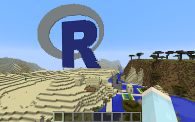
R programming with Minecraft
-
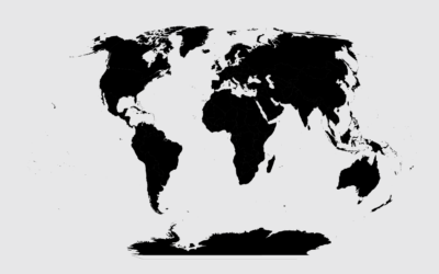
Introducing a Course for Mapping in R
Mapping geographic data in R can be tricky, because there are so many…
-
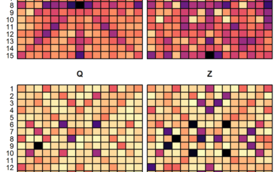
Scrabble data and analysis
Looking for some data to play with? James P. Curley compiled Scrabble data…
-
Easily download large-ish survey datasets
Many government organizations release microdata for surveys every year. It comes as anonymized…
-
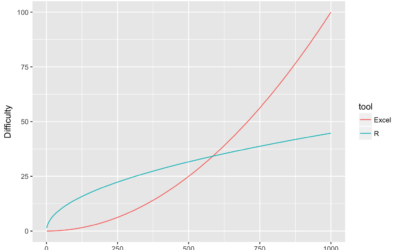
R for Excel users
For Excel users getting started with R, pain oftentimes finds its way into…
-
Members Only
How to Edit R Charts in Adobe Illustrator
A detailed guide for R users who want to polish their charts in the popular graphic design app for readability and aesthetics.
-
Now over 10,000 packages in R
There are a lot of R packages, which is why before I implement…
-
Members Only
How to Make an Animated Map in R, Part 4
In the the last part of the four-part series, you make a longer animation with more data and annotate.
-
Interpolate your data for animation in R
The tweenr package in R, by Thomas Lin Pedersen, helps you interpolate data…
-
Members Only
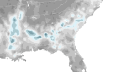
Transitioning Map, Part 3: Animate Change Over Time
How to make a bunch of maps and string them together to show change.
-
Members Only
Transitioning Map, Part 2: Refining the Format and Layout
How to make a more readable and more visually accurate map, before you dive into the big transitions.
-
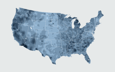
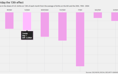
Majority minorities
We saw the changing percentage of white people in the United States and…
-
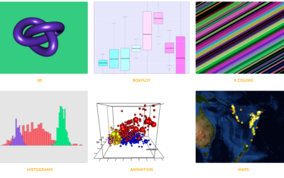
R graph gallery
One of best ways to learn visualization in any given software is to…
-
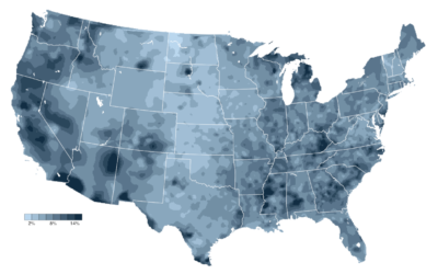
Members Only
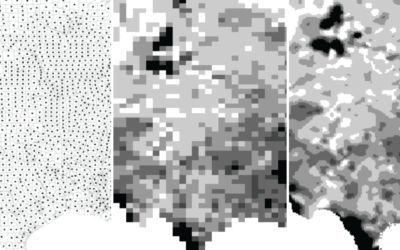
Transitioning Map, Part 1: Mapping Irregular Data with Interpolation in R
Rarely do you have evenly-spaced data across an entire geographic space. Here is a way to fill in the gaps.
-
Interactive charts in R
Interactive charts in R are still so-so, but if you don’t mind giving…
-

Tilegrams in R
Last month Pitch Interactive launched an online tool for tiled cartograms, or tilegrams…
-
Learning R Versus d3.js for Visualization
For those who work with R and d3.js, the differences between the two…
-
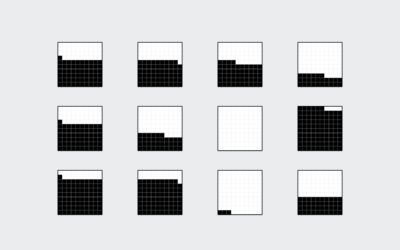
Members Only

How to Visualize Proportions in R
There are many ways to show parts of a whole. Here are quick one-liners for the more common ones.
-
Members Only
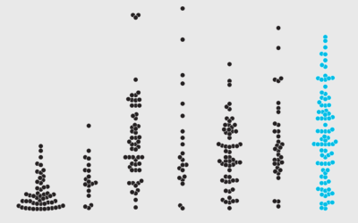
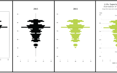
How to Make Beeswarm Plots in R to Show Distributions
Try the more element-based approach instead of your traditional histogram or boxplot.
-
Members Only
How to Make Square Pie Charts in R
Instead of traditional pie charts that rely on angles and arc lengths to show parts of a whole, try this easier-to-read version.
Recently for Members
Second Edition
 Visualize This: The FlowingData Guide to Design, Visualization, and Statistics (2nd Edition)
 Visualize This: The FlowingData Guide to Design, Visualization, and Statistics (2nd Edition)
New tools, refined process.
Browse by Chart Type See All →


