How to Make a Mosaic Plot in R
Also known as a Marimekko diagram, the mosaic plot lets you compare multiple qualitative variables at once. They can be useful, sometimes.
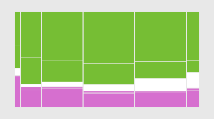
Mosaic plots let you compare multiple categories at once, so that you can see individual breakdowns and get a sense of overall distributions.
The plot type can handle several categories. However, you start to push it with readability beyond two. (Some might argue you’re already pushing readability with two dimensions.) Any more than that, and you should try a different chart type or a set of chart of chart types.
That said, in this tutorial, I’ll show you two ways to make readable mosaic plots in R.
To access this full tutorial, you must be a member. (If you are already a member, log in here.)
Get instant access to this tutorial and hundreds more, plus courses, guides, and additional resources.
Membership
You will get unlimited access to step-by-step visualization courses and tutorials for insight and presentation — all while supporting an independent site. Files and data are included so that you can more easily apply what you learn in your own work.
Learn to make great charts that are beautiful and useful.
Members also receive a weekly newsletter, The Process. Keep up-to-date on visualization tools, the rules, and the guidelines and how they all work together in practice.
See samples of everything you gain access to:
About the Author
Nathan Yau is a statistician who works primarily with visualization. He earned his PhD in statistics from UCLA, is the author of two best-selling books — Data Points and Visualize This — and runs FlowingData. Introvert. Likes food. Likes beer.