How to Make Chord Diagrams in R
Show connections in the circular layout for a more compact presentation.
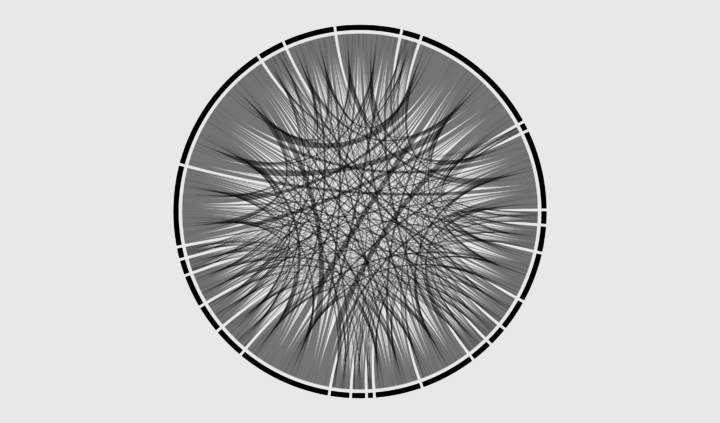
Chord diagrams are compact and often visual pleasing. Because circles. The outer track shows totals for in and out links, and the width of links represent the subtotals for each category.
The diagram carries with it similar challenges to other network graphs, namely a lot of lines crossing makes for a bowl of spaghetti. But in the event that you need a chord diagram, here’s how to do it.
I cover two methods. One uses a built-in function and the other draws a diagram piece-by-piece. As is usually the case, the former provides convenience while sacrificing flexibility. The latter offers flexibility, but takes a bit more effort.
To access this full tutorial, you must be a member. (If you are already a member, log in here.)
Get instant access to this tutorial and hundreds more, plus courses, guides, and additional resources.
Membership
You will get unlimited access to step-by-step visualization courses and tutorials for insight and presentation — all while supporting an independent site. Files and data are included so that you can more easily apply what you learn in your own work.
Learn to make great charts that are beautiful and useful.
Members also receive a weekly newsletter, The Process. Keep up-to-date on visualization tools, the rules, and the guidelines and how they all work together in practice.
See samples of everything you gain access to:
About the Author
Nathan Yau is a statistician who works primarily with visualization. He earned his PhD in statistics from UCLA, is the author of two best-selling books — Data Points and Visualize This — and runs FlowingData. Introvert. Likes food. Likes beer.