Data, R, and a 3-D Printer

The NBA playoffs are in full swing, so basketball has been on my mind. And whatever is on my mind tends to lead me to searches for related datasets. Luckily, we’re in the year 2018. Where there is sports, data follows, and the NBA is no exception. They provide numbers for players, teams, plays, games, etc. They also provide a (poorly-documented) API to access the data.
I didn’t feel like making more court heatmaps though.
Instead, I got a little carried away with the 3-D printer. I used Todd Schneider’s BallR package to bring shot selection data into R. Then I processed, aggregated, and messed around a lot with 3-D views. Finally, I used Ian Walker’s r2stl package to export for printing.
The results, 3-D printed charts showing shots made, are something of a cross between cityscapes and Mordor. Heights are on a logarithmic scale, each cell represents one square foot on the court, and they collectively show shot distribution for each player.
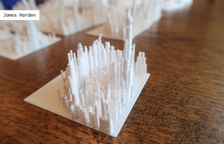
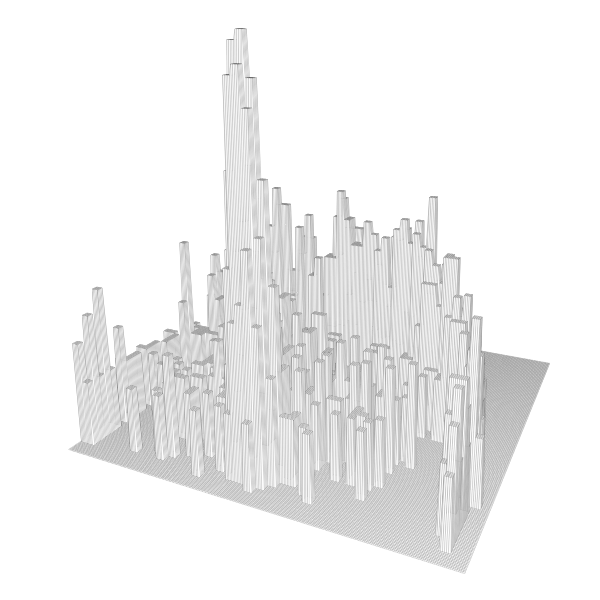
In all likelihood, this year’s winner of the regular season Most Valuable Player award, point guard James Harden plays for the Houston Rockets. Their strategy is to shoot a lot of threes and layups and to avoid everything else in between. Harden’s shooting chart exemplifies this pattern with peaks on the perimeter, another at the basket, and a cavern in the middle.
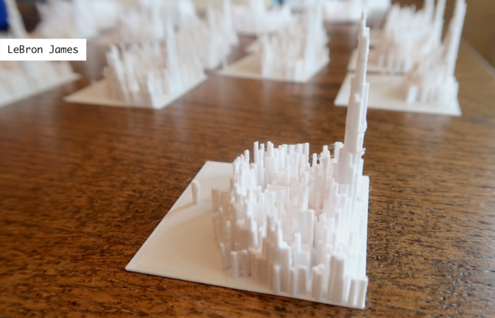
LeBron James on the Cleveland Cavaliers improved his three-point shooting this season, but his strength is taking it to the hole. Compared to Harden’s chart, the middle area looks less cavernous.
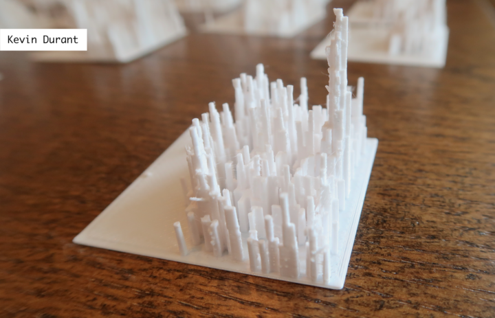
Kevin Durant’s shot distribution is kind of a cross between the previous two. This comes from mid-range shots, many at the elbow and shots to the side of the lane. If you’re familiar with the Golden State Warriors’ style of play, this probably doesn’t surprise you.
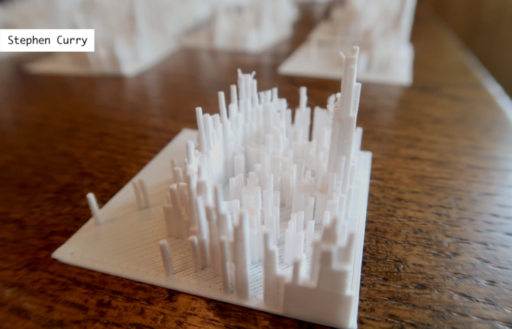
Stephen Curry of the Golden State Warriors makes a lot of threes and shoots mid-range shots fairly evenly across the floor. The most distinguishing characteristic is how far away from the line that Curry makes threes. This is more obvious when you actually hold the distribution and compare it against others.
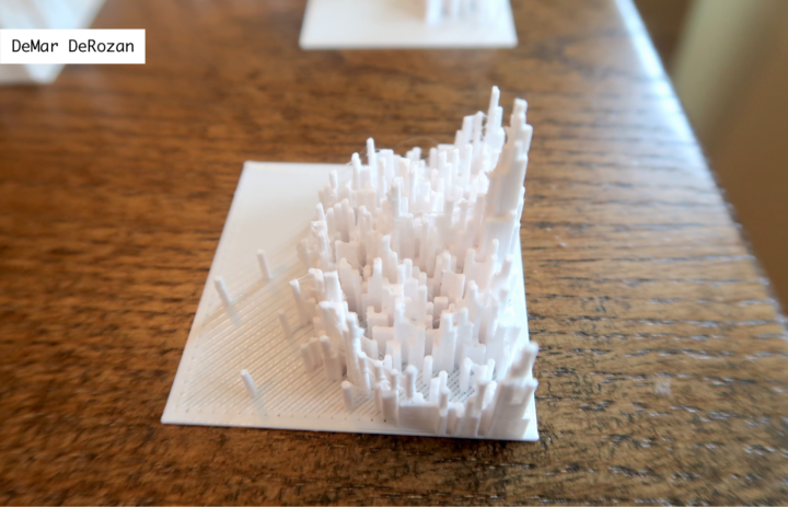
DeMar DeRozan on the Toronto Raptors gets to the foul line a lot, and you can see his willingness to drive for contact with a subtle trail in the middle of the lane.
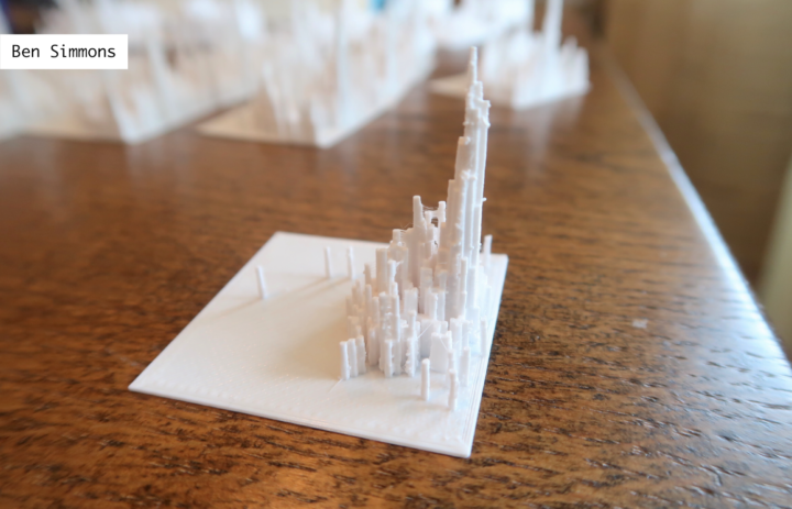
In contrast to other guards in the league, Ben Simmons on the Philadelphia Seventy-Sixers plays to his strengths within fifteen feet of the basket. With the exception of a couple of makes outside the three-point arc, Simmons’ distribution looks more like a center’s. However, his assist numbers are that of a point guard’s.
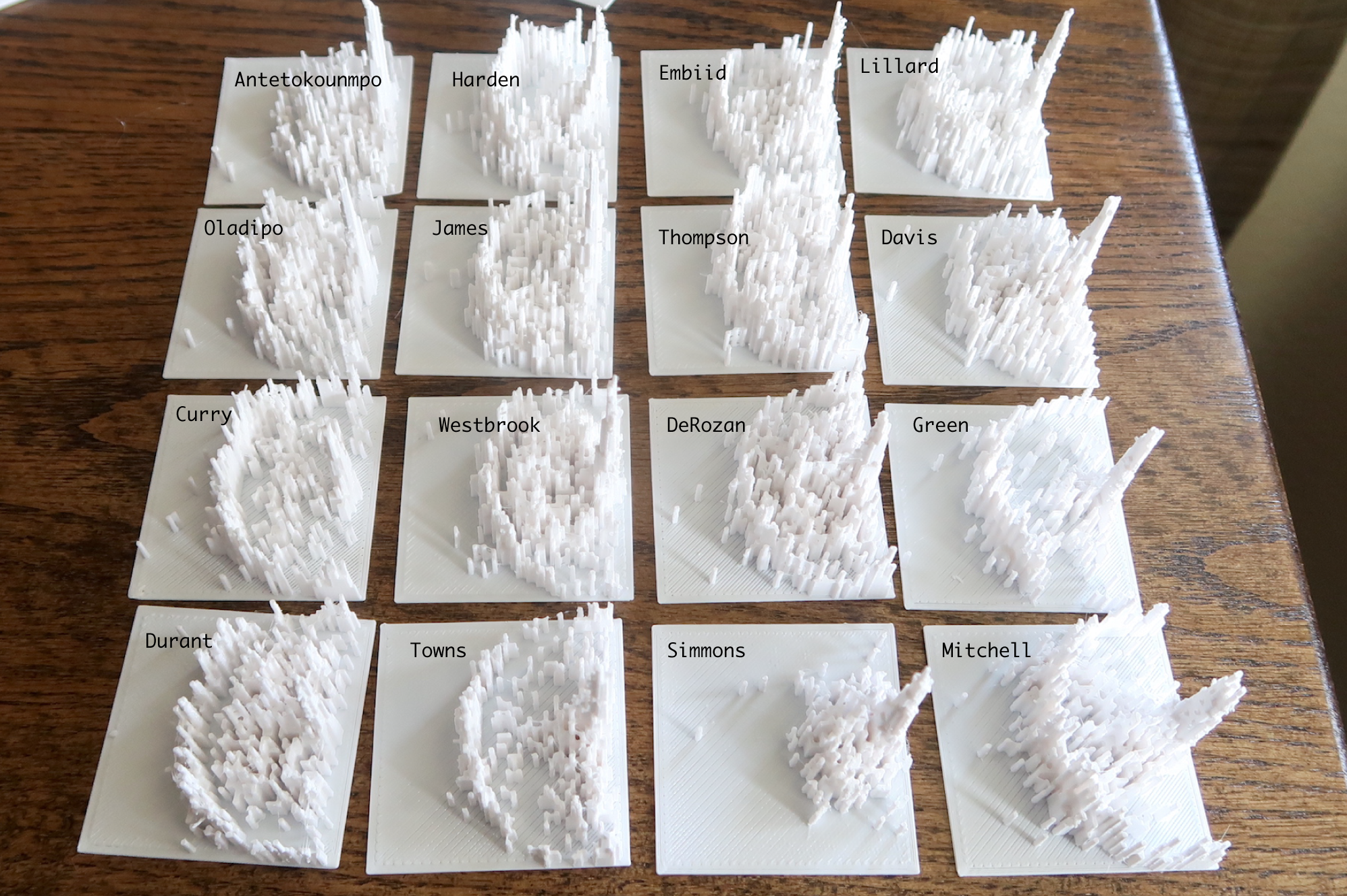
Anyways, you get the idea. Once I figured out what I was doing, I couldn’t stop printing. These are most of the notable players from this season’s playoffs.
What I Learned
I learned a lot on the technical side about how to get from data to R to printing. It initially seemed like a straightforward task. I had the data, I knew how to get the data in the right format, and I knew how to export already. But 3-D printing has its little intricacies that requires trial and error.
I enjoyed the process.
There was something fun about walking back and forth between the printer in my garage to the computer in the office — and then waiting a long time to see the finished object. Maybe I felt a little bit like my dad who’s good with saws, hammers, and wood.
I’ll describe my process in more detail in a tutorial.
My main takeaway was that there appears to be value in being able to touch the data. I could make a digital version of the 3-D prints, rotate them around with my mouse, zoom in and out, and basically see the same thing.
But holding the models in my hand added something. I could walk around my desk to see different angles or just move my face closer to get a more detailed view.
That said, I wouldn’t use 3-D printing for data exploration. It takes hours to print these things, which isn’t exactly conducive to quick data play. But data presentation, maybe? Would it encourage others to look more closely at the data you print?
Now What?
I would have kept on printing, but I reached a limitation of the physical world that I rarely run into in the digital. I ran out of filament, which is the 3-D printing equivalent of ink or toner in a paper printer. So I have to wait for more filament to arrive.
The next print job in the queue is variable bin sizes. Instead of one square foot per cell, I wanted to try larger bins to reduce noise, make patterns more obvious, and to increase the physical size of columns in the print.
If you look at the photos above, you see a lot of peaks and valleys, especially in the mid-range area. You can also see random plastic bits sticking out towards the top of columns. This comes about when the melted filament isn’t quite hardened yet when a new layer starts. The larger physical size should help with that (along with temperature and print speed adjustments that I haven’t gotten into yet).
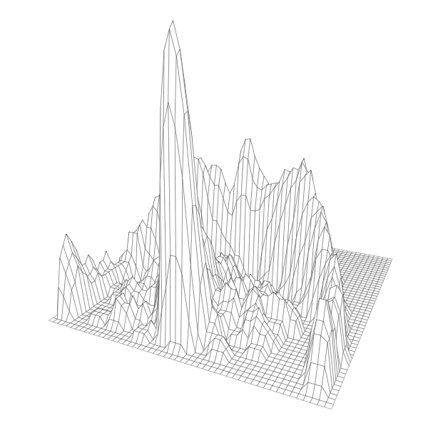
I also wanted to try smoothing the distributions out to a surface instead of discrete bars. Sacrificing accuracy, I’m curious if the surface provides something more useful in terms of seeing patterns.
After that, can I generalize the process? It’s easy to see how this can apply to other datasets where physical space is one of the components. It’s shrinking down something that you usually see on a larger scale, which provides a quick mental connection.
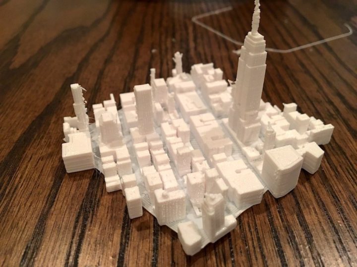
For example, Mapzen (which shut down earlier this year) built a tool to export buildings for 3-D printing.
A few year back, Malika Khurana experimented with 3-D printing textures as a way to communicate data. I grew curious and tried some of my own, mainly with concavity.
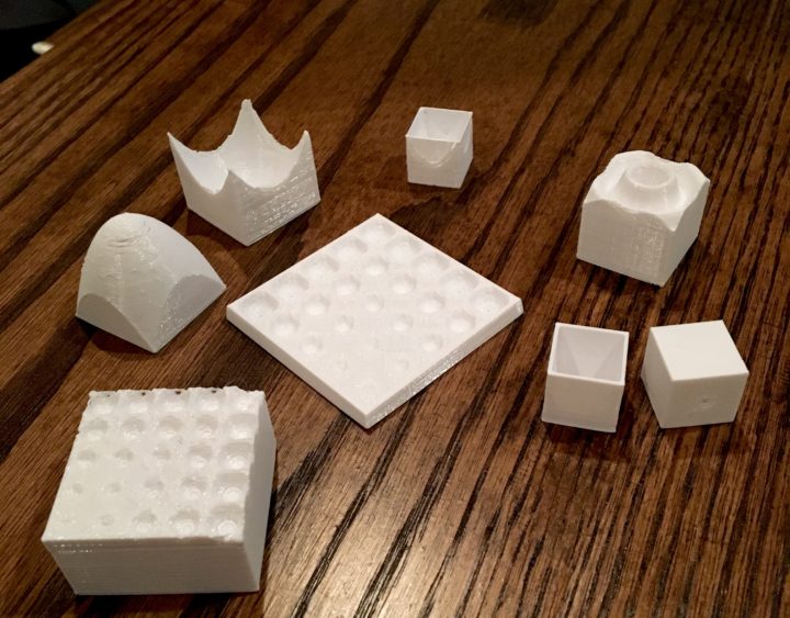
Can the physical supplement the digital? What is the tactile equivalent of visualization for those who can’t see? Would augmented reality provide a similar experience? I feel like these questions could use an answer.
Chart Type Used

Become a member. Support an independent site. Get extra visualization goodness.
See What You Get