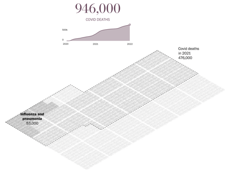
Sergio Peçanha and Yan Wu, for The Washington Post, used a combination unit chart with individual icons to represent the scale and weight of the near million Covid deaths in the United States.
Compare this with NYT’s particle-based charts and Axios’ scaled squares. It’s kind of in between the two in level of abstraction, but all three carry similar messages, with a focus on the one-million mark.

 Visualize This: The FlowingData Guide to Design, Visualization, and Statistics (2nd Edition)