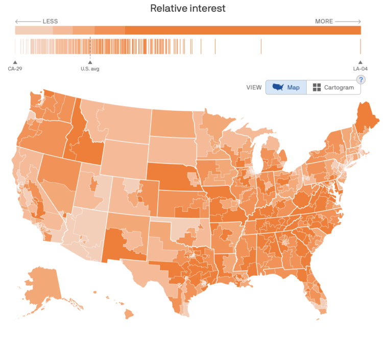
To estimate public interest in the many political issues across the United States, Axios used Google Trends data to map issues by congressional district. Switch between the many topics, and you see a choropleth map (that can change to a cartogram), along with a barcode chart to show the distribution of interest among all districts.
I’m not sure if it’s that beneficial to see the overall geographic distributions for most topics, but it’s useful as a point of reference to look at specific districts. For me, the barcode chart is the most interesting with the distributions shifting quite a bit from topic to topic.


 Visualize This: The FlowingData Guide to Design, Visualization, and Statistics (2nd Edition)