Deaths by Firearm, Compared Against Injury-Related Deaths

The Centers for Disease Control and Prevention track cause of death over time, under several classifications and groupings. Among 1- to 19-year-olds, regulations decreased motor vehicle deaths, but deaths by firearms increased and became the leading mechanism in 2018.

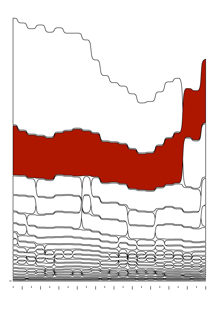
Firearms Are the Leading Injury Mechanism

Among 1- to 19-year-olds in the United States, from 1999 to 2020.

DEATHS

16,709

As motor vehicle deaths decreased, firearm deaths increased and became the leading cause of injury-related death in 2018, among 1- to 19-year-olds.

Motor Vehicle Traffic

Firearm

Drowning

Suffocation

Poisoning

Fire

0

1999

2000

’01

’02

’03

’04

’05

’06

’07

’08

’09

’10

’11

’12

’13

’14

’15

’16

’17

’18

’19

’20

SOURCE: Centers for Disease Control and Prevention

DEATHS

16.7k

As motor vehicle deaths decreased, firearm deaths increased and became the leading cause of injury-related death in 2018, among 1- to 19-year-olds.

Motor Vehicle Traffic

Firearm

Drowning

Suffocation

Poisoning

Fire

0k

2000

’02

’04

’06

’08

’10

’12

’14

’16

’18

’20

SOURCE: Centers for Disease Control and Prevention

Become a member. Support an independent site. Make great charts.

See What You Get

Learn to Visualize Data See All →

How to Make Cartograms in R

While the reshaped geography doesn’t work all the time, the use of size to show data can be more intuitive in some cases.

How to Make Animated Histograms in R, with ggplot and gganimate

Make them move to show a shift in distributions over time.

How to Make an Animated Growth Map in R

Although time series plots and small multiples can go a long way, animation can make your data feel more real and relatable. Here is how to do it in R via the animated GIF route.

How to Visualize Hierarchical Graphs in R, with ggraph and tidygraph

Network graphs are a good way to find structure and relationships within hierarchical data. Here are several ways to do it.

Favorites

Top Brewery Road Trip, Routed Algorithmically

There are a lot of great craft breweries in the United States, but there is only so much time. This is the computed best way to get to the top rated breweries and how to maximize the beer tasting experience. Every journey begins with a single sip.

The Stages of Relationships, Distributed

Everyone’s relationship timeline is a little different. This animation plays out real-life paths to marriage.

Unemployment in America, Mapped Over Time

Watch the regional changes across the country from 1990 to 2016.

Reviving the Statistical Atlas of the United States with New Data

Due to budget cuts, there is no plan for an updated atlas. So I recreated the original 1870 Atlas using today’s publicly available data.