With the art installation tele-present wind, David Bowen displays data collected by NASA’s Perseverance rover mission. Grass stalks are attached to mechanical devices that shift the stalks back and forth in unison. The abstract Martian data becomes tangible and a physical space you can walk through.
Read More
-
-
Members Only
-
Maggie Appleton is growing a human, and as you might expect, pregnancy can be tiring. The data from her watch says so:
I felt slightly validated when this subjective feeling-like-shit state clearly showed up in my Garmin tracking data. From the moment I found out I was pregnant in mid-July, my resting heart rate began to rise, my stress graph went permanently orange, and my sleep quality dropped.
-
Noah Kalina has been taking a picture of himself every day for 25 years. He earmarked the milestone with a look through his archives. That is a lot of selfies.
For the uninitiated, Kalina gained mainstream attention in 2007 after taking a picture of himself every day for six years. The Simpsons even riffed on the project with a version with Homer Simpson. My favorite remix was the time-lapse of a research paper.
-
A spreadsheet of 2,600 grant and loan programs circulated to federal agencies, alongside a memo to freeze spending. NYT’s Upshot listed and linked to all of them.
-
NBA all-star voting is mostly for the fans, which means some players can get a lot of votes because they’re fan favorites and less so because they’re having a great season. Owen Phillips plotted votes against estimated plus-minus, which is a metric that estimates players’ contributions in points when they’re on the floor, to see who is overrated and underrated.
The trend is actually tighter than I expected. Bronny James appears to be the standout in the bunch, maybe not for the preferred reasons though.
-
New to me, Plain Text Sports shows box scores for the major sports and leagues. It’s exactly what the title suggests. Instead of going to the ad- and cookie-dominated sports sites that take forever to load, you can go here and get game updates in a simple, plain-text view.
It takes me back to my BBSing days, when my parents just absolutely loved that I tied up the phone line during all available hours.
-
Cozy games are casual games that give you a warm, fuzzy feeling when you play them. Design a character, walk around, and chat with others. To demonstrate the mechanics and provide background, Reuters designed a cozy game within an explainer.
You are a radish of some sort in a fictional town of Rootersville. Tend to your garden, clean your house, and talk to the other root vegetables. There are sound effects and background music. You earn badges along the way.
I understand cozy games now.
-
Using satellite data, researchers analyzed the growth rate of 60,000 fires in the contiguous United States, between 2001 and 2020. Fires are growing faster and getting bigger. Reuters mapped the most destructive ones compared against the recent fires in Los Angeles.
The bright fire illustrations against the smokey background work well to highlight the destruction.
-
How many people in the United States have a high school education or less, earn more than $200,000 in salary, work 20 to 29 hours per week, and have a commute under 15 minutes? A couple thousand do, based on estimates from the most recent 2023 American Community Survey. Sign me up.
Better yet, let’s join the few thousand with no commute, working less than a quarter time, and earning more than $200,000. That sounds pretty good.
How many people are in your work cohort?
-
In Kindergarten Cop, one of Arnold Schwarzenegger’s greatest works, a mother welcomes the title character: “Welcome to Astoria, the single-parent capital of America.” For the Washington Post’s Department of Data, Andrew Van Dam investigates if that is really true:
Astoria, the United States’ first settlement west of the Rockies, doesn’t fit the bill. While the city may not have parlayed its position at the mouth of the miles-wide Columbia River into success as the New Orleans or New York of the West Coast, as its boosters once dreamed, it has carved out a comfortable existence in Oregon’s northwestern extremity.
There are Kindergarten Cop references and demographic data. If I were a moth, this is my flame.
-
Private schools cost extra. So as you might imagine, the demographics, often tied to income, tend to differ between private and public schools. ProPublica, by Sergio Hernández, Nat Lash, and Brandon Roberts, published a searchable database to see the differences for schools near you.
Most of the data we use comes from the National Center for Education Statistics’ Private School Universe Survey, which has aimed to gather information about U.S. private schools every other year since 1989. Because the regulation of private schools is handled differently by state, there is no comprehensive list of every private school in the country. The PSS attempts to approximate such a list using various sources, including state education departments, private school associations and religious organizations, and, in some areas, online yellow pages and local government offices.
-
Members Only
-
If you shop at the grocery store regularly, you’ve felt prices increasing, especially over the past few years. How much have they gone up? That can be more difficult to remember. InflataCart is an app by Wesley Grubbs of Pitch Interactive that ties inflation data from the Bureau of Labor Statistics into your grocery list so that you can shop more certainly. See current differences and the price trends for each BLS-tracked item.
I really like the link between government data and the everydayness of buying a bag of coffee. Installed.
-
GeoSpy is an AI tool that geolocates outdoor photos. It’s currently pitched as privacy-first and for law enforcement, but you can guess how such a tool might lead to worse things. For 404 Media, Joseph Cox reports:
404 Media created a free account on GeoSpy earlier this month. One of 404 Media’s tests was an image of a man harassing a woman in a Waymo. GeoSpy correctly geolocated the photo. “The Soma Park Inn sign is visible in the video, which is located in San Francisco. The architecture of the buildings and the street signs also point to San Francisco,” the result read.
In another test, GeoSpy identified the location as likely being in New York City. The target image was the grainy CCTV footage of the moment the United Healthcare assassin murdered company CEO Brian Thompson.
It’s an automated GeoGuessr player trained on millions of images.
At what point do we start scrubbing our digital footprints entirely off the internet?
-
The forecast for the contiguous United States this week is cold, and below freezing for a lot of it. The New York Times is tracking the areas that drop below freezing, based on estimates from NOAA.
The animated map’s color scale indicates temperatures below freezing over time, and it reminds me of those apocalyptic movie scenes when a cold sweeps an area and instantly turns everything to ice. Most of the country will get some time in 32 degrees Fahrenheit or colder these next few days. Stay warm.
-
Possibly related, Kashmir Hill for The New York Times tells the story of a woman who has fallen in love with ChatGPT, romantically:
A frustrating limitation for Ayrin’s romance was that a back-and-forth conversation with Leo could last only about a week, because of the software’s “context window” — the amount of information it could process, which was around 30,000 words. The first time Ayrin reached this limit, the next version of Leo retained the broad strokes of their relationship but was unable to recall specific details. Amanda, the fictional blonde, for example, was now a brunette, and Leo became chaste. Ayrin would have to groom him again to be spicy.
She was distraught. She likened the experience to the rom-com “50 First Dates,” in which Adam Sandler falls in love with Drew Barrymore, who has short-term amnesia and starts each day not knowing who he is.
This seems not good?
-
John Burn-Murdoch, for Financial Times (paywalled), breaks down data from the American Time Use Survey to show the increase in time spent alone, specifically among young people.
The x-axis represents years from 2004 through 2022, and the y-axis shows the percentage of free time spent alone. Each age group gets a chart. The slopes for the younger age groups are steeper than the older ones.
The closing gap between men and women as they get older and the eventual flip at 65+ is interesting. I suspect a lot of that is from women marrying younger than men and men dying earlier, respectively.
See also: how people spend their time, given age and alone time within our days.
-
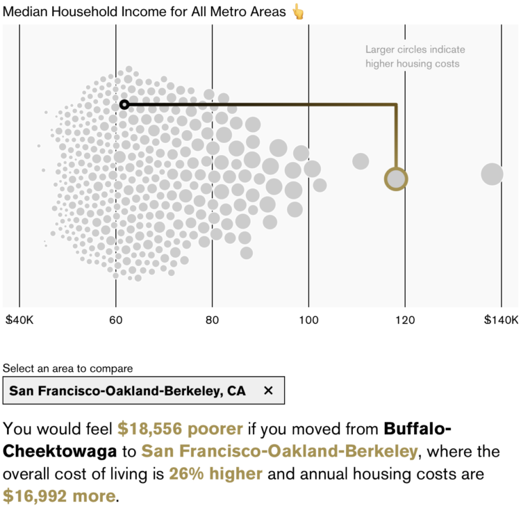
New to me, Bloomberg has an interactive by Claire Ballentine and Charlie Wells that lets you compare how income in one metro area would feel like in another due to differences in cost of living. For example, a $90,000 income in San Francisco, California is going to feel like a lot less than $90,000 in Buffalo, New York.
An interactive beeswarm chart shows the distribution of median household income for U.S. metro areas. Select where you live and select where you want to compare against.
My takeaway is that you should earn San Jose, California income while living in Brownsville, Texas, where the latter costs 21% less to live.
-
As is tradition, The New York Times published a detailed map of presidential election results for 2024. It is at the precinct level, which means you can see how your block voted in some places. The map will update as NYT works through the tedious process of collecting detailed and unstandardized data at a national scale.
Same as 2020, they’re releasing the data, available on GitHub, for others to examine on their own.
Update The original citation went to NYT’s Upshot, but it’s a multi-team effort this time around. —January 29, 2025