• Membership
  • Newsletter
  • Projects
  • Learning
  • About
  • Member Login
  • January 6 defendants, a breakdown

    January 6, 2025

    Topic

    Infographics  /  conviction, riots, Washington Post

    1,580 people were charged with federal crimes for the riot at the U.S. Capitol on January 6, 2021. The Washington Post shows the court status of each as of December 20, 2024. Many are expecting pardons.

    I’m not sure what the icons are. Hair? Blobs for visual variation?

  • Tracking the effects of Congestion Pricing in New York

    January 6, 2025

    Topic

    Statistical Visualization  /  congestion, New York, tolls, traffic

    In an effort to reduce traffic, New York launched a program that charges a toll to enter defined areas that are often congested. To see if the program works, Joshua Moshes and Benjamin Moshes, as a student project, made a tracker that logs Google Maps traffic data at checkpoints. Current travel times are compared against average times before the program launch.

    It looks like there’s a shift on this first day, and I am sure many other cities are watching.

  • Where and when to travel

    January 6, 2025

    Topic

    Statistical Visualization  /  Bloomberg, prices, travel

    Bloomberg put together a list of places to visit in 2025. Most of my interest rested on the charts for each place that show the best month to go, based on your nearest origin for flights and hotel prices. Color-coding for best and worst times incorporate context such as holidays and weather.

  • Star Wars galaxy map

    January 3, 2025

    Topic

    Maps  /  fiction, Star Wars

    I can’t vouch for the accuracy of this Star Wars map, but I appreciate the spirit of visualizing fictional spaces.

  • Convergence to sameness in the algorithm

    January 2, 2025

    Topic

    Statistics  /  algorithm, creation, New York Times

    As my father-in-law’s Facebook feed would suggest, the “algorithm” has a way of converging hard into your interests and everything starts to look familiar. For NYT Opinion, Kirby Ferguson ponders what that means for creativity.

    In analysis, we often seek patterns in data. Convergence is an indicator that something is happening. However, convergence in our everyday lives might not be the best route.

  • 2024.

    December 31, 2024

    Topic

    Site News  /  annual review

    I haven’t reviewed a year on FlowingData since 2020, which seems like a serious oversight in the system (me). I need to get this annual review out before my boss (also me) finds out. To my credit, I pushed out the picks for best data visualization projects of the year, but I guess it’s time to push the attention inwards.
    Read More

  • Visualization  /  best-of

    Best Data Visualization Projects of 2024

    Many datasets were analyzed and many charts were made this year. If I liked a project, it was on FlowingData. But only a handful can be the best. These are my favorite data visualization projects from 2024.

    Read More
  • Seeing the single largest tree in the forest of 400 billion

    December 30, 2024

    Topic

    Statistics  /  CTrees, Fabien Wagner, rainforest, tree

    Fabien Wagner works with CTrees in an effort to map tree canopy height in the Amazon rainforest. In the process, he might have found the largest tree in the Amazon:

    I am currently working on a model to map the tree canopy height of the entire Amazon forest using Planet NICFI images. The model can detect canopy height up to 45-50 meters. By inspecting the results, we can discover the tallest and largest trees in the entire Amazon.

    For this tree, specifically: I had previously searched the data for individual trees with a crown diameter of 50-55 meters, which to my knowledge, is the largest possible crown size observed in the Amazon. After finding a few trees in this range, I realized that, statistically, an even larger tree could exist. That’s when I expanded my search, bringing me to this exceptional specimen.

    Pretty big.

  • Home insurance companies dropping customers

    December 27, 2024

    Topic

    Maps  /  climate, insurance, New York Times

    Because of a warming planet with more wildfires and hurricanes, it’s growing more common for insurance companies to stop insuring people with existing policies. For the New York Times, Christopher Flavelle, with analysis and graphics by Mira Rojanasakul, describes the coverage shift.

    The consequences could be profound. Without insurance, you can’t get a mortgage; without a mortgage, most Americans can’t buy a home. Communities that are deemed too dangerous to insure face the risk of falling property values, which means less tax revenue for schools, police and other basic services. As insurers pull back, they can destabilize the communities left behind, making their decisions a predictor of the disruption to come.

    Oh good.

  • Year of tornadoes

    December 26, 2024

    Topic

    Maps  /  New York Times, tornado

    For the New York Times, Marco Hernandez visualized all the tornadoes in 2024, which amounted to more than the usual.

    Not only were there more tornadoes reported, but 2024 is also on track to be one of the costliest years ever in terms of damage caused by severe storms, according to the National Center for Environmental Information. Severe weather and four tornado outbreaks from April to May in the central and southern United States alone cost $14 billion.

    Oh good.

  • More time on the plane, but more flights arriving early

    December 24, 2024

    Topic

    Statistics  /  airlines, schedule, Upshot

    By just about every metric, flights are slower now than they were 30 years ago. However, the percentage of flights that arrive early is higher, based on an analysis by Ben Blatt for NYT’s Upshot.

    Why do today’s flights arrive early more often, even though they’re slower? Airlines have extended their scheduled flight durations even more than the flights have lengthened in actual duration. The average scheduled duration from J.F.K. to Los Angeles has increased 23 minutes since 1995, according to an Upshot analysis of Bureau of Transportation Statistics data.

    Publish a metric that involves money, and companies optimize for it somehow. In this case, the airlines lowered expectations to create a buffer.

  • When cities last saw snow on Christmas

    December 23, 2024

    Topic

    Maps  /  Bloomberg, Christmas, climate, snow

    Christmas is coming. For some, that means snow on the ground, but as areas get less snow than in previous years, that means more regular Christmases than White Christmases in the United States. For Bloomberg, Denise Lu mapped the last time cities had at least one inch of snow fall or accumulation.

    Compared to Christmases since 1970, last year’s holiday had the lowest average snow on the ground across the continental US. The chance for a white Christmas this year may be higher than last year, according to AccuWeather, but many areas will likely still not see any snow.

    Bonus points for the shoveler with a Santa hat that doubles as a progress bar:

    This is in contrast to the Washington Post piece from last week. WaPo used similar data from NOAA but highlighted cumulative snowfall instead of the lack of it.

  • Data Advent Calendar

    December 23, 2024

    Topic

    Data Art  /  Advent, embroidery, Jordan Cunliffe

    Jordan Cunliffe uses embroidery to explore and visualize data. This year, headed towards Christmas, he’s been posting one stitch per day for a Data Advent Calendar.

  • Counting the Christmas days with snow

    December 20, 2024

    Topic

    Maps  /  Christmas, snow, Washington Post, weather

    This is a fun one by Dylan Moriarty for the Washington Post. Punch in your city to see the percentage of Christmas days (or Hanukkah, New Year’s Eve, or Winter Solstice) since 1940 when it snowed.

    It’s nice and corny like it should be, with holiday illustrations and snow falling on the screen. There’s even a data postcard that you can download and share with all your friends and family, because they will most definitely be interested.

    Maybe it’s just the movies telling me so, but there’s something special about snow falling, holiday lights, Christmas music playing in the background, and a warm drink in hand.

  • Map of walkable neighborhoods

    December 20, 2024

    Topic

    Maps  /  city, local, walking

    Researchers at Sony Computer Science Laboratories in Rome estimated the time it takes to walk to places for amenities such as education, healthcare, and restaurants:

    Proximity-based cities have attracted much attention in recent years. The ‘15-minute city’, in particular, heralded a new vision for cities where essential services must be easily accessible. Despite its undoubted merit in stimulating discussion on new organization of cities, the 15-minute city cannot be applicable everywhere, and its very definition raises a few concerns. Here we tackle the feasibility and practicability of the 15-minute city model in many cities worldwide. We provide a worldwide quantification of how close cities are to the ideal of the 15-minute city. To this end, we measure the accessibility times to resources and services, and we reveal strong heterogeneity of accessibility within and across cities, with a pivotal role played by local population densities.

    Check your city on the interactive map. The Washington Post has a version that is easier to use, but it only shows the data for a subset of cities in the United States, whereas the Sony map shows cities around the world with more granular breakdowns.

  • Members Only

    Visualization Tools and Resources, December 2024 Roundup

    December 19, 2024

    Topic

    The Process  /  roundup

    Here’s the good stuff for the month: things to use, things to poke at, and things to learn from.

  • Probability does not exist

    December 19, 2024

    Topic

    Statistics  /  David Spiegelhalter, probability, uncertainty

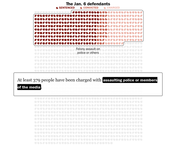
    Probability itself is an expression of uncertainty, but the calculations behind the percentages can seem objective. David Spiegelhalter argues that this is impossible:

    My argument is that any practical use of probability involves subjective judgements. This doesn’t mean that I can put any old numbers on my thoughts — I would be proved a poor probability assessor if I claimed with 99.9% certainty that I can fly off my roof, for example. The objective world comes into play when probabilities, and their underlying assumptions, are tested against reality (see ‘How ignorant am I?’); but that doesn’t mean the probabilities themselves are objective.

    Some assumptions that people use to assess probabilities will have stronger justifications than others. If I have examined a coin carefully before it is flipped, and it lands on a hard surface and bounces chaotically, I will feel more justified with my 50–50 judgement than if some shady character pulls out a coin and gives it a few desultory turns. But these same strictures apply anywhere that probabilities are used — including in scientific contexts, in which we might be more naturally convinced of their supposed objectivity.

    Riffing off George E. P. Box’s “All models are wrong, but some are useful”, Spiegelhalter concludes, “In our everyday world, probability probably does not exist — but it is often useful to act as if it does.”

  • Elon Musk’s posting (and sleep) schedule

    December 19, 2024

    Topic

    Statistical Visualization  /  Economist, Elon Musk, Twitter

    Not to dwell on Musk, but I was reminded of this dot plot by the Economist that shows when he posted on Twitter/X and how much. The volume picked up a bit post-acquisition.

  • Online reach of Elon Musk on X

    December 19, 2024

    Topic

    Statistical Visualization  /  Elon Musk, social media, Washington Post, X

    As you can imagine, Elon Musk, the owner of X, has a prominent influence on the social media platform. For the Washington Post, Jeremy B. Merrill, Trisha Thadani, and Kevin Schaul show the scale through view counts (on the x-axis) and time since posting (on the y-axis).

    I’m not sure how much I trust view count accuracy on X, but you can at least see the relative weights of what the company wants you to see.

    Mostly, I put this here for the flaming data point at the beginning of the piece and to highlight how it reminds me of the interactive by Periscopic a few years back. It starts with a single point for the anecdote and then multiplies for the patterns.

  • Data Underload  /  chains, grocery

    Network of Supermarket Chains

    Here’s the current landscape of supermarket parent companies and their subsidiaries — national chains, regional, local, co-ops, specialty, ethnic, and discount.

    Read More
  • Page 12 of 392
  • <
  • 1
  • ...
  • 9
  • 10
  • 11
  • 12
  • 13
  • 14
  • ...
  • 392
  • >

Analyze, visualize, and communicate data usefully, beyond the defaults.

Become a member →

Recently for Members

May 8, 2025
When the data is not what it seems

May 1, 2025
Finding the Right Charts

April 24, 2025
Visualization Tools, Datasets, and Resources – April 2025 Roundup

April 17, 2025
Breaking Out of Chart Software Defaults

April 15, 2025
Line Chart with Decorative Neon Accents

Browse by Chart Type See All →

Pictogram Beeswarm Bubble Chart Choropleth Map Density Plot Surface Plot Spike Map Streamgraph Organogram Venn Diagram

Browse By Topic

  • Visualization

    Seeing data

  • Maps

    Seeing geographic data

  • Infographics

    Explaining data

  • Networks

    Connecting data

  • Statistics

    Analyzing data

  • Software

    Working with data

  • Sources

    Getting data

  • Design

    Making data readable

Get the Book

Visualize This: The FlowingData Guide to Design, Visualization, and Statistics

Available now.

Order: Amazon / Bookshop

Made by FlowingData

  • The Process

  • Data Underload

  • Chart Everything

  • Guides

  • Books

  • Shop

  • About
  • Contact
  • Newsletter
  • LinkedIn
  • Instagram
  • Bluesky
  • RSS
Copyright © 2007-Present FlowingData. All rights reserved.