The National Survey of Family Growth, run by the Centers for Disease Control and Prevention, asks participants about their birth and relationship history.
Nathan Yau
-
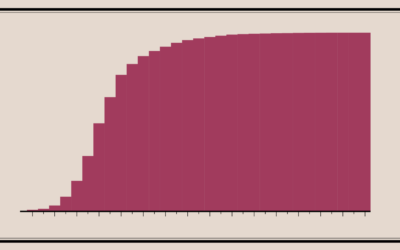
When Americans Had Intercourse with Opposite Sex for the First Time
-
Members Only

Visually Inefficient
Trading optimized visual efficiency in charts for joy and interest.
-

Diagram of watercolors from the 17th century
In 1692, artist A. Boogert published a guide to watercolors, showing the thousands…
-
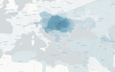
Mapping the boundaries of history
While geographic boundaries can often seem like a semi-static thing, they’ve changed a…
-
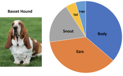
Pie charts of dogs
John Rich made pie charts of dog body proportions. This is very important.…
-
Members Only

How to Make an Animated Donut Chart in R
There are “better” ways to show proportions over time, but sometimes you just want an animated donut.
-
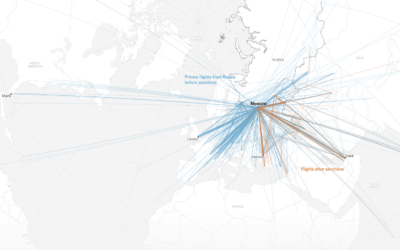
Shifting flight paths for wealthy Russians
For The New York Times, Pablo Robles, Anton Troianovski, and Agnes Chang mapped…
-

Possible lead exposure around small airports
Thousands of smaller airplanes are still allowed to use leaded fuel, which can…
-
Members Only

Gridlines
They serve as a point of reference in some charts and guide the eyes in others, coming in different styles and layouts.
-
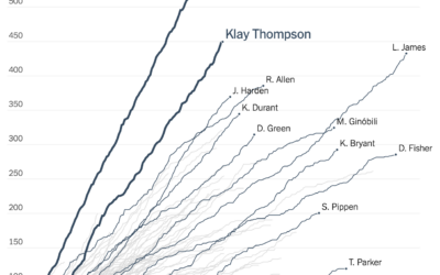
Cumulative 3-pointers for the Splash Brothers
Tonight is game six of the NBA Finals. If the Golden State Warriors…
-

Communicating risk in the context of daily living
Wayne Oldford, a statistics professor at the University of Waterloo, explains risk in…
-

Hands-On Data Visualization, an open-access book on interactive visualization for beginners
Hands-On Data Visualization, by Jack Dougherty and Ilya Ilyankou, is an open-access book…
-

Unreliable FBI crime data
The Marshall Project and Axios report that the FBI changed their reporting system…
-
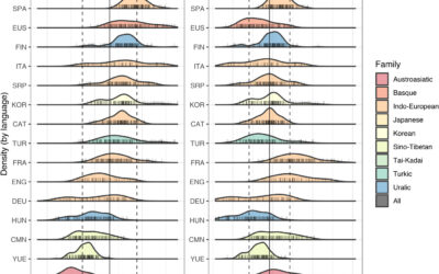
Different languages, but similar information rates
Christophe Coupé and company analyzed speech rate (on the left) across different languages,…
-

Map of closest airports everywhere
This fun interactive map by William B. Davis shows you the ten closest…
-
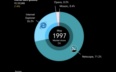
Browser share over time
James Eagle used an animated donut chart to show browser share from 1996…
-
Members Only

Using Absolute vs. Relative Scales
The key is assigning an appropriate amount of weight, statistically and visually, for comparisons that make sense.
-
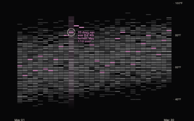
History of heat records in major U.S. cities
Matt Daniels and Russell Goldenberg for The Pudding are tracking heat records in…
-

Garbage in space
There are thousands of satellites that orbit Earth, with about half of them…
-

Maps of noise
Karim Douïeb, in collaboration with Possible, mapped noise in Paris, New York, and…
Recently for Members
Second Edition
 Visualize This: The FlowingData Guide to Design, Visualization, and Statistics (2nd Edition)
 Visualize This: The FlowingData Guide to Design, Visualization, and Statistics (2nd Edition)
New tools, refined process.
Browse by Chart Type See All →


