Is there something that comes after we die? For the Pudding, Alvin Chang…
Nathan Yau
-
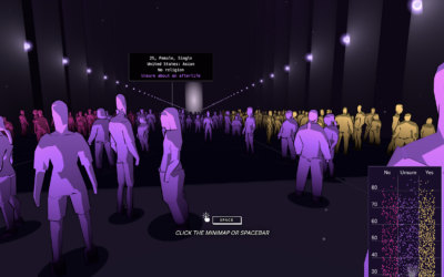
Beliefs in life after death
-
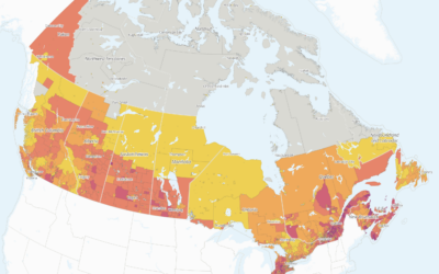
Exposure to tariffs in Canada
Researchers at the School of Cities, a center at the University of Toronto,…
-
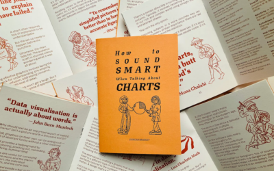
Sound smart about charts
Duncan Bradley made a zine of one-liners from data visualization folks. It is…
-
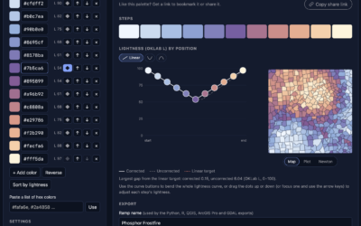
Color gradients that are accessible and perceptually steady
It has been a whole ten minutes since posting a color selection tool,…
-

Extract color palettes from images
OKpalette is a tool to grab a color palette from an image. Load…
-

Bedazzled campus surveillance
Over summer break, MIT installed over 500 AI-enabled surveillance cameras around campus. In…
-
Members Only
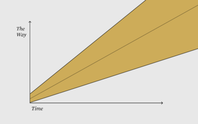
Charts we made along the way
This week is about finding your way by getting lost in the data.
-

Jagged intelligence demonstrated with a puzzle
Large language models are heavily dependent on training data to determine what comes…
-
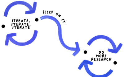
Ideas and thought in the detours
For NYT Opinion, Giorgia Lupi argues that the best ideas come from getting…
-

Dario Amodei on SNL Weekend Update discussing doom
Jane Wickline impersonated Anthropic CEO Dario Amodei for Saturday Night Live’s Weekend Update.…
-

Elevation map of the world
Bert Spaan, with help from Jules Schoonman, made an elevation map for the…
-
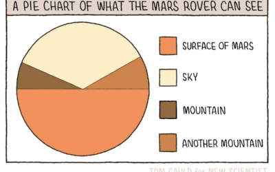
Pie chart of what the Mars rover can see
New to me, Tom Gauld, for New Scientist, made a fine pie chart…
-

Game to understand the president’s crypto endeavors
Thin Air, Real Money is a game to help you understand the cryptocurrency…
-
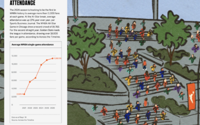
Illustration of 30 WNBA seasons
Celebrating 30 seasons of the WNBA, ESPN has a fun piece on the…
-
Members Only

Visualization tools, datasets, and learning resources — September 2026 roundup
Here’s what happened in September.
-

Biggest political donors so far
Using data from the Federal Election Commission, the Washington Post called out the…
-
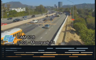
Music generated through live freeway traffic feed
A live Caltrans feed of the southbound 101 highway in California is translated…
-
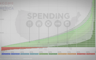
Income and spending inequality
Continuing the four-part series on wealth inequality in America, the most recent video…
-
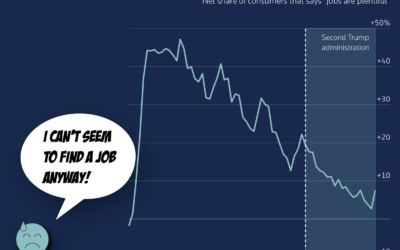
When the economy seems good in numbers but feels bad in reality
When you think about how the economy is doing these days, it can…
-
Annoying agents that ruin the internet
For 404 Media, Jason Koebler collated the dumb emails they receive from dumb…
Recently for Members
Second Edition
 Visualize This: The FlowingData Guide to Design, Visualization, and Statistics (2nd Edition)
 Visualize This: The FlowingData Guide to Design, Visualization, and Statistics (2nd Edition)
New tools, refined process.
Browse by Chart Type See All →