The two counts have been getting closer to each other. The past couple of years accelerated the process.
-
When There Were More Deaths Than Births in the U.S.
-
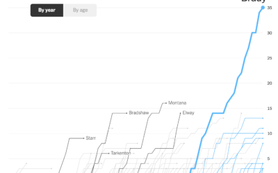
Charts showing Tom Brady’s standout career
Tom Brady announced his retirement from the National Football League, which ends a…
-
Crisis Text Line and data sharing
Crisis Text Line was sharing data with a for-profit business started by its…
-
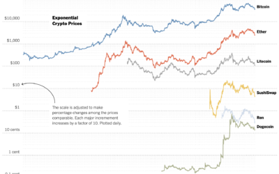
Crypto volatility charts
One of the attractions of crypto is that values can swing into the…
-
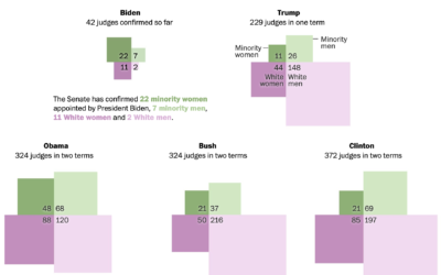
Diversity of federal judge picks, compared by president
Adrian Blanco for The Washington Post used squares connected at the corners to…
-
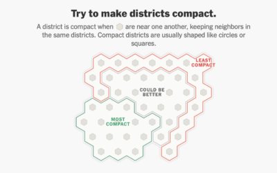
A game to gerrymander your party to power
Ella Koeze, Denise Lu, and Charlie Smart for The New York Times made…
-
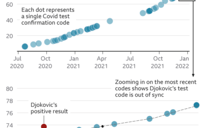
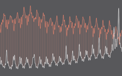
Questioning Novak Djokovic’s Covid tests, based on data
Tennis player Novak Djokovic is not vaccinated against the coronavirus, and as a…
-

Chicken egg color spectrum
Eggs aren’t always white, which is oddly calming in this photo by way…
-
Members Only
Visualization Tools and Learning Resources, January 2022 Roundup
Here’s the good stuff for January.
-
Spotting spurious correlations in health news
When it comes to diet and health, you might see one day that…
-

How Much Americans Make
Median income only tells you where the middle is. The distributions of income are a lot more interesting.
-
Members Only
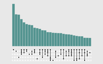
How to Make UpSet Plots in R, with ggplot2 and ggupset
A more readable alternative to Venn diagrams for when you have more than a few sets.
-
Optimized Wordle solver
In case you’re not so good with the words, but feel the social…
-

Scale of the Tonga eruption
Manas Sharma and Simon Scarr used satellite imagery to show the scale of…
-

How N95 masks work
In efforts to reduce further spread of the virus, the US is set…
-

Joke machine learning projects to advance your career
In an automated job climate that analyzes resumes and inspects social profiles, it…
-
Members Only

Boring Charts – The Process 173
Thinking about the differences between boring charts and not so boring charts.
-

Declining U.S. Births
The number of births per month has been decreasing over the past decade. The pandemic seems to have sped up the process in the beginning.
-
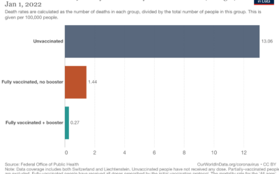
Death rates by vaccination booster status
Our World in Data continues their important work on providing and showing up-to-date…
-
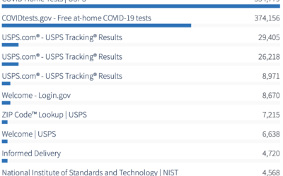
Analytics for U.S. government websites
With the announcement of free Covid-19 tests through the United States Postal Service,…
Recently for Members
Second Edition
 Visualize This: The FlowingData Guide to Design, Visualization, and Statistics (2nd Edition)
 Visualize This: The FlowingData Guide to Design, Visualization, and Statistics (2nd Edition)
New tools, refined process.
Browse by Chart Type See All →


