How Much Americans Make
In the United States, the median annual income among the employed was about $43,000 in 2020. However, by definition, this just tells you where the midpoint is in a distribution. As you probably know, maybe a little too well over the past few years, personal income spans a wide range.
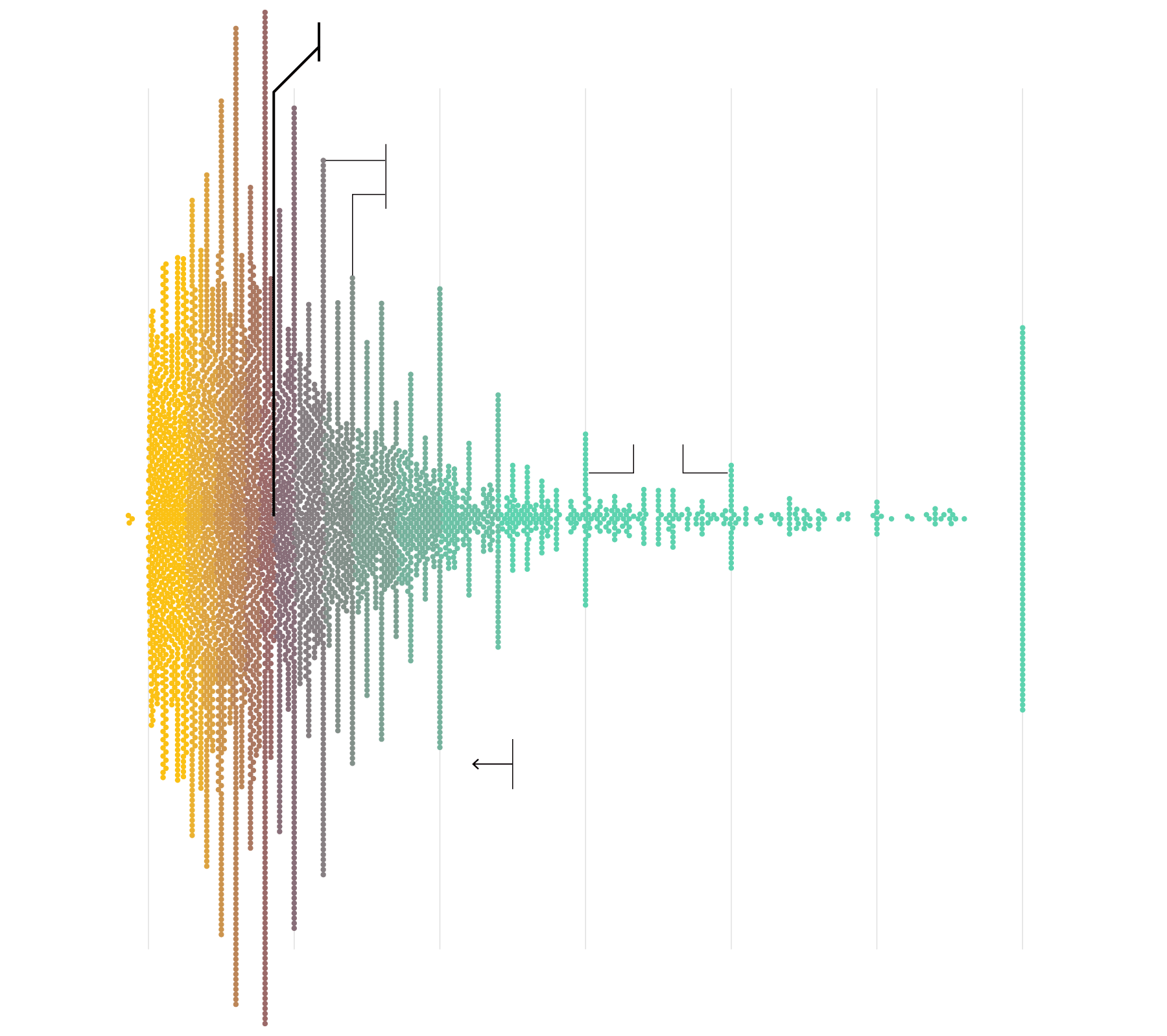
Here’s a more detailed view of how much Americans make per year.
PRE-TAX
INCOME
MEDIAN TOTAL INCOME
$43,000
$0
$50,000
$100,000
$150,000
$200,000
$250,000
$300,000+
Annual income often comes in rounded numbers, as seen in the spikes sticking out at each $10,000.
More round numbers at the $150,000 and $200,000 marks.
About 2% of employed people made $300,000 or more in total income.
Some reported a loss for the year.
In 2020, about 90% of employed people made less than $125,000 in total income.
$0
$50,000
$100,000
$150,000
$200,000
$250,000
$300,000+
PRE-TAX
INCOME
SOURCE: 2020 AMERICAN COMMUNITY SURVEY
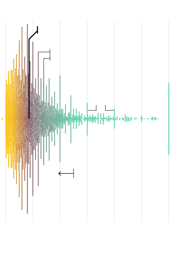
PRE-TAX INCOME
$0k
$50k
$100k
$150k
$200k
$250k
$300k+
MEDIAN TOTAL INCOME
$43,000
Annual income often comes in rounded numbers, as seen in the spikes sticking out at each $10,000.
More round numbers at the $150,000 and $200,000 marks.
In 2020, about 90% of employed people made less than $125,000 in total income.
About 2% of employed people made $300,000 or more in total income.
$0k
$50k
$100k
$150k
$200k
$250k
$300k+
PRE-TAX INCOME
SOURCE: 2020 AMERICAN COMMUNITY SURVEY
Income by Age
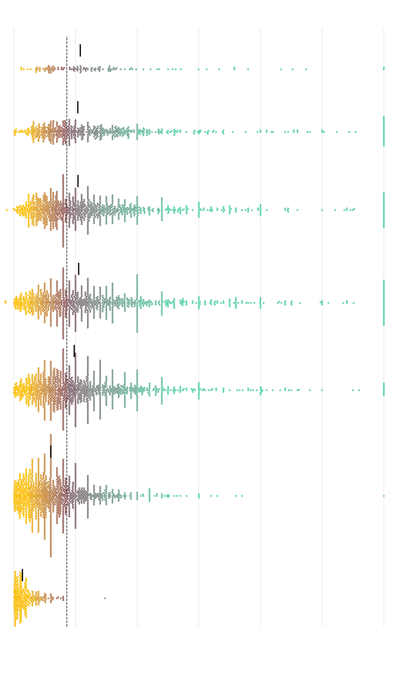
Here’s the same incomes categorized by age.
PRE-TAX INCOME
$0
$50,000
$100,000
$150,000
$200,000
$250,000
$300,000+
$43,000 MEDIAN FOR ALL EMPLOYED
Relatively fewer people are still working at this age.
71 and older
$53,900 MEDIAN FOR AGE GROUP
Normal retirement age in the U.S. is 67. Some likely shift to part-time work while those with higher income seem to stick around longer.
61 to 70
$51,900
51 to 60
$52,000
The distribution of income looks similar from 41 to 60 years old. Although the 41 to 50 group skews slightly higher, maybe as people move into manager roles or finish professional education.
41 to 50
$52,600
31 to 40
$49,000
People working their way up.
21 to 30
$30,000
Careers begin.
16 to 20
$7,000
You mostly see part-time work in this younger age group.
$0
$50,000
$100,000
$150,000
$200,000
$250,000
$300,000+
PRE-TAX INCOME
SOURCE: 2020 AMERICAN COMMUNITY SURVEY
PRE-TAX INCOME
$0k
$50k
$100k
$150k
$200k
$250k
$300k+
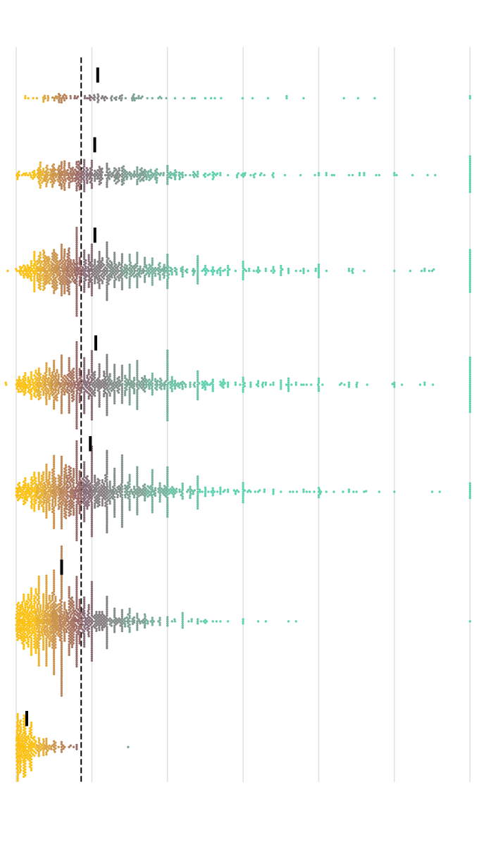
$43,000 MED. FOR ALL EMPLOYED
$53,900 MED. IN AGE GROUP
71+ YRS.
Relatively fewer people are still working at this age.
61–70
$51,900
Normal retirement age in the U.S. is 67. Higher income seems to stick around longer.
$52,000
51–60
The distributions of income look similar from 41 to 60 years old. Although the 41 to 50 group skews slightly higher, maybe as people move into manager roles or complete education.
41–50
$52,600
31–40
$49,000
People working their way up.
21–30
$30,000
Careers begin.
16–20
$7,000
You mostly see part-time work in this younger age group.
$0k
$50k
$100k
$150k
$200k
$250k
$300k+
PRE-TAX INCOME
SOURCE: 2020 AMERICAN COMMUNITY SURVEY
I thought that during the working years, from 21 to 67-ish, there would be a more obvious shift in the distributions towards higher income. I was thinking more experience and/or education would equate to more pay. This is sort of the case if you’re looking at the $100,000 and $300,000 marks.
But overall, the spreads look similar across age groups. I’m not totally sure how to make of that. Once we get to middle age, our incomes don’t change that much? You stay in the same ballpark? I guess I’m not going to get that yacht.
Notes
Become a member. Support an independent site. Make great charts.
See What You GetFlowingData is made possible by supporting members. Since 2007, I, Nathan Yau, a real person, have been analyzing and visualizing data to help more people understand and appreciate it in their everyday lives.
If you liked this or want to make similar data things, please consider supporting this small corner of the internet. You get unlimited access to visualization courses, tutorials, and extra resources. Thanks. — Nathan
Chart Type Used
