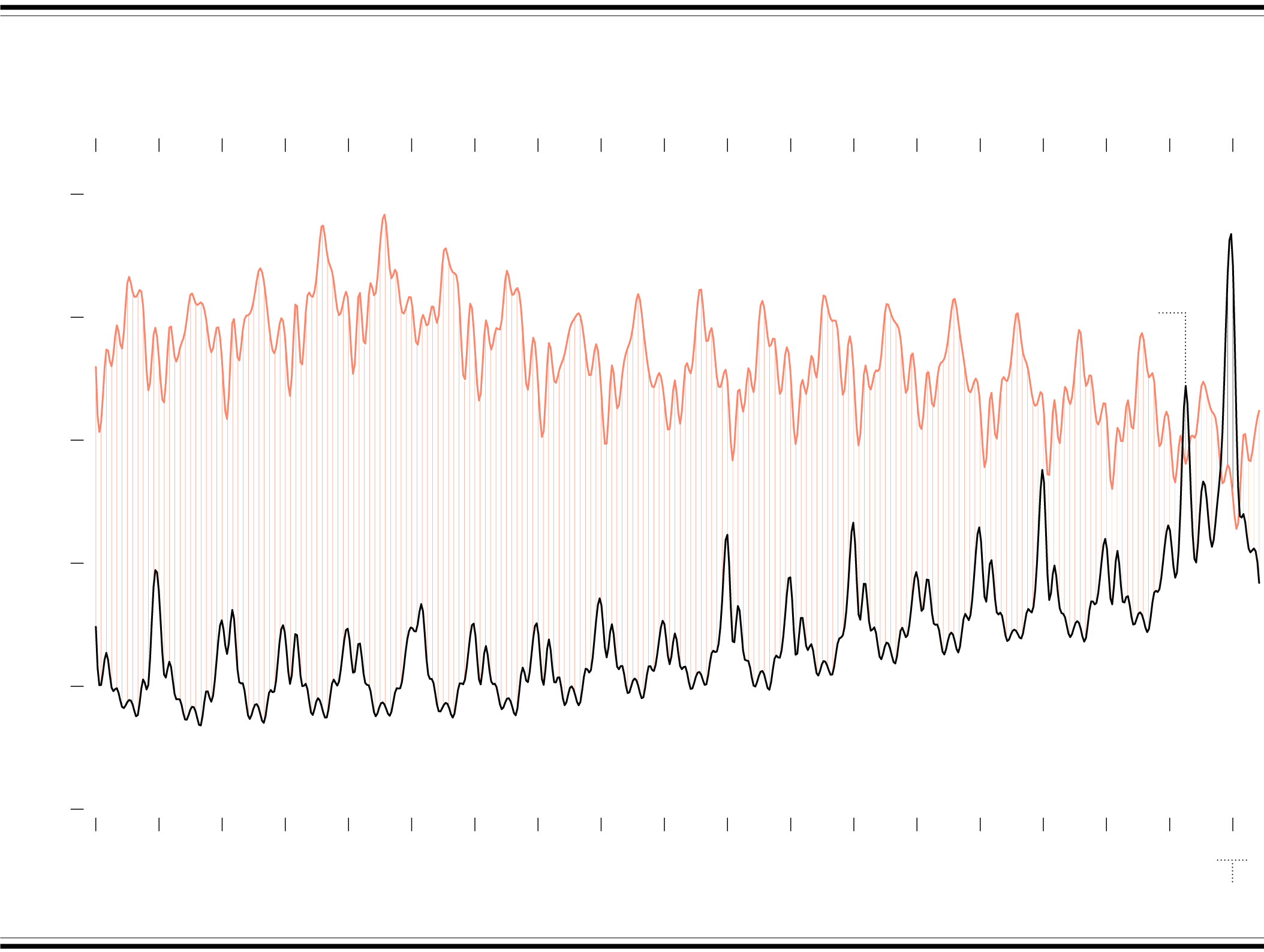
When There Were More Deaths Than Births in the U.S.
Births have declined over the years, whereas number of deaths have gone up with the population. So the two counts over time have been getting closer to each other. The past couple of years of covid accelerated the process.
FROM 2003 TO 2021
LIFE VS. DEATH
YEAR
2003
2004
2005
2006
2007
2008
2009
2010
2011
2012
2013
2014
2015
2016
2017
2018
2019
2020
2021
PEOPLE
Births tend to increase in summer months. Overall, birth rate and total births have decreased over the years.
Deaths surpassed births for four months from December 2020, peaking in January 2021.
400,000
LIVE BIRTHS
In April 2020, deaths surpassed births.
350,000
300,000
Despite the seasonal offsets of more births in summer and more deaths in winter, births outnumbered deaths significantly over the years. But the difference is getting smaller.
Came close in 2018.
250,000
200,000
Deaths tend to increase during the winter months. Overall, the mortality rate has decreased, but an increasing population means has still meant more total deaths.
DEATHS
150,000
2003
2004
2005
2006
2007
2008
2009
2010
2011
2012
2013
2014
2015
2016
2017
2018
2019
2020
2021
YEAR
Data for 2021 is provisional with counts rounded to the nearest thousand.
SOURCE: National Center for Health Statistics
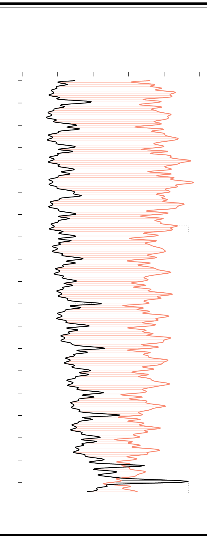
FROM 2003 TO 2021
LIFE VS. DEATH
PEOPLE
150k
200k
250k
300k
400k
350k
2003
DEATHS
LIVE
BIRTHS
2004
2005
Despite the seasonal offsets of more births in summer and more deaths in winter, births outnumbered deaths significantly over the years. But the difference is getting smaller.
2006
2007
2008
2009
2010
Births peak in the summer.
2011
2012
2013
Deaths peak in the winter.
2014
2015
2016
2017
Came close in 2018.
2018
2019
In April 2020, deaths surpassed births.
2020
*Data for 2021 is provisional.
2021
Deaths surpassed births for four months from December 2020, peaking in January 2021.
SOURCE: National Center
for Health Statistics
The chart above is a difference chart. Two time series lines are plotted, and the space between each line is filled with a color indicating which time series is greater. As you might have guessed, this highlights which metric is more during spans of time and by how much. Focus on the individual lines to read the patterns like a standard line chart.
Chart Type Used

Become a member. Support an independent site. Get extra visualization goodness.
See What You Get