How to Make a Line Chart with a Color Gradient in R
Use color to reinforce or add another layer of meaning to a regular line chart.
It’s typically straightforward to make and read a line chart. The position on the line represents a value, and the slope between points represents a rate of change.
Usually a line chart that represents a single time series uses a solid color for the line. But while messing with a heatmap, which uses color as its primary visual encoding, I was curious what you could show if you introduced a color scheme to a line chart.
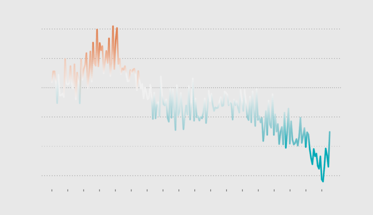
I ended up with this gradient line on a baseline chart that shows change in U.S. births:
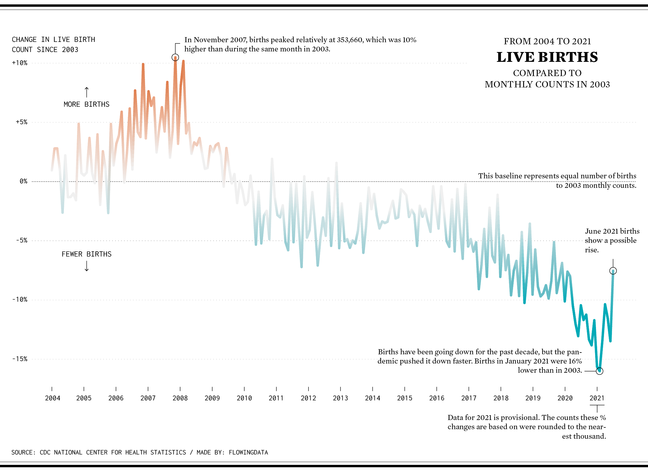
A diverging color scale indicates whether births were above or below the baseline. While the line itself shows the same change, the color seems to highlight the changes.
In this tutorial, you’ll learn how to make a similar gradient line.
To access this full tutorial, you must be a member. (If you are already a member, log in here.)
Get instant access to this tutorial and hundreds more, plus courses, guides, and additional resources.
Membership
You will get unlimited access to step-by-step visualization courses and tutorials for insight and presentation — all while supporting an independent site. Files and data are included so that you can more easily apply what you learn in your own work.
Learn to make great charts that are beautiful and useful.
Members also receive a weekly newsletter, The Process. Keep up-to-date on visualization tools, the rules, and the guidelines and how they all work together in practice.
See samples of everything you gain access to:
About the Author
Nathan Yau is a statistician who works primarily with visualization. He earned his PhD in statistics from UCLA, is the author of two best-selling books — Data Points and Visualize This — and runs FlowingData. Introvert. Likes food. Likes beer.