How People Like You Spend Their Time

The American Time Use Survey is an ongoing program from the Bureau of Labor Statistics that asks thousands of people, as you might guess, what they did during the last 24 hours.
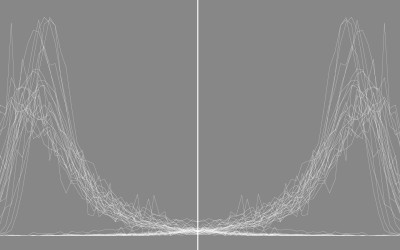
Using the data for 2015, I simulated days for different groups of people so that you can see the hours they typically spend in a 24-hour period. The interactive below shows the results.
Each row represents an activity, and each gray line represents the hours spent in one person’s day. I ran 100 simulations for each demographic group. The orange line shows the median hours for each activity.
For some activities, such as household work and leisure, the number of hours spent varies a lot, which is why you see a lot of criss-crossing lines. However, for other activities, such as sleeping and work, there’s more of pattern, which is why you see a lot of lines headed in the same direction.
Tip: Switch to the absolute scale to compare various demographics. This puts the horizontal scale for every activity at 0 to 24 hours.
More on How Americans Spend Their Day
 A Day in the Life of Americans
I used similar data to simulate an average day for 1,000 Americans.
 Most Common Activities
See the half-hour breakdowns for a day, by sex and age group.
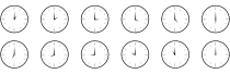 Counting the Hours
Here are the half-hour distributions for all Americans.
Nerd Notes
- Like in a previous simulation I did, I modeled a day as a time-varying Markov chain using minute-by-minute tabulations of the ATUS data.
- I tabulated, formatted, and simulated in R. The visualized with d3.js.
- The data comes from the Bureau of Labor Statistics, but I downloaded the extract with the ATUS-X tool, which makes the data much easier to subset and manage. It’s maintained by the Minnesota Population Center and the Maryland Population Research Center.
Chart Type Used

Become a member. Support an independent site. Make great charts.
See What You Get