Peter Oppenheimer, the chief global equity strategist for Goldman Sachs, points to the…
bubbles
-

Looking for an AI bubble in the markets
-
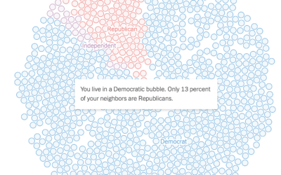
See if you live in a political bubble
Gus Wezerek, Ryan D. Enos, and Jacob Brown for NYT Opinion use neighborhood-level…
-
Floaty bubble charts with d3.js
D3.js, or Data-Driven Documents, version 4.0 was released a few months ago, so…
-
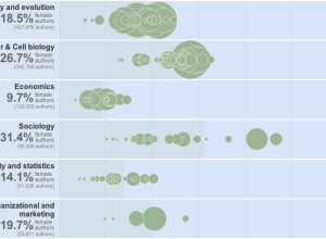
Women as academic authors over the years →
The Chronicle of Higher Education has a look at the percentage of academic…
-
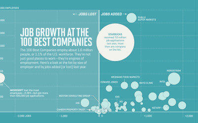
Job growth at the best companies to work for
Nicolas Rapp and Anne Vandermey with a straightforward look at new jobs added…
-
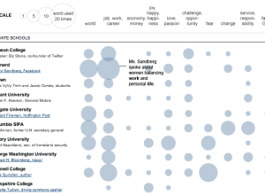
Words used in commencement speeches
If you’ve visited YouTube in the past couple of weeks, you’ve probably noticed…
-
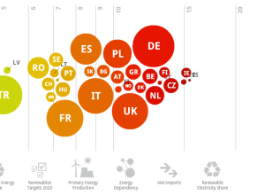
Europe’s energy targets in perspective
Designer Gregor Aisch has a look at energy usage in Europe. Click on…
-
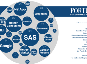
Best companies to work for and what employees say
Fortune Magazine recently published their annual list of top companies to work for,…
-
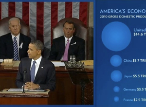
Open thread: Charts during the State of the Union address
President Barack Obama delivered his State of the Union address yesterday, and this…
-
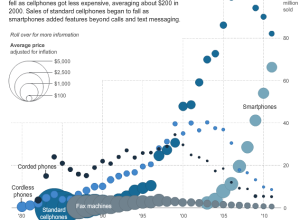
Price and adoption timeline of gadgets
New gadgets, from Web-connected TVs, to smartphones, to Fax machines, always seem to…
-
Similarities between PhD dissertations
Certain fields of study tend to cover many of the same topics. Many…
-
How to Make Bubble Charts
Ever since Hans Rosling presented a motion chart to tell his story of the wealth and health of nations, there has been an affinity for proportional bubbles on an x-y axis. This tutorial is for the static version of the motion chart: the bubble chart.
-
Comparison of Republican and Democratic tax plans
Lori Montgomery of the The Washington Post reports on the difference between the…
Recently for Members
Second Edition
 Visualize This: The FlowingData Guide to Design, Visualization, and Statistics (2nd Edition)
 Visualize This: The FlowingData Guide to Design, Visualization, and Statistics (2nd Edition)
New tools, refined process.
Browse by Chart Type See All →


