Most Popular Fields of Study, Since 1970

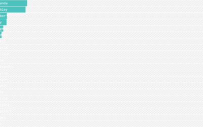
The National Center for Education Statistics maintains a variety of metrics related to various levels of schooling. Poking around, I wondered what the kids these days are learning and how it might be different from decades past, which led me to the number of bachelor’s degrees conferred by field of study, going back to 1970. I ranked them over time.

I’m surprised by the big rises for law enforcement and firefighting, along with parks and recreation. I didn’t even know there were majors in the latter field of study, but I guess that shows what I know.

I was also surprised that library science ranked so low, because I had classmates in the field when I was in graduate school. But again, this is based on bachelor’s degrees. Based on additional data, it looks like there aren’t a whole lot of undergraduate programs for library science, and it’s more common for students to pursue master’s or doctorates in the field.

Become a member. Support an independent site. Make great charts.

See What You Get

Learn to Visualize Data See All →

Drawing Lines and Segments in R

Show connections and changes over time with start and end points.

How to Make a Sankey Diagram to Show Flow

These tend to be made ad hoc and are usually pieced together manually, which takes a lot of time. Here’s a way to lay the framework in R, so you don’t have to do all the work yourself.

How to Make Frequency Trails in R

Also known as ridgeline plots, the method overlaps time series for a 3-D-ish view of the data. While perhaps not the most visually efficient, the allure is undeniable.

How to Make and Use Bar Charts in R

The chart type seems simple enough, but there sure are a lot of bad ones out there. Get yourself out of default mode.

Favorites

Air Quality Mapped Over Time

With wildfires burning in the western United States, smoke fills the air. This is an animation of the air quality during the past couple of months.

A Day in the Life: Women and Men

Using the past couple of years of data from the American Time Use Survey, I simulated a working day for men and women to see how schedules differ. Watch it play out in this animation.

Causes of Death

There are many ways to die. Cancer. Infection. Mental. External. This is how different groups of people died over the past 10 years, visualized by age.

Finding the New Age, for Your Age

You’ve probably heard the lines about how “40 is the new 30” or “30 is the new 20.” What is this based on? I tried to solve the problem using life expectancy data. Your age is the new age.