• Membership
  • Newsletter
  • Projects
  • Learning
  • About
  • Member Login
  • Data Underload  /  CDC, cherrypicking, coronavirus, mortality

    Multiple Causes of Death

    There’s a 6 percent figure from the CDC that could be easily misinterpreted. Here’s what it means.

    Read More
  • Red-blue electoral map and the green-gray in satellite imagery

    September 2, 2020

    Topic

    Maps  /  electoral, Krishna Karra, machine learning, satellite imagery, Tim Wallace

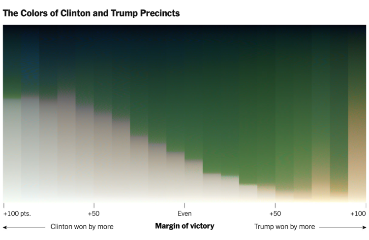
    For NYT’s The Upshot, Tim Wallace and Krishna Karra looked at how the red-blue electoral map relates to the green and gray color spectrum in satellite imagery:

    The pattern we observe here is consistent with the urban-rural divide we’re accustomed to seeing on traditional maps of election results. What spans the divide — the suburbs represented by transition colors — can be crucial to winning elections. It’s part of why President Trump, seeking to appeal to swing voters, has portrayed the suburbs as under siege and menaced by crime. But the suburbs are neither politically nor geographically monolithic. They are where Democratic and Republican voters meet and overlap, in a variety of ways.

    The breakdown and process are impressive. Be sure to check out the full rundown. Wallace also provides more details about how this came together on the Twitter.

  • Choose your own election outcome

    September 2, 2020

    Topic

    Infographics  /  election, New York Times, outcome, uncertainty

    The election is full of what-ifs, and the result changes depending on which direction they take. Josh Holder and Alexander Burns for The New York Times use a pair of circular Voronoi diagrams and draggable bubbles so that you can test the what-ifs.

    Contrast this with NYT’s 2012 graphic showing all possible paths. While the 2012 graphic shows you the big picture, the 2020 interactive places more weight on individual outcomes.

  • How to vote in each state

    September 1, 2020

    Topic

    Infographics  /  election, FiveThirtyEight, voting

    Each state is handling mail-in voting in a certain way with varying timelines and rules. FiveThirtyEight provides a straightforward state-by-state guide so you can see what your state is doing.

    I like the color-coded grid map doubling as quick navigation. You get the overview and a jump to the state of interest.

  • How to Untangle a Spaghetti Line Chart (with R Examples)

    Put multiple time series lines on the same plot, and you quickly end up with a mess. Here are practical ways to clean it up.

  • Audit advanced data science course online

    August 31, 2020

    Topic

    Statistics  /  course, data science, Jeff Leek, Johns Hopkins, Roger Peng

    Jeff Leek and Roger Peng started their course Advanced Data Science at Johns Hopkins University. It’s meant for JHU students, but you can learn from the weekly course material for free:

    The class is not designed to teach a set of statistical methods or packages – there are a ton of awesome classes, books, and tutorials about those things out there! Rather the goal is to help you to organize your thinking around how to combine the things you have learned about statistics, data manipulation, and visualization into complete data analyses that answer important questions about the world around you.

    So you know the methods and tools (or how to learn them on your own), but you want to learn more about putting it all together.

    Nice. I could probably use a refresher.

    You can get the weekly updates here.

  • Time for last-minute mail voting

    August 31, 2020

    Topic

    Statistical Visualization  /  election, New York Times, USPS, voting

    The New York Times provides a state-by-state chart timeline for voting by mail:

    But 16 states allow voters to apply for mail ballots so close to Election Day that their votes could be at risk of being too late if they are sent and returned through the Postal Service. Officials in these places recommend applying for and sending in ballots early, or dropping them off at local election offices or in secure drop boxes if available.

    In Minnesota, voters can request a ballot the day before the election, too late to be mailed to them on time. But if voters request their ballots early and postmark them by Election Day, they should arrive in enough time to be counted. Montana has the same deadline for requesting a ballot but does not accept those returned after the election.

    The takeaway is that you should vote early to make sure it counts. I’m just going to do it right when the ballot arrives.

  • Minimizing risk

    August 31, 2020

    Topic

    Statistics  /  coronavirus, New York Times, risk

    For NYT Opinion, Aaron E. Carroll on doing small things that sum to something bigger:

    Too many view protective measures as all or nothing: Either we do everything, or we might as well do none. That’s wrong. Instead, we need to see that all our behavior adds up.

    Each decision we make to reduce risk helps. Each time we wear a mask, we’re throwing some safety on the pile. Each time we socialize outside instead of inside, we’re throwing some safety on the pile. Each time we stay six feet away instead of sitting closer together, we’re throwing some safety on the pile. Each time we wash our hands, eat apart and don’t spend time in large gatherings of people, we’re adding to the pile.

    A lot of what we do and the choices we make are based on past personal experience. It’s a challenge to look at a dataset that seems beyond us as an individual. So if you’re trying to galvanize a population with numbers, look for all of the ways you could help the individual relate.

  • Minutes spoken at the Republican Convention

    August 28, 2020

    Topic

    Infographics  /  convention, New York Times, Republican, talking

    The New York Times provides a breakdown of minutes spoken at the Republican National Convention. The bubbles, sized by minute count, start as an overview of everyone who spoke, and then cluster into specific groups as you scroll.

  • Dying mid-range mall

    August 28, 2020

    Topic

    Statistical Visualization  /  bankruptcy, Bloomberg, coronavirus, mall

    Bloomberg looks at how retail struggles might kill the middle-of-the-road malls before this pandemic is done:

    Although many bankrupt retailers continue operating while restructuring under Chapter 11, they’re planning to shut down droves of lower-performing stores. Justice recently shuttered its location in Crystal Mall after its parent company, Ascena Retail Group Inc., filed for bankruptcy on July 23. The mall also houses a Men’s Wearhouse, whose parent, Tailored Brands Inc., filed for bankruptcy on Aug. 2. It wants to close up to 500 stores, accounting for a third of its locations. Vitamin retailer GNC, which filed for bankruptcy on June 23, wants to close at least 800 to 1,200 stores. They both operate in Crystal Mall.

    I like these triangles to show scale. There’s also a variable width bar chart in the piece. It’s so back.

  • Two.js for two-dimensional drawing and animation in modern web browsers

    August 27, 2020

    Topic

    Software  /  animation, JavaScript

    “Two.js is deeply inspired by flat motion graphics. As a result, two.js aims to make the creation and animation of flat shapes easier and more concise.” It also renders in webgl, canvas2d, and svg, with not much change in your code. Two.js is definitely going on my list of things to try.

  • Members Only

    Visualization Tools and Resources – August 2020 Roundup

    August 27, 2020

    Topic

    The Process  /  roundup

    Here’s the good stuff for August 2020.

  • Shot chart for Aug 26 2020 NBA playoffs

    August 26, 2020

    Topic

    Chart Everything  /  Bucks, NBA
  • FDA commissioner corrects his misinterpretation of reduced mortality

    August 26, 2020

    Topic

    Mistaken Data  /  absolute, coronavirus, FDA, relative

    Talking about a possible plasma treatment for Covid-19, the Food and Drug Administration Commissioner Stephen Hahn misinterpreted results from the study. The study from the Mayo Clinic notes a possible 35% reduction in mortality rate, and Hahn said that if 100 people were sick with Covid-19, 35 lives would be saved.

    For The Washington Post, Aaron Blake discusses why the interpretation is incorrect:

    The vast majority of people who get the virus will recover with or without plasma. The 35 percent figure comes into play among those who die — a much smaller group. That would still be a huge development if borne out. But strictly speaking, the treatment would have saved about 3 out of 100 coronavirus patients, not 35. And given the smaller numbers we’re talking about, the finding is much closer to the margin of error — even as the preliminary study finds the effect to be statistically significant.

    And even then, the claim doesn’t make sense. The data that he and Trump were referring to compared those receiving plasma treatments not to a control group, but between higher and lower levels of plasma treatments. The group with lower levels died at a rate of 11.9 people out of 100 died, while 8.7 percent died with higher levels.

    Hahn later corrected himself.

    See also Christopher Ingraham’s quick explanation of relative versus absolute risk. And this visual explainer from 2015 by NYT’s The Upshot should also be helpful in understanding the difference.

  • Data Underload  /  age

    Redefining Old Age

    What is old? When it comes to subjects like health care and retirement, we often think of old in fixed terms. But as people live longer, it’s worth changing the definition.

    Read More
  • Optimizing a peanut butter and banana sandwich

    August 25, 2020

    Topic

    Statistics  /  deep learning, optimization, sandwich

    How do you assemble a banana and peanut butter sandwich that maximizes the number of bites with the perfect ratio of bread, peanut butter, and banana? Ethan Rosenthal, in a quest to work on something truly meaningless, solved the problem over several months with a truly roundabout solution:

    So, how do we make optimal peanut butter and banana sandwiches? It’s really quite simple. You take a picture of your banana and bread, pass the image through a deep learning model to locate said items, do some nonlinear curve fitting to the banana, transform to polar coordinates and “slice” the banana along the fitted curve, turn those slices into elliptical polygons, and feed the polygons and bread “box” into a 2D nesting algorithm.

    Best.

  • How long before there is gender equality in the U.S. House and Senate

    August 25, 2020

    Topic

    Statistical Visualization  /  gender equality, government, Sergio Peçanha, Washington Post

    For The Washington Post, Sergio Peçanha asks, “What will it take to achieve gender equality in American politics?”

    It will take some more time and a lot more effort to reach equal representation. I asked my colleague David Byler, a statistics expert, to estimate how long it would take for women to reach equal numbers in Congress at the current pace. His estimate: about 60 years.

  • Racist housing policy from 1930s and present-day temperature highs

    August 24, 2020

    Topic

    Maps  /  climate, housing, New York Times, racism, redlining

    Brad Plumer and Nadja Popovich for The New York Times show how policies that marked black neighborhoods as “hazardous” for real estate investment led to a present-day with fewer trees and higher temperatures. The maps that shift back and forth between past districting and how things are now show the picture clearly.

    This goes hand-in-hand with how tree-cover and neighborhood incomes are also tightly coupled.

  • Visits to businesses compared year-over-year in each state

    August 24, 2020

    Topic

    Statistical Visualization  /  business, coronavirus, New York Times

    Businesses are still seeing visits mostly down compared to last year, which shouldn’t be much of a surprise. But there is a lot of variation across the states. The New York Times shows the comparison over time, based on mobile location data (which I still feel uneasy about). NYT went with the scrollytelling state-by-state approach to work their way through the spaghetti plot.

  • Excess deaths, by race

    August 21, 2020

    Topic

    Statistical Visualization  /  coronavirus, Marshall Project, race

    It’s clear that Covid-19 has affected groups differently across the United States. By geography. By education level. By income. The Marshall Project breaks down excess deaths by race:

    Earlier data on cases, hospitalizations and deaths revealed the especially heavy toll on Black, Hispanic and Native Americans, a disparity attributed to unequal access to health care and economic opportunities. But the increases in total deaths by race were not reported until now; nor was the disproportionate burden of the disease on Asian Americans.

    With this new data, Asian Americans join Blacks and Hispanics among the hardest-hit communities, with deaths in each group up at least 30 percent this year compared with the average over the last five years, the analysis found. Deaths among Native Americans rose more than 20 percent, though that is probably a severe undercount because of a lack of data. Deaths among Whites were up 9 percent.

    Difference charts are used to show deaths above (red) or below (turquoise) normal counts, but of course, it’s mostly red.

    See the piece for an additional categorization by state.

  • Page 97 of 392
  • <
  • 1
  • ...
  • 94
  • 95
  • 96
  • 97
  • 98
  • 99
  • ...
  • 392
  • >

Analyze, visualize, and communicate data usefully, beyond the defaults.

Become a member →

Recently for Members

May 8, 2025
When the data is not what it seems

May 1, 2025
Finding the Right Charts

April 24, 2025
Visualization Tools, Datasets, and Resources – April 2025 Roundup

April 17, 2025
Breaking Out of Chart Software Defaults

April 15, 2025
Line Chart with Decorative Neon Accents

Browse by Chart Type See All →

Stacked Bar Chart Streamgraph Line Chart Pie Chart Beeswarm Voronoi Diagram Frequency Trails Strip Plot Word Cloud Treemap

Browse By Topic

  • Visualization

    Seeing data

  • Maps

    Seeing geographic data

  • Infographics

    Explaining data

  • Networks

    Connecting data

  • Statistics

    Analyzing data

  • Software

    Working with data

  • Sources

    Getting data

  • Design

    Making data readable

Get the Book

Visualize This: The FlowingData Guide to Design, Visualization, and Statistics

Available now.

Order: Amazon / Bookshop

Made by FlowingData

  • The Process

  • Data Underload

  • Chart Everything

  • Guides

  • Books

  • Shop

  • About
  • Contact
  • Newsletter
  • LinkedIn
  • Instagram
  • Bluesky
  • RSS
Copyright © 2007-Present FlowingData. All rights reserved.