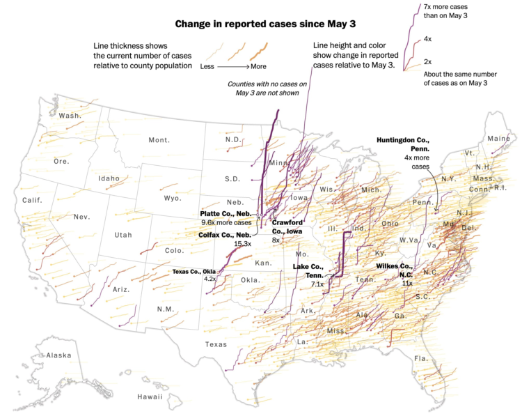
This map by Tim Meko for The Washington Post uses time series lines to show change in confirmed cases by county. Using a combination of line thickness, height, and color, the map highlights the counties with the greatest change since early May.
Hairy.
 Visualize This: The FlowingData Guide to Design, Visualization, and Statistics (2nd Edition)