• Membership
  • Newsletter
  • Projects
  • Learning
  • About
  • Member Login
  • Using the FiveThirtyEight model, see how the election odds shift with different scenarios

    October 21, 2020

    Topic

    Statistics  /  election, FiveThirtyEight, simulation

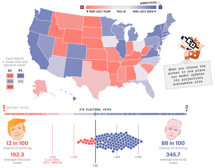
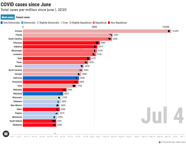
    With each model update, FiveThirtyEight runs 40,000 simulations, or what-ifs, to calculate the odds for who will win the election. Their new interactive lets you experiment with all of the what-ifs to see how the odds shift when a candidate wins a state.

    It answers the question, “If ______ wins in ______ and in ______, etc., what are the chances of him winning the whole thing?”

    So if Trump wins a very red state or Biden wins a very blue state, the overall odds don’t change that much. But if a very red goes blue, or a very blue goes red, then the odds swing dramatically.

    There’s a good lesson on conditional probability somewhere in there.

  • Making map art in R

    October 21, 2020

    Topic

    Coding  /  Esteban Moro, R

    If you can make maps in your software and customize the aesthetics, you can make map art. Esteban Moro outlined how he made a personalized map in R:

    For my map art, I wanted to create something more personal: a combination of those beautiful street maps with personal mobility. That is, the city and how we navigate it. In this tutorial, you’ll learn how to create those street maps for your city and your mobility. We will use data from Open Street Maps (OSM) and, of course, R. We will also use personal mobility data, which you can input manually. Still, we will learn too how to get it from Google Maps Timeline (if you have your location activated). Part of the material here is based on the tutorial by Christian Burkhart.

  • Tips for not letting polls and forecasts occupy your mind for two weeks

    October 20, 2020

    Topic

    Statistics  /  election, FiveThirtyEight, forecast

    For FiveThirtyEight, Nate Silver provides tips to stay less stressed staring into the darkness known at election forecasts:

    This is perhaps the single piece of advice we give most often at FiveThirtyEight, but it’s especially important in the final couple weeks of a campaign. After a lull this weekend, there are likely to be a lot of polls the rest of the way out. On any given day, it will be possible to take the two or three best polls for Biden and tell a story of his holding or expanding his lead, or the two or three best polls for Trump and make a claim that the race is tightening.

    Resist buying too much into those narratives.

    Good luck.

  • Interactive data essays on climate change

    October 20, 2020

    Topic

    Statistical Visualization  /  climate, Parametric Press

    In their second issue, Parametric Press focuses on climate change with a set of interactive data essays:

    The articles explore the gamut of our climate’s past, present, and future, exploring not only what has happened (and is happening) but also what should happen, and what we as citizens should do to realize that future. In this issue you will find a personalized history of Earth’s CO2 record, a close look at disturbances in the floodplains in the Mekong Delta, an analysis of how YouTube and other digital streaming services impact the environment, along with critiques on potential carbon sequestration methods and an exploration of the corporations that are most responsible for getting us to where we are today.

  • Data visualization in virtual reality

    October 19, 2020

    Topic

    Statistical Visualization  /  physical, VR

    [arve url=”https://www.youtube.com/watch?v=XmYNISBjL_Q” loop=”no” muted=”no” /]

    Virtual reality puts you in a digital world that can feel like a real world when it’s done right. Research from Benjamin Lee, et al. explored some of the possibilities in work they’re calling data visceralation.

    As a proof of concept, shown in the video above, the researchers recreated popular works for virtual reality. Watch Olympic runners sprint past you or look up at the comparison of the world’s tallest buildings.

    The goal is essentially to make the abstract shapes or data points feel more real. Looks promising.

    By the way, this work is going to be presented at VIS 2020, which will be virtual and free to attend this year. If you’re interested in poking your head in, but don’t know where to start, Robert Kosara wrote an outsider’s guide to the conference to point you in the right direction.

  • More fire weather days coming

    October 16, 2020

    Topic

    Maps  /  California, climate change, ProPublica, wildfire

    It’s been smoky this season. Based on research from Michael Goss et al., Al Shaw and Elizabeth Weil for ProPublica look at the current fire situation in California and what that might mean for the future and the rest of the country.

    In wildfires, as with flooding and heat, climate change doesn’t create novel problems; it exacerbates existing problems and compounds risks. So there is no precise way to measure how much of all this increased wildfire activity is due to climate change. An educated guess is about half, experts say. Its role, however, is growing fast. Within 20 years, climate change promises to be the dominant factor driving larger and more frequent megafires — not only in California, but across the country.

  • Lifelines

    October 16, 2020

    Topic

    Infographics  /  despair, mortality, Periscopic

    Using estimates from a report by the Well Being Trust and the Robert Graham Center, Periscopic shows projected deaths of despair in Lifelines.

    Lights, each representing a life, float above the water, and as you adjust levels of mental health care, employment, and social connection, the lives either sink to the bottom or stay above the water. How do we keep as many as we can above water?

  • Members Only

    The Process 111 – Excel Limit

    October 15, 2020

    Topic

    The Process  /  Excel, limitations

    A row limit in Microsoft Excel led to an undercount of Covid-19 cases in the thousands. The root of the problem goes past the software though.

  • Covid-19 cases and state partisanship

    October 15, 2020

    Topic

    Statistical Visualization  /  coronavirus, Dan Goodspeed, partisanship

    From Dan Goodspeed, the bar chart race is back. The length of the bars represents Covid-19 case rates per state, and color represents partisanship. The animation currently starts on June 1 and runs through October 13. It plays out how most of us probably assumed at some level or another.

  • Visual tour through the technology hype cycle

    October 14, 2020

    Topic

    Infographics  /  hype, Mark Mine, technology

    The Gartner hype cycle is a graphical representation of where certain technologies are at in terms of expectations and productivity. It’s abstract and qualitative. But Mark Mine looked at 25 years worth of cycles to see how things have changed in a more quantitative fashion.

    Mine made his dataset available here.

  • Data Underload  /  money

    Who Makes More Money

    Someone mentioned that $400,000+ per year was commonplace in American households. That seemed like an odd comment.

    Read More
  • Exploration of 12 timelines along Sunset Boulevard

    October 13, 2020

    Topic

    Data Art  /  Ed Ruscha, Getty, photos, Stamen, Sunset Boulevard

    In 1966, artist Ed Ruscha published Every Building on the Sunset Strip, which was a stiched collection of photos taken while driving along Sunset Boulevard. Ruscha continued to take pictures over the years. Getty and Stamen made the multi-year work available online with a unique explorer that lets you drive the drive along 12 timelines.

    Select your vehicle, the years, and move along the map.

    See also Eric Rodenbeck’s process post on how the work came together.

  • Making a convincing deepfake

    October 12, 2020

    Topic

    Statistics  /  deepfake, MIT Technology Review, Richard Nixon

    For MIT Technology Review, Karen Hao looks into the process of artists Francesca Panetta and Halsey Burgund to produce a deepfake of Richard Nixon reading an alternate history of the moon landing:

    This is how Lewis D. Wheeler, a Boston-based white male actor, found himself holed up in a studio for days listening to and repeating snippets of Nixon’s audio. There were hundreds of snippets, each only a few seconds long, “some of which weren’t even complete words,” he says.

    The snippets had been taken from various Nixon speeches, much of it from his resignation. Given the grave nature of the moon disaster speech, Respeecher needed training materials that captured the same somber tone.

    Wheeler’s job was to re-record each snippet in his own voice, matching the exact rhythm and intonation. These little bits were then fed into Respeecher’s algorithm to map his voice to Nixon’s. “It was pretty exhausting and pretty painstaking,” he says, “but really interesting, too, building it brick by brick.”

    Sounds like a lot of work, luckily.

  • Reconstructing protests in Minneapolis using hundreds of livestreams

    October 9, 2020

    Topic

    Infographics  /  George Floyd, Minneapolis, protest, Pudding, video, Washington Post

    From a distance, it’s difficult to build an understanding of the scale and nature of protests. A soundbite here. A video clip there. So, to show the Minneapolis protests more completely, The Washington Post and The Pudding stitched together 149 livestreams with timestamps and location:

    Videos were collected by searching Youtube, Facebook, Twitter, Twitch and other sources and then limited to live streams to ensure accuracy of time, location and remove reposted clips. Each video was reviewed and tagged to a location by hand to remove any videos that were replays as live streams. Thumbnails were then extracted using FFMPEG and links to the original videos were provided. Interesting quotes and context setting annotations were called out to provide a deep experience while allowing for quick scanning. Finally links and inline play of the original videos is provided for those wishing to see the videos as streamed.

    With so much footage, it’s easy to imagine any sense of narrative getting lost in a bunch of moving pictures. But the layout and structure of this story, organized as a timeline and categorized by area, really help you see what happened over a week.

  • NBA playoff win probabilities, animated over time

    October 9, 2020

    Topic

    Statistical Visualization  /  Adam Pearce, basketball, FiveThirtyEight

    FiveThirtyEight publishes win probabilities for NBA games throughout the season. During the playoffs, they show chances of winning each round, and with each game, the probabilities shift. Adam Pearce animated these shifts, from the start of the playoffs up to now.

    Nice. The visualization. Not so much the Lakers.

  • Covid-19, the third leading cause of death

    October 8, 2020

    Topic

    Statistical Visualization  /  coronavirus, mortality, Scientific American

    For Scientific American, Youyou Zhou made a line chart that shows cause of death in the United States, from 2015 up to present. Covid-19 was the leading cause of death in April and is now sitting at number 3. The rise in unclassified deaths also stands out.

  • Members Only

    The Process 110 – Contrast

    October 8, 2020

    Topic

    The Process  /  contrast, fly

    For two minutes, a black speck on a white background was all anyone could talk about.

  • Colour Controversy is a game of perception and labeling

    October 8, 2020

    Topic

    Design  /  color, game, perception

    Colour Controversy is a simple game that shows you a shade and asks you what color it is. The fun part is that the shades are usually in between two colors, say blue and green, and you can only choose one. A running tally is kept so that you can see the “most controversial” colors.

  • Breaking down the $4 trillion bailout

    October 7, 2020

    Topic

    Statistical Visualization  /  bailout, coronavirus, Washington Post

    Using a straightforward treemap, The Washington Post looks at where the $4 trillion bailout went. As you scroll, different categories highlight with accompanying text.

    This is probably the old man in me, and I know the scrollytelling format works better for mobile and provides more focus, but I find myself missing the large, featured-filled interactives. Those were the days.

  • Presidential Plinko

    October 6, 2020

    Topic

    Statistical Visualization  /  election, Matthew Kay, Plinko, R, uncertainty

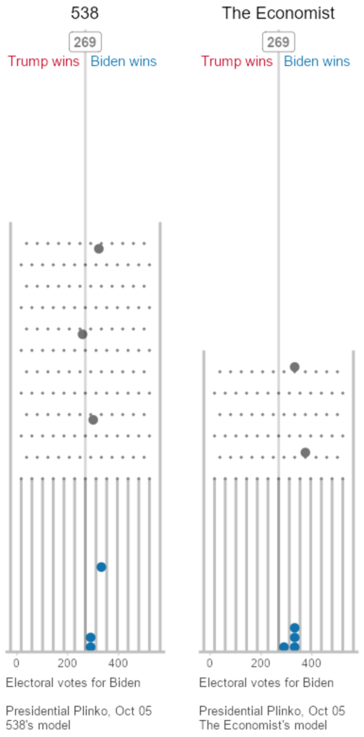
    To visualize uncertainty in election forecasts, Matthew Kay from Northwestern University used a Plinko metaphor. The height of each board is based on the distribution of the forecast, and each ball drop is a potential outcome. The animation plays to eventually shows a full distribution.

    See it in action.

    (And Kay made his R code available on GitHub.)

  • Page 94 of 392
  • <
  • 1
  • ...
  • 91
  • 92
  • 93
  • 94
  • 95
  • 96
  • ...
  • 392
  • >

Analyze, visualize, and communicate data usefully, beyond the defaults.

Become a member →

Recently for Members

May 8, 2025
When the data is not what it seems

May 1, 2025
Finding the Right Charts

April 24, 2025
Visualization Tools, Datasets, and Resources – April 2025 Roundup

April 17, 2025
Breaking Out of Chart Software Defaults

April 15, 2025
Line Chart with Decorative Neon Accents

Browse by Chart Type See All →

Barcode Chart Treemap Line Chart Alluvial Diagram Stacked Area Chart Dot Map Surface Plot Venn Diagram Gantt Chart Bubble Chart

Browse By Topic

  • Visualization

    Seeing data

  • Maps

    Seeing geographic data

  • Infographics

    Explaining data

  • Networks

    Connecting data

  • Statistics

    Analyzing data

  • Software

    Working with data

  • Sources

    Getting data

  • Design

    Making data readable

Get the Book

Visualize This: The FlowingData Guide to Design, Visualization, and Statistics

Available now.

Order: Amazon / Bookshop

Made by FlowingData

  • The Process

  • Data Underload

  • Chart Everything

  • Guides

  • Books

  • Shop

  • About
  • Contact
  • Newsletter
  • LinkedIn
  • Instagram
  • Bluesky
  • RSS
Copyright © 2007-Present FlowingData. All rights reserved.