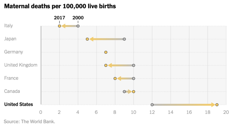
• The Royal Statistical Society published ten lessons governments should takeaway from this year, which should naturally apply to standard data practice:

    1. Invest in public health data – which should be regarded as critical national infrastructure and a full review of health data should be conducted 
    2. Publish evidence – all evidence considered by governments and their advisers must be published in a timely and accessible manner
    3. Be clear and open about data – government should invest in a central portal, from which the different sources of official data, analysis protocols and up-to-date results can be found
    4. Challenge the misuse of statistics – the Office for Statistics Regulation should have its funding augmented so it can better hold the government to account
    5. The media needs to step up its responsibilities – government should support media institutions that invest in specialist scientific and medical reporting
    6. Build decision makers’ statistical skills – politicians and senior officials should seek out statistical training
    7. Build an effective infectious disease surveillance system to monitor the spread of disease – the government should ensure that a real-time surveillance system is ready for future pandemics
    8. Increase scrutiny and openness for new diagnostic tests – similar steps to those adopted for vaccine and pharmaceutical evaluation should be followed for diagnostic tests
    9. Health data is incomplete without social care data – improving social care data should be a central part of any review of UK health data
    10. Evaluation should be put at the heart of policy – efficient evaluations or experiments should be incorporated into any intervention from the start.

    See the full report here.

  • There was a lot of uncertainty in the beginning of the pandemic, so the forecasts varied across sources. There were also many forecasts. Youyang Gu provided on of those forecasts, and it predicted well. Ashlee Vance reporting for Bloomberg on the Covid-19 forecasting work of Youyang Gu:

    The novel, sophisticated twist of Gu’s model came from his use of machine learning algorithms to hone his figures. After MIT, Gu spent a couple years working in the financial industry writing algorithms for high-frequency trading systems in which his forecasts had to be accurate if he wanted to keep his job. When it came to Covid, Gu kept comparing his predictions to the eventual reported death totals and constantly tuned his machine learning software so that it would lead to ever more precise prognostications. Even though the work required the same hours as a demanding full-time job, Gu volunteered his time and lived off his savings. He wanted his data to be seen as free of any conflicts of interest or political bias.

    Reading this, it felt a little bit like cherry-picking the forecast that was best, but I don’t know enough to decide. It does seem to highlight though some of the limitations of larger organizations that don’t always have the best point of view.

  • For Reuters, Julia Janicki and Simon Scarr, with illustrations by Catherine Tai, show why bats make ideal hosts for viruses. They went with the old nature journal aesthetic, which I appreciate.

    One reason bats have started outbreaks is longevity, shown in the chart above, which compares mass against lifespan. Bats live a surprisingly long time for their size. Plus, they can fly.

  • Members Only

    Every month I collect new visualization tools and learning resources to help you make better charts. Here’s the good stuff for February 2021.

  • RAWGraphs, a tool conceived by DensityDesign in 2013, got a 2.0 update in a collaborative effort between DensityDesign, Calibro and Inmagik:

    RAW Graphs is an open source data visualization framework built with the goal of making the visual representation of complex data easy for everyone.

    Primarily conceived as a tool for designers and vis geeks, RAW Graphs aims at providing a missing link between spreadsheet applications (e.g. Microsoft Excel, Apple Numbers, OpenRefine) and vector graphics editors (e.g. Adobe Illustrator, Inkscape, Sketch).

    Load your dataset, and make a wide range of charts with the point-and-click interface. The options try to update smartly depending on your data and visualization choices.

  • This is quite a dive by Moises Velasquez-Manoff and Jeremy White for The New York Times. They look at the potential danger of melting ice from Greenland flowing into the Gulf Stream.

    An animated map of currents and temperature, reminiscent of NASA’s Perpetual Ocean from 2011, shows what’s going on underwater. The piece flies you through as you scroll with a familiar view as if you’re in space looking down.

    Keep reading though, and you’re taken underwater 800 feet below the surface. It’s like seeing the currents from a fish’s point of view.

  • As schools begin to reopen, The New York Times illustrates why classrooms should open a window for ventilation. Lower viral concentrations swirling around means reduced exposure.

    The 3-D model to show airflow was already something, but keep scrolling to see the cross-sections. Then scan the QR code on your phone to see the simulated data with augmented reality.

  • Minimum wage has increased over the years, but by how much depends on where you live.

  • Oftentimes we see “algorithms” referenced in various contexts, but the definition of an algorithm is often unclear. For MIT Technology Review, Kristian Lum describes what an “algorithm” means these days:

    In statistics and machine learning, we usually think of the algorithm as the set of instructions a computer executes to learn from data. In these fields, the resulting structured information is typically called a model. The information the computer learns from the data via the algorithm may look like “weights” by which to multiply each input factor, or it may be much more complicated. The complexity of the algorithm itself may also vary. And the impacts of these algorithms ultimately depend on the data to which they are applied and the context in which the resulting model is deployed. The same algorithm could have a net positive impact when applied in one context and a very different effect when applied in another.

  • For Reuters, Sarah Slobin and Feilding Cage imagine life back at the office with an interactive game. Navigate through different office scenarios while maintaining social distance:

    To understand what that might feel like, we spoke to some experts on work and workspaces who predicted that social distancing measures and hybrid work models are here to stay. Walk through our simulations below to experience what going back to the old/new office might be like. Make sure to avoid contact with others along the way!

    I haven’t worked in a proper office in many years, and it never appealed to me, but it sounds pretty nice these days.

  • The Centers for Disease Control and Prevention released a report that said life expectancy decreased by a full year in 2020. While the calculation is correct, the interpretation and message from that number is more challenging. For STAT, Peter B. Bach provides context to the measurement:

    Don’t blame the method. It’s a standard one that over time has been a highly useful way of understanding how our efforts in public health have succeeded or fallen short. Because it is a projection, it can (and should) serve as an early warning of how people in our society will do in the future if we do nothing different from today.

    But in this case, the CDC should assume, as do we all, that Covid-19 will cause an increase in mortality for only a brief period relative to the span of a normal lifetime. If you assume the Covid-19 risk of 2020 carries forward unabated, you will overstate the life expectancy declines it causes. […]

    Bach wonders if the CDC should have released the report at all, if most people were just going to misunderstand it. That seems like the wrong direction though. Life expectancy is a useful metric, and if you know there are a lot of chances for miscommunication, you try your best to explain the numbers with the audience in mind.

  • Members Only

    Everyone’s a beginner at some point.

  • While we’re on the topic of scale, The New York Times plotted weekly deaths below and above normal since 2015. Check out that Covid-19 pandemic mountain.

    NYT has been updating this chart, but I hadn’t looked at it in a while. Just, wow.

  • The United States passed the half million mark for confirmed Covid-19 deaths. It’s difficult to imagine 500,000 of anything, let alone deaths in a year, so Reuters used a modified beeswarm chart to show the timeline of events and the individual deaths. Each dot represents a death, and a scaled down version of the chart appears in the top left corner to show where you are in the timeline.

    It’s not possible to reflect the true meaning of such a scale through a screen, but the mini-obituaries on the left-hand side help. I had to pause a few times.

  • I compared spending in 1996 against the most recent spending estimates from the Bureau of Labor Statistics.

  • I’m happy to announce a new course on mapping geographic data in R, using the ggplot2 package. The course is by data journalist and visualization consultant Maarten Lambrechts, and it’s available immediately to FlowingData members.

    If you’re not a member yet, now is a great time to join. You get instant access to this course, plus four others and over a hundred in-depth visualization tutorials.

    For those who’ve read FlowingData for a while probably know that I’m not much of ggplot2 user. It’s not that I don’t like it. I just never worked it into my workflow, and what I’m using now hasn’t stalled my work yet.

    But when it comes to visualizing data, I’m a firm believer in learning a wide array of tools. A flexible toolset lets you visualize data in the way that you want. The tool shouldn’t be the limiting factor.

    Hence, this course.

    I worked through the course myself, and I’ll tell you first-hand that it’s fun, practical, and will get you up to speed quick. There’s real data, concrete examples, and you’ll be making beautiful maps with your own data in no time.

    Check it out now.

  • A common depiction of an iceberg is one that has a short head peeking out of the water and a deep spike underneath. However, as Megan Thompson-Munson pointed out, that’s not how icebergs actually float. Because physics.

    Inspired by Thompson-Munson’s comment, Joshua Tauberer made Iceberger, which is a fun interactive that lets you draw an iceberg of your own and the shape floats accordingly.

  • [arve url=”https://vimeo.com/370007362″ loop=”no” muted=”no” /]

    For several years, Xavi Bou has been using long-exposure photography to capture stills of bird flight patterns. The project, Ornitographies, produced gloriously abstract images. There’s also a video (above) piece under the same premise.

    Jessica McKenzie, reporting for Audubon:

    More recently, Bou has expanded the project to video, including one called Murmurations that shows a flock of starlings evading a hawk. “What happens is, if in this moment a hawk appears to attack them, it’s when they do this dance,” he says. “The hawk is like carving this ephemeral sculpture that’s in the air.” As with the still images, Bou knit multiple series of photographs together to create an animation. He estimates that every day of filming requires two weeks of post-production work; for Murmurations, he also enlisted the help of a film editor. The final product, which was filmed in southern Catalonia, was then set to ethereal music.

    The video deserves the full-screen treatment.

    See also the swallows of essex by Dennis Hlynsky.

  • As vaccinations roll out, we work towards herd immunity, there are various challenges to consider along the way. Thomas Wilburn and Richard Harris, reporting for NPR, used simulations to imagine three scenarios: a more infectious variant of the coronavirus, high initial immunity, and low initial immunity.

    Since it’s a simulation it of course doesn’t consider every real-life detail of immunity and viral spread, but the animations and the hexagon grids provide a good overhead view.

  • Members Only

    The two approaches answer two different questions.